

Painting a sunflower in oil is a great way to practice your painting skills while being inspired by nature. Today, I will guide you through my process for painting a sunflower in oils incorporating the elements of design. I’ll also give you a supply list, so you can find any necessary supplies you need easily. If you prefer to watch this sunflower come to life on video, this link will open in a separate tab on your desktop.
Steps to create a sunflower painting using design elements overview:
- Supplies needed
- Using directional lines for sketching
- Creating shapes with the first layer
- Building layers and creating texture
- Creating contrast by reestablishing darks
- Adding details with texture and pattern
- Painting the finishing touches
Note: Some of the links in this article are affiliate links. I may receive a small commission if you use them to purchase items. By doing so, you are supporting a fellow artist. I’m so grateful for your support.

Some of the supplies I used for the painting.
1. Supplies For Painting A Sunflower
Here is a general list of the supplies I used for this painting. You certainly don’t need to have the exact same supplies I have. This is only to give you an idea of what you would need.
***Please use caution when disposing of materials to avoid fire hazards. Also, always work in a well ventilated area.
- Canvas – you can use any type and size. I used a 5″x7″ primed linen panel.
- Vine charcoal – using vine charcoal for the initial sketch on the canvas allows for easy revisions.
- Gamsol – this is an oderless mineral spirit used for thinning paint.
- Linseed oil – linseed oil can be used to improve the flow of stiff paint.
- Oil paint – I mostly used Gamblin Artist oil paints, but have other brands as well. Feel free to use what you have on hand.
- Burnt Umber
- Yellow Ochre
- Cadmium Yellow Light
- Cadmium Red Light
- Ultramarine Blue
- Alizarin Crimson Permanent (Gamblin) or
- Alizarin Crimson in photo above (Lukas)
- Titanium White
- Brushes – I used a variety of sizes. Lately, I’ve been using more synthetic oil brushes and love the results.
- Painting palette – I’ve used disposable paper palettes with great success. I now use a glass palette. You could get some glass dishes from the thrift store for a budget friendly option.

I use a glass palette with a neutral color under the glass. It’s easy to scrape off paint for a clean surface.
These supplies are optional:
- Liquin impasto – Liquin impasto is a heavy body medium that helps create more dimensional brush strokes.
- Palette knife – I use a palette knife to mix paints.
- Mahl stick – I use an aluminum mahl stick to steady my hand while painting. A wooden dowel could work as well.
- Kneaded eraser – I use a kneaded eraser to refine my charcoal sketch. Alternatively, you can wipe the charcoal with a soft cloth.
- Scraper – If using a glass palette, a scraper is very helpful for removing paint.
- Gamblin Artist Oil Set (has most of the colors listed above and is a great value when on sale.)
- Lead White – Lead white is more transparent and less overwhelming than titanium white. However, it is expensive and should only be used with gloves as lead is toxic.
- Nitrile gloves – I use these gloves as a precaution with lead white and cadmium paints. They also keep my hands clean.
- Cobalt teal – This isn’t a must have, but cobalt teal a great complementary color to yellow hues. It’s great for portraits too.
- Shop towels or thick paper towels – try to get lint free towels or use old T-shirts. Viva paper towels are excellent.
- Oily waste can – It is very important to dispose of paper towels correctly by placing them in a proper waste can. I also poor water onto my discarded paper towels when I throw them into the can to help prevent combustion from the oil residue oxidizing on the towels.

Freehand sketch onto 5″x7″ linen panel.
2. Directional Lines Can Help With The Initial Sketch
In a lot of my tutorials, I sketch in my subject using a grid and a toned canvas. For painting this sunflower, I simply sketched the flower in freehand with vine charcoal. The canvas was pre-primed linen and I chose to keep the canvas white, which I rarely do.
I made sure that the drawing followed a strong diagonal line (see below) which helped to create a more dynamic painting. Using design elements can help you to construct simple and powerful compositions.

Making use of design elements help to create engaging compositions.
A few design elements to consider when painting:
- Line: Creates movement and directs the viewer’s eye through the composition.
- Shape/form: Defines the subject of the painting. Negative shapes may also be considered.
- Contrast: Creates definition and can draw attention to the right place when used skillfully.
- Texture: Adds depth and interest to the surface of the painting.
- Pattern: Creates a sense of unity and rhythm.
- Color: Creates mood and emotion, as well as contrast and harmony.
These design elements work together to create a cohesive work of art. I keep all of these elements in mind while working on my paintings. I wil refer back to them repeatedly in this article as the painting progresses so you can get an idea of how I incorporate them into the painting. There are many more design elements to consider, but focusing on just a few keeps things more manageable.

Reinforce the charcoal sketch with thinned burnt umber.
Reinforcing the sunflower sketch
After I’m happy with my charcoal sketch, I thin down a small amount of burnt umber with Gamsol and paint over the lines. You can allow the burnt umber sketch to dry and then erase leftover marks with a kneaded eraser or wipe them off with a soft cloth.
Tip: If you don’t have burnt umber, but do have ivory black and cad red light, you can make a burnt umber color by mixing the two.
3. Creating Shapes In The First Layer Of The Sunflower Painting
Most of the time I do a monotone underpainting, using thinned out burnt umber to create a value structure. However, I had planned for this little painting of a sunflower to be painted with a less structured approach. I wanted to have a little more freedom and fun while painting this study.
In the first layer, I painted in thin layers of cad yellow, yellow ochre, cad red and most likely a little alizarin crimson.
A note on fugitive colors
As you may have noticed, I recommended getting a permanent alizarin crimson in the supply list. This version of alizarin crimson is more lightfast meaning it doesn’t fade as much over time. Alizarin crimson that is not labeled permanent or lightfast is considered to be a fugitive color, meaning it fades. Permanent alizarin isn’t a must have, so don’t let that stop you.

Starting to add the first layer to paint out shapes.
Two ways of using shape
For this part of the painting, the design element of shape is considered in multiple ways. One obvious way was to create and paint the individual shapes of the petals and stem. The less obvious way was the overall triangular shape of the flower shown below.

An inverted triangle makes up the overall shape of the sunflower.
Triangles are very common shapes found in art. Traditionally, triangles have been used with the two pointed base at the bottom and single point on top. When used this way, the triangle creates feelings of stability and certainty. However, the overall triangle of this sunflower painting is upside down.
Upside down triangles signal uncertainty and the idea that something could fall over and break. Of course, when we see a flower with a stem, we assume it is attached but the inverted triangle in the composition creates more visual excitement.

Painting out the rest of the ray florets.
Color – Pushing chroma on the sunflower petals
First, what is chroma exactly? Chroma is the degree to which a color is saturated in an oil painting. How much of a given hue comes out as clean and unchanged, as opposed to washed out and grayed.
Colors with a high chroma value are very vibrant, whereas those with a low chroma value are more subdued. The use of chroma can give a painting depth, motion, atmosphere and increase emotion or drama.
In the image above, I’m using more of a pure yellow and cad red without mixing it down in value with darker colors. This establishes a brighter base for the petals A.K.A. “ray florets”.

Painting in the stem with ivory black and yellow ochre.
Create contrast by establishing the darkest values in the sunflower painting
The darkest values will be seen in the stem and parts of the center of the sunflower. I mixed the dark green color using yellow ochre, ultramarine blue and burnt umber.
Ultramarine blue and burnt umber mixed together create my darkest values and are used instead of adding ivory black to my palette. You could achieve a similar color if you mixed yellow ochre and ivory black.
Creating contrast with light and dark colors adds visual interest to the painting. Contrast can also be created using varying sizes, shapes and textures.
4. Building Layers & Creating Texture
Once the first pass of the sunflower painting is completed, it is time to go back in and start to add a little more definition to the petals. Below, I am adding darker tones to create dimension and texture in the petals.

Starting to add in shadows on the petals to create a variation of texture.
Creating visual texture
As you may recall, texture is one of the design elements and I want to incorporate that into this painting of a sunflower.
Texture can be created through tonal shifts of lights and darks (contrast) and also by thicker layers of paint that show brushwork. At this stage, I’m using contrast to create texture. The thicker layers of paint will come later.
Adding in a neutral background color.
Adding the first pass of the background to the sunflower painting
Up until this point, I have avoided painting in the background. I wanted this background to be light and neutral rather than have a strong, dark contrast-y background (which is one of my favorite tricks for creating drama in a painting).
While I want the background to be a supporting character in this painting of a sunflower, I also want it to provide a little visual interest without being overwhelming.
Even though the photo above looks like the background is more of a bluish color, it was painted with a warm white using titanium white and small amounts of burnt umber and yellow ochre. I may have added touches of teal blue in at this stage, but that would have been minimal. I’ll talk more about the background later on in the article.

Working with edges for a painterly effect.
Be mindful of edges in the painting
Being mindful of edges in oil painting means paying attention to how the many sections of a painting interact with one another, particularly at their edges. This includes the transitions between colors, values (lights and darks), and textures.
Above, I’m softening the edges on the stem of the sunflower as I don’t want as much contrast to draw focus there. I also want to create a painterly effect.
The different types of edges in painting:
- Hard edges: These edges are crisp and and create distinct boundaries between objects.
- Soft edges: These borders are hazy and vaguely defined. They produce more gentle transitions.
- Lost edges: These edges are completely invisible and create a sense of depth.
- Broken edges: A mix of hard and soft edges that provide a more dynamic and diverse aesthetic.
- Implied edges: These are edges that are hinted at but don’t stand out.
Edges may be used to provide movement and depth, as well as to focus the viewer’s attention to certain areas. Being aware of edges also means knowing which edges are visible and which are hidden, and how they can be used to give the painting a sense of depth and realism.

Increasing the chroma on the petals.
Continue to increase chroma on the sunflower petals
Since I am not using a dark color in the background to create drama through contrast, I’m using stronger yellow tones in the petal florets to add drama with color.
I’ve mixed a variety of yellow shades for this sunflower. The darker yellows are created with cad yellow, cad red, burnt umber and/or alizaren crimson. The lighter yellow shades are created with cad yellow straight from the tube, and also with lead white and titanium white added in to lighten the value.
Even though the photo above is rather flat, you can see how the intensity of the high chroma yellow is helping to create dimension in the petals.

Reestablishing some dark areas to create definition.
5. Create Contrast By Reestablishing Darks
When I release this video, you will see my struggle with this painting. In my mind, I wanted it to be very light in value and more intense in color. But I love contrast and kept going back and forth adding contrast and then taking it out. In this step, I am adding the contrast back in to reestablish my dark areas.
The sunflower has a lot of repeating patterns with the petals, and I could feel myself needing to add a little more separation between the petals by increasing the contrast. If I had wanted to go further away from a realistic palette, I could have chosen a deep violet or blue to reinforce my dark areas. Actually, I wish I would have tried that but I was on a deadline.
Adding darker shades also helps to increase the texture of the flower petals, which I will cover next.
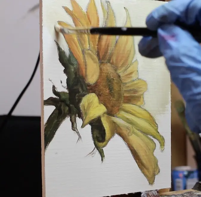
6. Add Details To The Sunflower With Texture And Pattern
I talked a little bit about pattern in the previous step. Below you can see that I’m adding highlights onto the petals, which is creating a pattern within the petals themselves. Sunflowers have a mathematical pattern they follow which is quite fascinating. If you want to know more about sunflowers and the Fibonacci sequence, follow this link.

Adding highlights to the ray floret petals.
The ray floret petals around the outside of the flower and the disc florets in the center of the sunflower automatically set up a pattern we can draw on for our composition. Patterns create a sense of rhythm in a composition.
In the image above, the highlights were made with titanium white and yellow mixed with Liquin impasto. This medium is great for adding body to the paint and creating texture with each brush stroke. Ideally, I would have liked to add even more texture to this painting, but time was getting away from me.

Adding details to the disc florets.
7. Painting The Finishing Touches
As I get closer to completing the painting, my brushes tend to get smaller. This painting was quite small to begin with, so I had to fairly small brushes throughout the painting.
Above I’ve finally made the decision to represent the disc florets in a more realistic manner. At first I wanted to keep the center of the sunflower more abstract, but it just was not looking right. Adding these small details made the painting finally come together in a more cohesive way.
I did not, however, methodically measure out every position of the disc florets in accordance with the Fibonacci sequence. You rarely need to be precise in painting unless you are going for hyper-realism or trompe l’oeil. (I found out writing this post that Alexa has no idea how to spell “trompe l’oeil”. She told me to spell it “trump loy”. I told her she was wrong. Hopefully, she will get her act together.)

Cleaning up my signature.
Singing the painting
Always sign your work, even if you are not sure if it is finished yet. I knew I still needed to do a couple more things on the painting, but needed to take time and figure out exactly what I wanted to add. This is a good time to add in your signature. You can practice your signature on a piece of paper or canvas before you put it on your painting. I have found that no matter how much I practice my signature, I will always mess it up.
It’s OK though. You can always go back in with some background paint and clean it up. I talk about signing your work in this article if you want to learn more.

Not quite finished yet – adding a little texture with Liquin impasto medium.
More texture, please
Of course, I couldn’t leave the painting alone as I had a vision in my mind that the painting would have a lot more texture to it. Maybe I was channeling my inner Van Gogh. Above, you can see that I went back in with Liquin imapsto and a little paint and added another layer.
You can see the texture of the petals in the image below. Honestly, I could have added more but there comes a time when you have to stop. I didn’t want to overpaint the sunflower. It had a loose and painterly look, so I wanted to preserve that.

This close up shows all the different layers of colors and texture in the paint.
Notes on the background
All of the images above were screenshots from a video I was recording. Because of the angle, you couldn’t get a good idea of what was going on in the background of the painting. The screenshots were also tinted a little more blue than the actual painting.
Below is a better representation of the background. I didn’t want the background to just be a flat color. I wanted it to have almost a watercolor effect. The paint was put on thinly and with random brushstrokes. If you look closely, you can see that there is a variation in color going back and forth between warm and cool. It is a very subtle effect, but the warm and cool colors vibrate off of each other and create a sense of movement.

The finished painting drying before getting varnished.
Key Takeaways On Using Design Elements In Painting
Using the design elements of line, shape, contrast, texture, pattern and color can be very helpful when planning a painting. You don’t need all of the elements to have a successful composition though. Focusing on one or two of the elements in your work may be all you need to do. When in doubt, keep things simple.
If you are painting something from nature, chances are most of the design elements will be present. But how you position your subject on the canvas can have a big impact on the overall feel of the piece.
And if you would like to find a photo to paint your own sunflower from, there are a lot of sunflower images available royalty free on Pexels to help you get started.

“Sunflower at Dawn” 5″x7″ oil on linen panel
Thanks For Stopping By The Studio
If you enjoyed this article and want to learn more, below are some of my other articles and tutorials. If you want to know when more tutorials are available, make sure to sign up for the mailing list at the top of the page.
How To Paint A Pet Portrait – Limited Palette, Unlimited Possibilities
How To Paint A Realistic Portrait – Avoid These 11 Mistakes!
Painting A Cat In Oil Featuring Prescott, A Gorgeous Maine Coon