

Learning how to paint a puppy portrait can be challenging on many levels. In this article, I’ll walk you through the steps I took creating a realistic puppy portrait from a reference photo. I’ll also share my thoughts on how I planned out this painting using composition and color.
First, Evaluate The Reference Photo
There are a few factors I like to consider when I review a reference photo from a client:
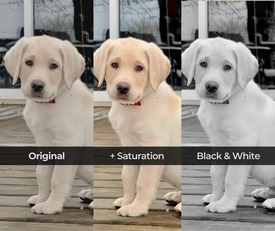
- Image saturation: A photograph’s appearance and meaning can be altered by the addition (or subtraction) of color. I will take a reference photo and play with saturation levels on my phone or computer to get a feel for the range of color I need to work with. The use of cool and warm colors help to bring a painting to life.
- Value: The value of an image is its range of light and dark tones. It can be used to highlight specific features of an image, establish a particular mood, and generate contrast. Value is one of the most important considerations when painting realism. I’ll always view the reference photo in black and white to make sure I have a good range of light and dark values before I begin.
- Composition is how the parts of a photograph are put together, such as where the subject is placed, how negative space is used, and how the image looks as a whole. This was a challenge with the reference image I was working with. I’ll elaborate on that later.
- Image clarity: Ideally, a reference photo should be clear and in focus. This isn’t always the case with references, so I’ll give some tips on how I was able to deal with this for this puppy portrait.
- Emotion: It is pretty hard to find a photo of a puppy that doesn’t evoke emotion, but this is a consideration. My client particularly liked a full body image of their puppy which can create less of an emotional pull in the finished piece. I’ll show you how I handled this and what emotion I was targeting with the finished work.
I like to get a lot of photos of a subject so I can get a feel for their personality. If there is one photo that the client really wants painted, then I will try to find a way to paint it. That was the case with our subject today.
Making A Plan For The Puppy Painting
The position of this puppy in the reference photo felt very formal, so “formal” was the look and feel I targeted. With that in mind, I decided to simplify the background and make it a deep blue color. Dark blue shades complement the yellow tones in this puppy’s fur.
Dark shades of blue also convey meaning such as importance, stability, confidence, authority, power, and intelligence. All of these verbal cues lend themselves to a formal portrait.
My client asked to show their puppy’s full body in the portrait. Generally, I like to paint the head and shoulders of pets, with the eyes taking center stage. The eyes convey so much emotion, but with the overall tone leaning towards a formal portrait, they didn’t need as much emphasis.

Original reference image. The background was distracting, taking attention away from the face.
Amp Up The Emotion And Direct The Eye With Contrast
As you can see in the image above, the reference photo had a chaotic background. A simplified dark background would create more contrast and less chaos. More contrast adds drama, resulting in higher emotion.
A strong diagonal along the back of the puppy will be a result of darkening the background. Diagonal elements in design create more drama in a composition. A strong design element like a diagonal can make a formal portrait more interesting to look at.
Another aspect of design is that light colors attract more attention. (Could this be the reason why blondes have more fun?) With a dark background, the puppy ends up being the lightest part of the painting, directing the viewer’s gaze to him.
I wanted his face to be the focal point, so ideally that would be where the lightest colors would appear.
Eliminate Visual Elements Leading Off The Canvas
I also decided to change the position of the tail. As you can see in the photo above, that tail is pointing straight off the right side of the photo. This is a painting “no no”.
In order to keep a viewer engaged within the painting, anything carrying attention off the edge of the canvas needs to be addressed. Instead, I decided to have his tail curl in, which would direct attention back into the painting.

Rough sketch for positioning the puppy on canvas. Notice the tail is not longer pointing off the right side.
Using A Grid For Proportions
When I paint portraits for clients, I like to use a grid to make sure proportions are as accurate as possible. Keeping the proportion of the original photo sized to the proportion of the canvas is important. If it isn’t, your drawing will be inaccurate.
I generally make adjustments and apply grids in Photoshop. If you don’t have access to a program like that, there are very useful apps give you very similar tools to work with. One I have used in the past is Art Tools.
Before I had the help of apps and computers, I would mark my grid on a copy of a photo and transfer it to canvas. Of course, a grid is optional. I’ve done plenty of paintings without grids and sketched my subject in freehand.
Preparing The Canvas
Note – some of the links in this post are affiliate links which means I may make a small commission if you use them. Thank you for supporting a fellow artist.
Before the underpainting begins, I usually add gesso to a canvas to smooth out the texture. The gesso can be lightly sanded between layers for a smoother surface.
After that dries completely, I tone the canvas with a warm color. For this painting I applied a light layer of yellow ochre thinned out with some Gamsol. This will dry quickly. Next, if you are using a grid, you can map it out on your canvas with vine charcoal applied lightly. Then, sketch in your composition with the charcoal.
After I’m happy with the sketch, I use a relatively small brush and go over my charcoal drawing with burnt umber thinned with Gamsol. I did this step very loosely when I painted this puppy. Your initial drawing with burnt umber can be as detailed as you want.
The Underpainting – Blocking In The First Layer
Underpainting is a thinner layer of paint put on a canvas before thicker layers. I use it to establish some of the basic values in my painting.

The under painting can be done using burnt umber oil paint thinned with Gamsol.
The underpainting helps to see how the painting will look as a whole and make any necessary changes before you start with layers of color.
To get started, paint needs to be thinned with Gamsol or turpentine in the same way for toning the canvas and establishing the drawing.
It’s OK To Take Your Time At This Stage
Until recently, I started most of my painting exactly the way described above. I would speed through the underpainting so I could get to the color layers. I would now advise you to take your time with the underpainting, establishing values and creating a stronger framework.
Additionally, using a black and white version of your photo can help you to get the values established correctly.
Gather More References To Help With Painting The Puppy
If you don’t have a variety of reference images to work from, do a search online. For this painting I looked for a lot of different reference photos of yellow lab puppies.
By doing this, I got an idea of what the puppies fur looked like in different lighting. I was also able to get a better grasp on the structure of the puppy’s body.

Blocking in subtle colors on the face.
Achieving Puppy Softness
Puppies are baby dogs. Just like human babies, their bones and joints aren’t fully developed yet. This is what gives them that soft, round, squishy look.
Different breeds of dogs develop at different rates. This yellow lab puppy clearly had a lot of roundness to his body. I had to take into account that his structure was softer because his bones and joints weren’t fully formed.

Testing out a strong contrasting background color.
Also, it’s good to keep in mind that puppies have smaller bodies and bigger heads, which can be easily overlooked. Paying attention to how the head, body, and limbs fit together can help you paint a puppy portrait that looks more real and lifelike.
Here is a link to check out an x-ray of puppy bones so you can see how developed a puppies bones are at different ages. You will need to scroll down a bit to find the pictures.
Painting A Puppy – The Importance Of Color
In the planning phase, color choice played a big role in establishing a more formal feeling portrait. I had a good idea in mind of what color blue I wanted, but I also didn’t want the blue to be more attention getting than the puppy itself.

Adding cool tones help the warmer highlights pop.
There is actually a lot of variety in the blue tones in the background. Some warm tones are also mixed in as well. The mixture of warm and cool tones vibrate off of each other, creating a little more visual excitement.
This attention to color can turn a flat, boring painting into something that feels like a living, breathing being. It’s subtle, but makes all the difference.
I carried this same process of playing warm and cool tones off of each other while painting the puppy’s body.

The focal point is the eyes. The strong diagonal created by the contrast along the back help to strengthen the focal point.
Emphasizing Focal Points
You can see in the image above and below how the design element of the diagonal line has worked out very well in drawing attention up towards the puppy’s face.
Humans are programmed to notice eyes. Directing attention to the eyes using design and color creates a painting that appears to flow a little better.

A simple, stoic puppy surrounded by an artist’s chaos.
Puppies have a lot of extra skin to grow into. This is also another reason why they look so soft. Notice how the skin right above his hind leg sort of folds over. In older dogs you would see more of the structure of their muscles and not very much excess skin. Puppies also have big soft bellies, making their overall shape much more round.
Saving The Best For Last
I waited until the very last moment to paint this puppy’s feet. I really wasn’t sure how to approach it so I just ignored it for as long as possible.

The trick to painting puppy feet is to not paint puppy feet.
The feet weren’t going to paint themselves, so eventually I turned my attention to them. I found that the less I thought of them as feet or paws, the easier they were to paint.
It’s easier to paint something thinking about it in terms of abstract shapes rather than what it’s supposed to look like.

You would never know his tail wasn’t curled back in on the reference photo.
I approached all the feet in the same way, painting odd little shapes rather than feet. In the end, they looked like puppy feet. If you have the values correct, it is surprising how abstract you can keep parts of the painting.
The Final Puppy Portrait
It was impossible for me to photograph the final portrait accurately due to the layers of paint and lighting in my studio. The photograph below was taken on my iPhone and sharpened up a lot of the puppy softness I worked so hard to achieve.
I do have video footage I will post at some point on my YouTube channel that shows the subtlety in color and softness much better.

“Champ” 20 x 24 oil on canvas.
I hope you were able to pick up a few tips on how to paint a puppy portrait in this article. I will have more coming very soon, so stay tuned.
If you would like to see other tutorials, feel free to explore the links provided below.
How To Paint A Realistic Portrait – Avoid These 11 Mistakes!
How To Paint A Digital Portrait – Step-By-Step With Pictures
How To Paint White Fur – Painting A White German Shepherd Step-By-Step