A senior dog portrait painting has a few unique challenges. But these sweet older faces are so rewarding to paint for a variety of reasons.
When painting portraits of older people, you need to take into account how to paint wrinkles, grey hair and changing facial features. When you paint a senior dog portrait, having a plan for painting the white fur on their face as well as the changing skin on their nose can make your portrait a success.
If you prefer to watch videos on how to paint dogs, I’ll have one coming out soon demonstrating how to paint this German Shorthaired Pointer named Duke. The video link will appear below but until it premieres, I’ll keep the portrait of a pug video in its place. Check back soon. I’m working on it! Until then, keep reading.
Preparing For Painting A Senior Dog Portrait
This portrait of Duke was commissioned as a birthday present for one of his devoted humans. Duke is the Chief Morale Officer at Braden Heidner Lowe & Associates, so I was feeling the pressure painting such a high ranking business dog. I was given several images of Duke to work from and we chose the image where his personality seemed to shine through the most.
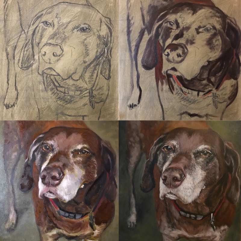
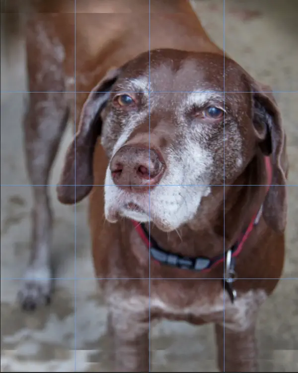
The image below is the final reference photo. I sized the original photo proportionally to fit a 16″x20″ canvas and added a simple grid. I don’t always use a grid, but to move things along more quickly I use it to help keep the proportions accurate early on.
It all seemed like it was going well until I actually drew out the sketch with vine charcoal on the canvas. While the composition looked great on my computer screen, when I drew it actual size on canvas, Duke’s head looked much too large. Below is the first sketch. I sat with it for a day to see how I felt about it. The next day it was still bothering me, so I wiped off the charcoal and decided to start over.
Correcting Mistakes Early On
In the reference photo above, you can see where I altered the image on the top and bottom. I lengthened Duke’s legs and extend the image at the top of the photo after I decided to resize Duke for the painting.
When doing portraits on a larger canvas such as 16″x20″, I generally like to keep the size of the head as close to actual size in real life. It’s OK if it’s slightly larger, but I could tell this first drawing was too large. There are instances where you could go much larger than actual size on a huge canvas and that doesn’t feel weird. I did a painting like that with my dog Eddie, which you can see at the end of this article.
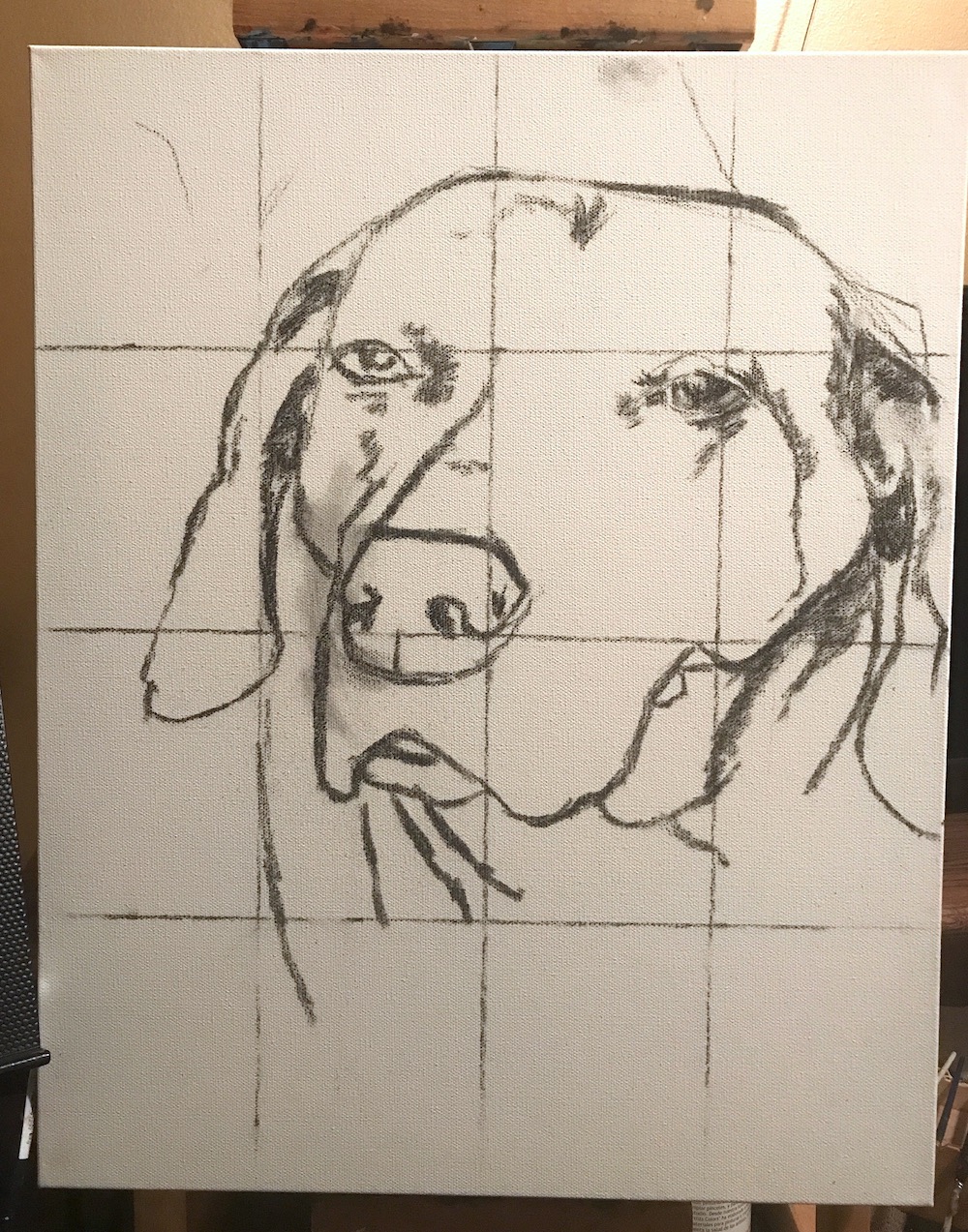
Duke’s head is just too big on the canvas. Looks like I’ll need to start over.
However, for some reason when the canvas size makes the portrait close to real-life size, it feels uncomfortable with the head too big. I don’t know if there is a reason for this or not, but if I figure it out I’ll let you know.
It could simply be that although I wanted to capture Duke’s personality, the portrait still needed to fit into the family home and have a little more of a formal feel to it. Since I was just at the sketch stage, it wasn’t a big deal to start over. If I had continued and gotten halfway done with the portrait, I would have been in big trouble. If you see a mistake early on, it’s best to address it right away.
A Note On Canvas Sizes
If I were painting a tiny dog such as a chihuahua, I would probably start with a smaller canvas such as an 8″x10″ or 9″x12″ and keep the head close to life-size as well. Chihuahuas, however, would probably prefer to be painted to the size of their personality on a canvas at least 36″ wide. This would be perfectly acceptable and make a larger than life statement, which the chihuahua’s human may love. It’s important to work with your client so they are feeling good about the direction the painting is going.
Art is emotional and hard to put into words sometimes. A couple of quick conversations on the phone or via email can make all the difference.
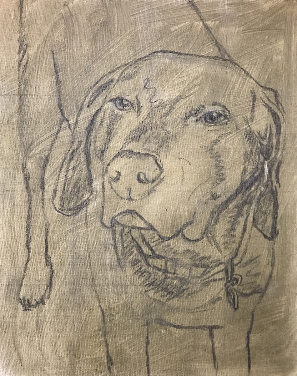
The second sketch looks much better and the toned canvas will be easier to work on.
A Toned Canvas Vs. A White Canvas
Since I was starting over with the sketch, I decided to tone the canvas by mixing ivory black with yellow ochre and thinning it with Gamsol. I put a light wash on the canvas and allowed it to dry. I added my grid back on and quickly sketched Duke in charcoal. The reason for toning the canvas is to not have the bright white from the canvas add too much contrast to the colors as I block them in. A toned canvas can aid in matching values more accurately. It’s also less intimidating than painting on a bright white canvas.
If you don’t want to use a grid, you can do a freehand drawing. I would recommend using a proportional divider to check measurements if you can print out your reference to actual size. This is useful for beginning artists and I show how I made use of a print actual size when I did a painting of a white German Shepherd named Maiden. For Duke, his reference photo was on my iPad, so a grid was much more useful since the reference was a different size than the canvas.
Many artists skip the charcoal and sketch in their paintings with paint thinned down with Gamsol. I’ve done this many times for my own paintings, but generally make sure to use grids when doing work on a tight schedule. It just saves time in the long run.
Painting Supplies Overview
Feel free to skip the next few paragraphs if you don’t want to review the supplies I used.
I used a pretty limited palette with this senior dog painting but did use the majority of the colors in the photo below. The introductory set of paints from Gamblin is great as it is more cost-effective to buy rather than as individual tubes. I’ll still include links in the text for you to Amazon for individual colors if you’d like to check them out. I used a gesso primed cotton stretched canvas. It’s better to choose a higher quality canvas rather than a cheap student grade canvas. Oil primed linen panels are my favorite surface to paint on but are not readily available in large sizes and are much more expensive.
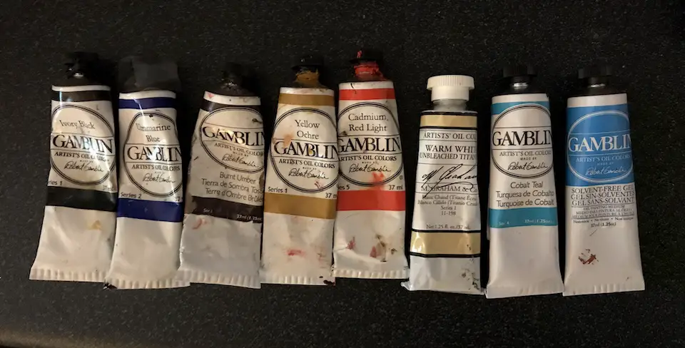
I mostly used Ivory black, burnt umber, yellow ochre, and cad red light along with a warm white from M. Graham for this senior dog portrait. I also used titanium white by Windsor Newton (not shown) at the end of the painting. It was used to paint the fur around the muzzle and eyes, and also the brighter reflections in the eyes.
Gamsol mineral spirits were used to thin the paint, especially to tone the canvas and I used Gamblin’s solvent-free gel to add body to the paint later on.
What Kind Of Easel Should You Use?
The easel I used is a simple tabletop easel. I have a giant artist easel but I’m always banging my feet on the bottom of it while I’m painting. It’s very annoying. With a tabletop easel, I can sit on my painting stool with my legs under the table and no obstructions. The only problem with this easel is I’ve found attaching a painting light to the top can tip the it over. This is remedied with a couple of 5lb. weights that I add to the back of the easel while it’s sitting on the table.
This easel on Amazon is very similar to the one I use and can accommodate larger canvas sizes. If you don’t attach a light to the top of it, you should have no problems with it tipping forward.
What Is A Mahl Stick?
A couple of people have asked me what the stick was that I used in my painting videos. As I see it, a mahl stick is a lifesaver for a painter. It helps to steady your hand so you can be more precise when you are painting. I highly recommend using one. The stick I have isn’t fancy, but it does the trick. This is one like it on Amazon if you are interested. You can also make your own if you are handy. Some people use canes or golf clubs as a substitute. I would make sure whatever you use, it’s lightweight.
Enough with the supplies and preparation, let’s paint!
Blocking In The Dark Areas On A Senior Dog Portrait
If you’ve gone through any of my other painting tutorials, I’m going to start sounding like a broken record. I always start my paintings by blocking in the dark areas first. Below you can see where I took burnt umber mixed with a little ivory black and drew over the charcoal sketch. Charcoal can easily be rubbed off, so if you don’t want to lose your drawing, it’s best to paint over it quickly. You don’t have to use as thick a brush as I did. If you want your drawing to be more precise, use a smaller brush and thin down your paint with some Gamsol.
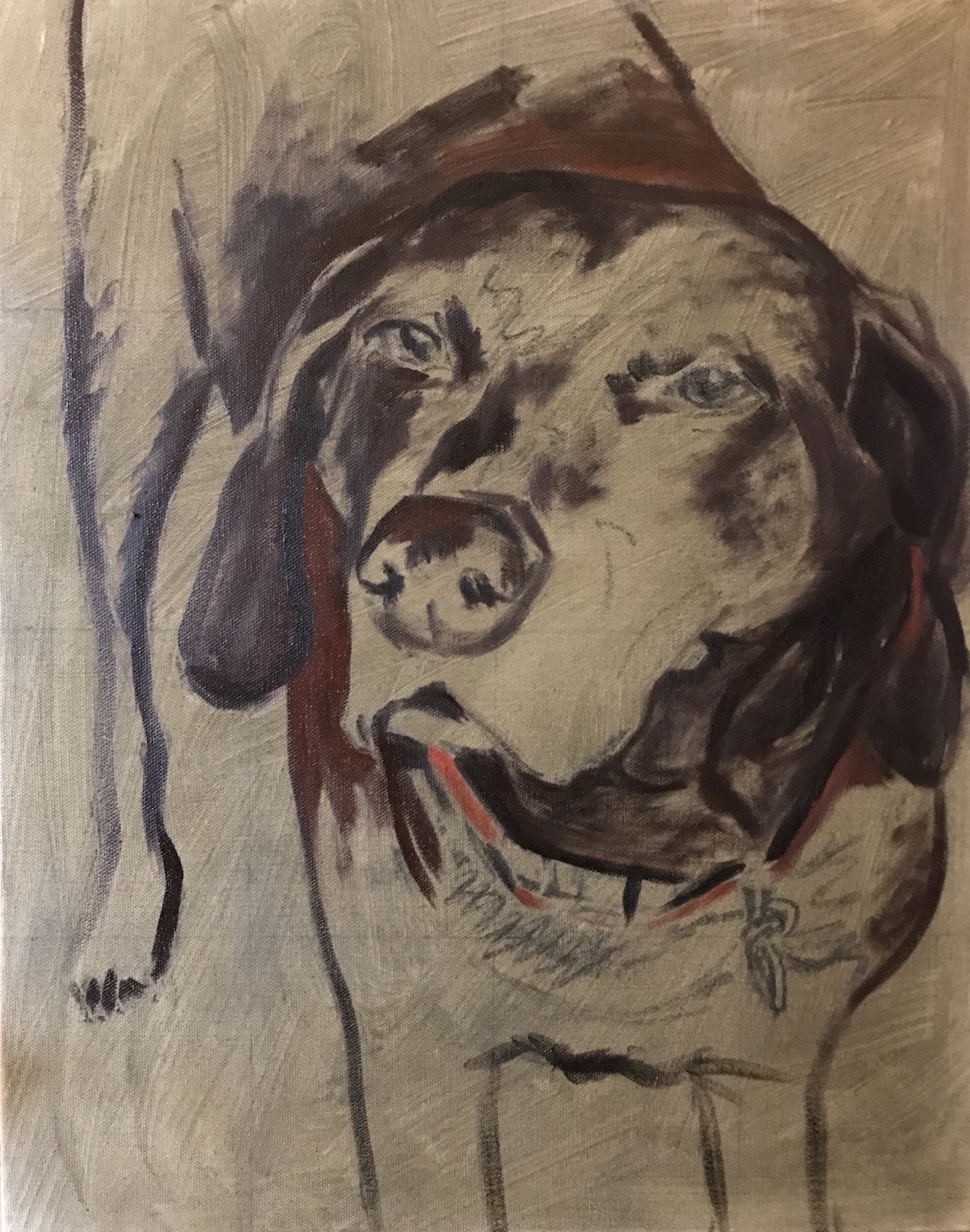
Starting with my dark areas and painting over the sketch.
I tend to work fairly quickly during this stage and use a larger brush to get paint down as fast as possible. Do what feels comfortable for you.
In addition to painting over my charcoal drawing, I also blocked in the darkest areas. I was squinting the whole time I did this. Squinting helps you to see the larger shapes and not get caught up in details.
I wasn’t being very careful at this stage. That will come later when I get to the details.
Indicating Highlights On The Muzzle
Normally I wouldn’t put any highlights down at this stage, but after I blocked in a little of the reddish-brown fur with cad red and burn umber, I added warm white to the muzzle.
When painting a senior dog portrait, there could be a lot of contrast between the white/grey fur on the face and the darker fur. I added in some of the lighter tones to help me understand and determine my value range. I also knew everything about that sweet face was going to be the focal point, so I wanted to make sure that the muzzle wasn’t too bright too soon.
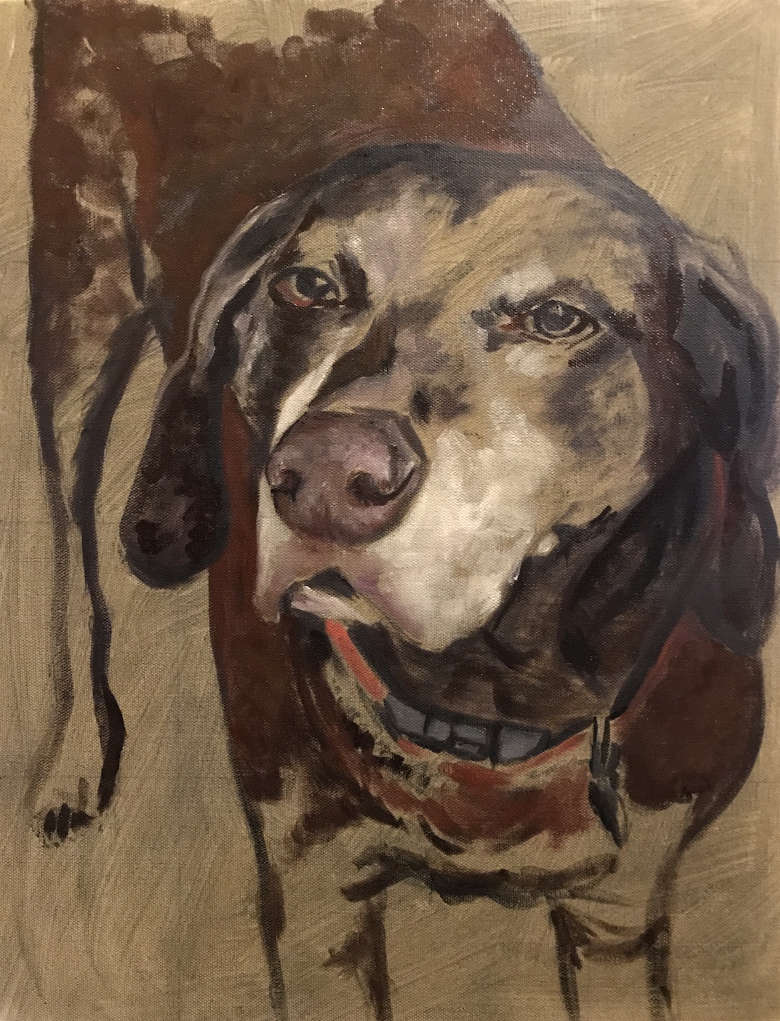
In the image above, the camera is reading the muzzle area as brighter than what I painted. When you paint white fur, you want to start with darker grey tones so you can build up the layers and create dimension.
The white fur on Duke’s face is one of the features that make him look like Duke and was key to getting a likeness. By quickly adding a little of this lighter color, it helped me to see that I was capturing him correctly. Again, this is where squinting to see if the values are matching is key.
Adding Medium Tones To The Senior Dog Portrait
Below, I started to add some of the medium reddish tones on the face. I was very careful not to add too much warm white to my cad red and burnt umber mixture. Too much white in your paint can be a major problem. It’s like adding too much salt into a recipe. It’s hard to go back.

This is why I keep my paintings on the dark side and build up to the light areas. You can always add more white if it’s too dark, but the reverse is not so true. Keeping things on the dark side makes for a more dramatic painting. More drama means more emotion, which is what you want when painting a beloved dog.
Building Form
Below I very loosely blocked in the rest of Duke’s body, making sure to be conservative with the light tones. I was adding in a little yellow ochre to help lighten some areas and add warmth without contaminating the darks too much with white.
I started to think about the light source for the portrait. In the reference photo, the light was coming from above and hitting his face first, making that the brightest area. The light that hit the rest of his body would be less bright. I then imagined him in a dark room and shining a spotlight on him. The spotlight effect on stage creates a lot of emotion and drama, so I was borrowing from this idea while painting Duke.
Blocking In Color In The Eyes
I love to paint eyes and usually can’t help myself and paint them in right away. I was using a little restraint with Duke’s eyes. The character of his eyes was already present, so I knew they would come along nicely.
In the image above, I already had some black to define the pupil and structure of the eye. For this stage, I added in some burnt umber and yellow ochre to the iris. I may have added in a little warm white to brighten up the iris a bit as well.
Intentionally Making Some Areas In Soft Focus
Ears on dogs can get somewhat complicated if you focus on them too much. I’ve found that indicating folds in the ears simply with a few brush strokes to be the best approach. Duke’s ears are mostly dark with a few subtle highlights. I wanted the crisper parts of the painting to be in the center of the face, with the rest of the painting more in soft focus and a little abstract. This makes for a more interesting composition to look at. It also helps the viewer’s eyes to move back to the focus of the painting after moving through the abstract strokes.
This subtle play between soft focus and sharper focus creates movement. And a little movement in a painting creates more emotion. After all, the word emotion contains the word “motion”.
Adding In The Background
It was time to block in the background. I usually try to get a background in early on, but since the canvas was toned a fairly dark color, it wasn’t as critical.
Duke has a lot of red tones in his fur, so I knew I wanted to land on the green side as a complementary color in the background. I started with a greyish green below, but towards the end of the painting, I decided to make that color much richer. This was a good starting point though.

Starting The Face Detail For A Senior Dog
You can also see in the image above that I started to add in face detail. It’s pretty rough at this point, but I’m starting to get the direction of the fur established. I was also trying to decide what level of detail I was going to go to for Duke.
In my past dog portrait paintings, I’ve been a little more abstract with my brush strokes for the fur. When you have the values correct, the eye doesn’t need to see all the intricate detail to understand the whole of the painting.
With Duke, I decided to go more detailed since the white fur on his face was such a key identifying factor for this stage of his life. This was a larger painting, so it would be easier for the viewer to take in the detail as opposed to looking at a much smaller painting.
Adding A Little Magic To The Eyes
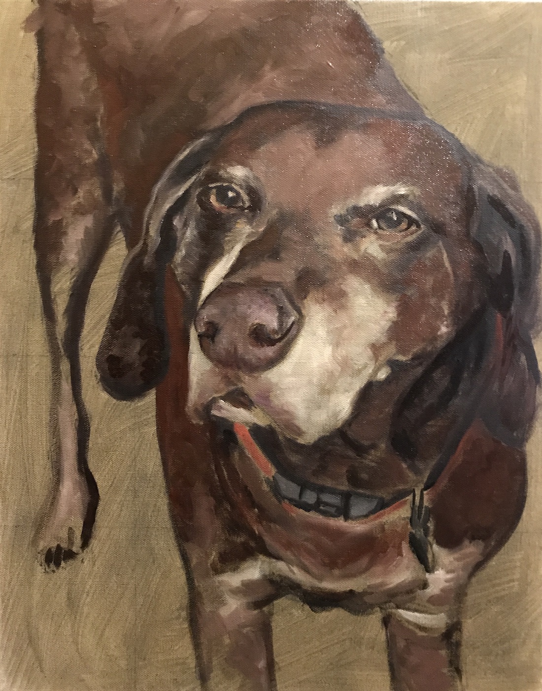
In the image below, you can see that the eyes have a little more life to them than in the previous image. This is done by blending the iris into the pupil and the edge of the eys very slightly. I also added a little more of a golden glow in the iris with warm white and yellow ochre. It’s important with eyes to have a shadow under the lid when the light source comes from above. I also brightened the highlights a little but will tweak these a bit more before the painting is finished.
I love those eyes and his little grey hairs are so cute!
Creating The Nose And Muzzle
The second most important part of creating a likeness with Duke was getting his nose and muzzle in the correct proportion. His head is at an unusual angle, and the foreshortening was a little tricky to get right.
As I painted the lighter reddish tones on the nose, it kept looking weird to me. At this point, I knew I may have been experiencing the artist curse and needed to step away from the painting for a bit. After a break, I made sure to squint my eyes, looking back and forth between the painting and the source photo. Everything was looking like it matched up well so I kept going.
I concentrated on getting my values to match and tried to ignore what was going on in my mind. Sometimes the rational part of the brain has no business in the creative process.
Changing The Background And Adding Facial Detail
Below you can see where I decided the green background needed to be richer. It was too grey before and I thought it was making the painting look a little flat. By deepening the green, it made the red in Duke’s coat look very nice. You’ve got to love a good complementary color scheme.
Deepening the background made a big difference.
I also made the green darker towards the edges, creating a vignette. This keeps the center of the painting looking bright and adds a lot of depth.
I also added in a lot more facial details with a fine brush. This takes quite a bit of time, but it was very satisfying getting all of his little old man white hairs in there. I love older dog faces and the more details I added to Duke, the more I felt like he was in the room with me.
You can also see with the fur on his neck and the ticking on his legs how abstract I left those strokes. Again, this was on purpose to keep the eye moving back up to the focal point and also continue to create the illusion of depth.
Challenges With The Nose On A Senior Dog Portrait
I’ve painted a lot of dog noses and each has its unique challenges, but for the most part, I find them pretty easy to paint. So I was a bit surprised to find myself spending A LOT of time getting this nose right.
This nose had me stumped at first, but I knew it would work out.
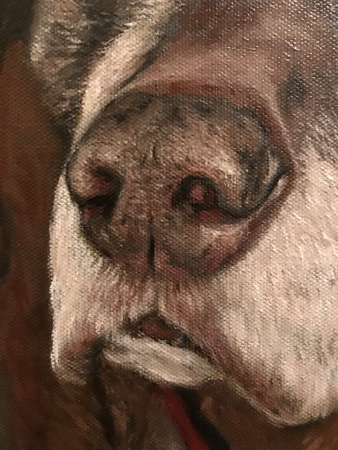
What I realized was different about Duke’s nose was that it was an old nose. The skin is much different on a senior dog nose than a younger dog nose. It has discolorations and markings that show the dog’s age. Once I realized this, I started to approach the nose like I would when I paint and older person’s skin.
Lighter noses like Duke’s also need to show some reddish or blush tones. Balancing between the red and greyish-brown colors was a little tricky. I’m really happy with the result of the nose. It reads correctly from a distance, but isn’t “photo perfect”. After all, I wanted this to look like an oil painting.
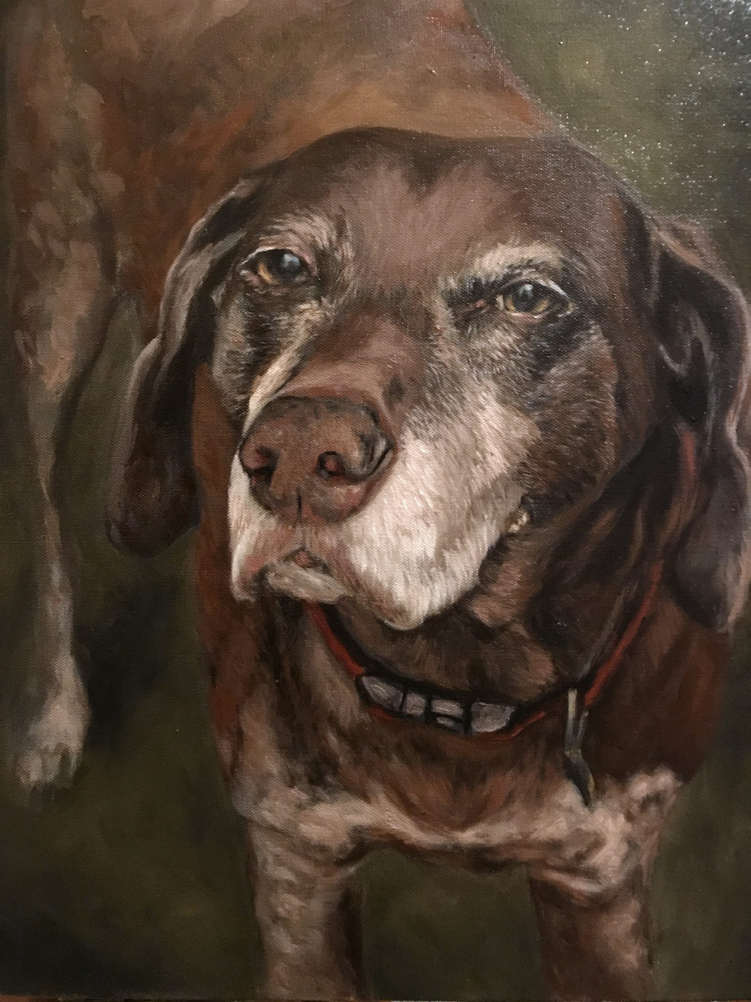
Adding The Final Touches To The Senior Dog Portrait
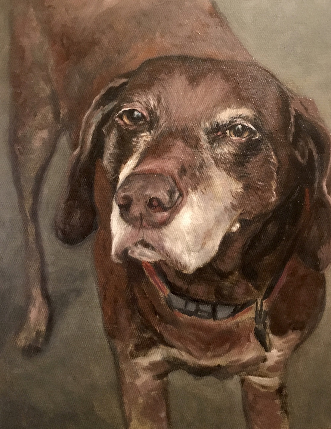
Below is the finished painting of Duke. As you can see, I spent some time adding more of his facial hair, as well as his whiskers.
I also reestablished dark areas that needed strengthening. The tag on Duke’s collar has been painted in a very simple fashion. It’s just a few dark grey brush strokes with five bright highlights added. It never ceases to amaze me what a couple of well-placed brush strokes can do.
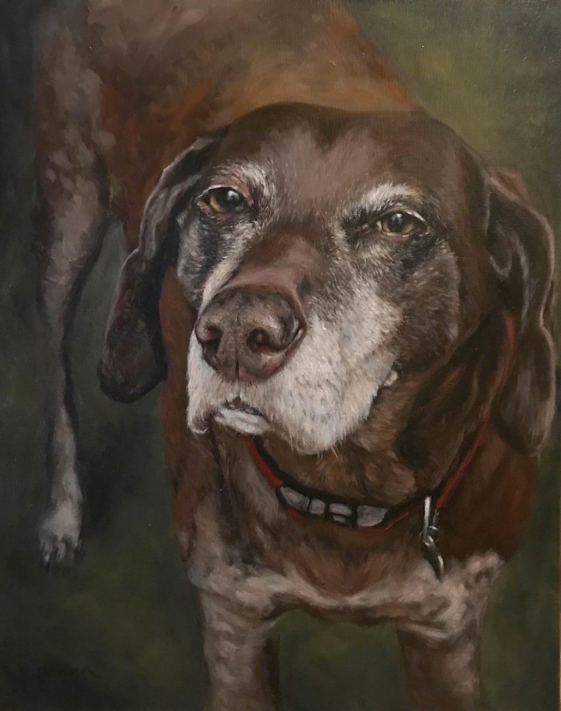
Duke Braden, Chief Morale Officer, and all-around good boy.
Signing The Painting
I just finished writing an article about signing paintings and after looking at the photographs of Duke, I was afraid that I had forgotten to sign it on the front. It was signed, but it’s really hard to see in the image above. I used a darker color to blend in with the background. The photo does too good of a job hiding the signature in the lower-left corner. It is there. I promise.
Whenever you finish a painting, make sure you sign it. I talk all about why it is so important to add your signature here in this article.
Thank You, Sandy, Greg, And Duke!
One of the best things about doing portraits for people is meeting them in person and hearing the story about how their dog entered their life. I’m convinced certain dogs choose their humans. Duke was no exception. Sandy and Greg are absolutely wonderful people and Duke found them via Greg’s father, who had taken him in.
Duke is very lucky to have so many people that love him in his life. Being the Chief Morale Officer at BHL is a big job, but from what I hear, he is extremely popular and does his job better than any human ever could. Way to go, Duke!
I Hope You Enjoyed This Tutorial On How To Paint A Senior Dog
Thank you for stopping by and learning about how to paint a senior dog portrait. I love sharing what I’m working on. If you are interested in more artist tips and tutorials, here are a few you can check out:
Impressionist Flower Painting PLUS How To Paint Silver & Fabric