Value may not seem like the most exciting topic to cover when creating art, but it is vital. It is the most fundamental aspect of any work of art. Value can make or break the structure of your work if you don’t get it right. Understanding value can improve your work dramatically.
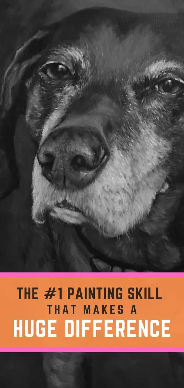
“Duke” will be featured in an upcoming tutorial.
What is Value?
Value – along with line, color, shape, form, space, and texture – is one of the 7 visual elements of art. It is the range of tone between black and white (light and dark) that underlie color. Value indicates the source of light, the shape of an object and depth in space.
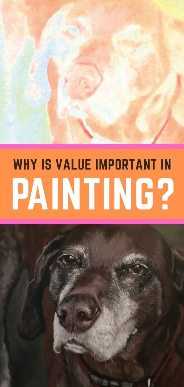
Think of it as taking a color picture on your phone and then changing it to black and white. You’ve desaturated the color out of the photo and are left with only grayscale values. The light areas are high value and the dark is low value.
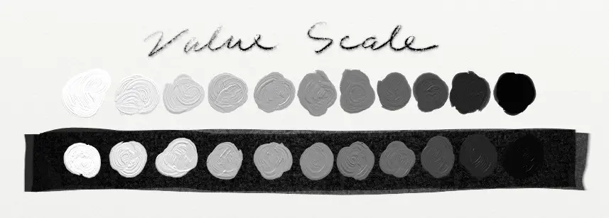
Notice how different a tone can look on a light background compared to a dark background.
If the grayscale image of your photo is really flat, chances are your values are off. You also may be working from a subject that doesn’t have a strong light source. Not enough or too much light creates little contrast in the form of your subject.
If the photo example above is too vague, consider the 4-color printing process. You have a cyan plate, magenta plate, yellow plate and then a black plate that combines together to create a 4-color image. For photos with a strong composition with lights and darks, the photo doesn’t really come together at all until you add the black plate. The black plate helps to define the values and adds structure to the image.
So if your values or “black plate” are off in any way in your painting, your work may seem like it’s lacking in some way that you just can’t put your finger on.
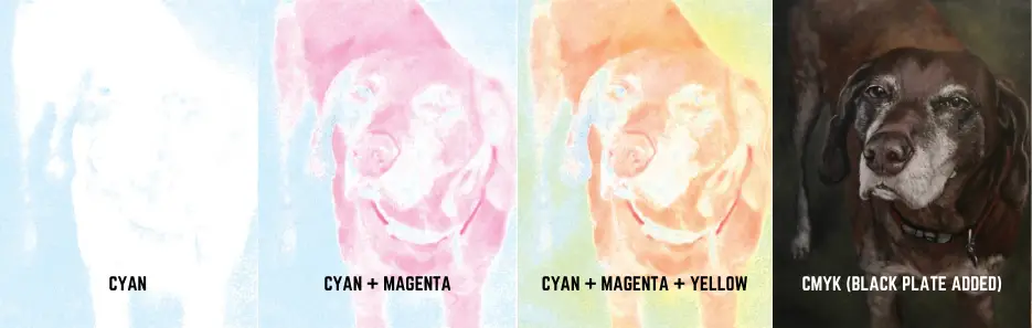
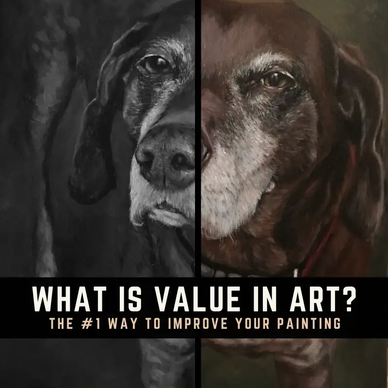
Example of the CMYK process in photography. Notice how the black plate adds strength and depth to the image.
Getting Values Wrong Can Make A Painting Feel Weak
What is the big deal about value anyway? Well, if you don’t have a strong value structure in your artwork, the entire work will feel like something is missing.
For example, when starting a painting thinking only of color first, many beginners will paint the darker or shadow areas too light. The reason for this is that the human eye is naturally drawn to bright, shiny things. We really can’t help it. It’s a survival mechanism in the brain. “Bright and shiny” could signal a water source, which is key to survival.
While we don’t need these survival mechanisms when creating art, the brain can’t help but go on auto-pilot and reach for the brightest colors on the palette. Being conscious of the brain’s natural instinct for “bright and shiny” can help you to discern how dark a shadow really is rather than what your brain thinks it “should be”.
Improve Your Paintings By Getting Values Right
Understanding painting values is key to figurative and representational art, which is the focus of my website. This is why I felt compelled to share this information. You will always be working with values as an artist, so by getting a good understanding of the value of value, you are on your way to doing better work.
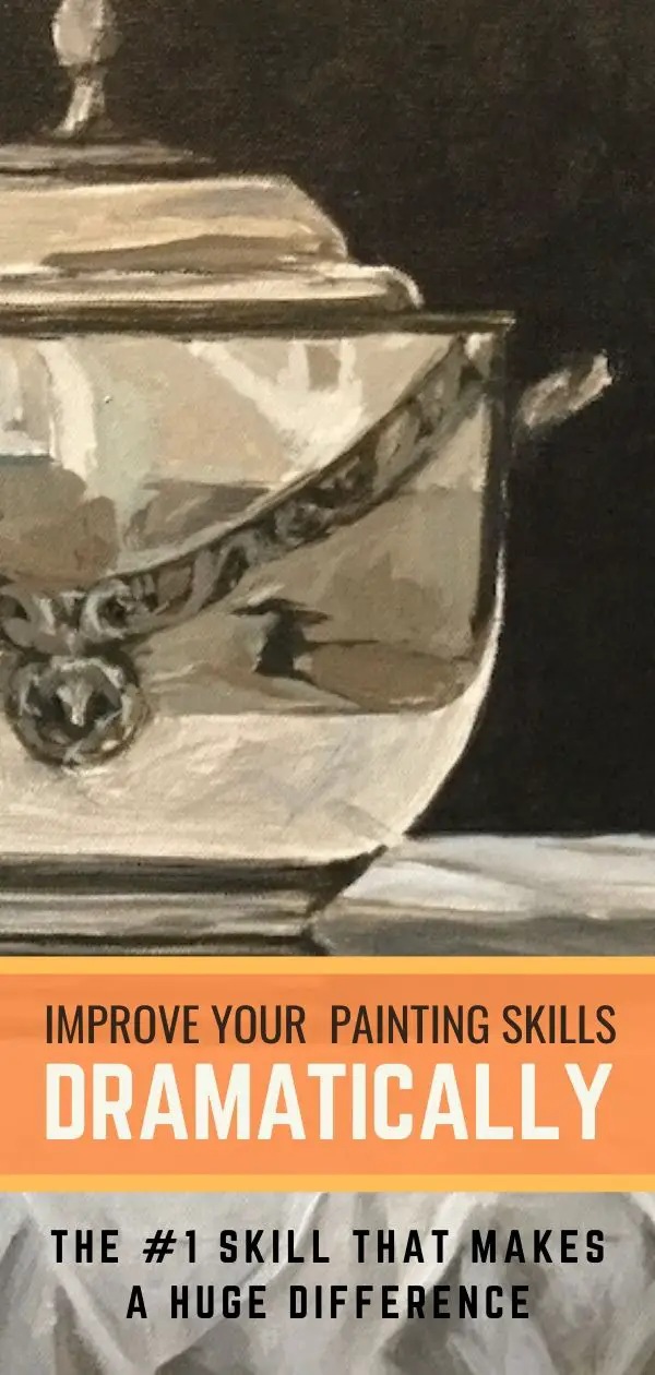
It’s the value that creates the form, making the subject of your painting recognizable. Color can steal the show, but value sets the stage. Without it, there would be no performance. This is why I’m always saying to start with your dark areas first and getting those right. When you have the form sketched out with your darker areas correctly, you can make better decisions when applying color.
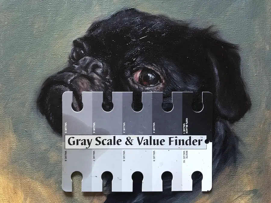
Using a Gray Scale & Value Finder can help you figure out how light or dark a color should be
Identifying The 3 Characteristics of Value
Everything I’ve read about value online has seemed rather vague and abstract. The three characteristics of value below help to take the vagueness out of value, making the concept more concrete.
3 Characteristics of Value in Painting
- Structure: As I said above, color can steal the show, but value sets the stage. The eye will be drawn to where the darkest darks and lightest lights meet. This creates a focal point. An artist aware of how value creates structure and movement through contrast will have a much more successful composition. Once a focal point is established, all the other values should be created in the proper context to support it as the main focus. Creating a simple structure is much more difficult than creating a complex one. This is something artists work on throughout their careers.
- Comprehension: Value helps the viewer to see the overall pattern and understand form. It aids in the ability for a painting to be read from a distance. The power of value can draw a viewer in and command attention. Coming from a design background, having a subject immediately recognizable from a distance gave it the ability to interrupt distracted people momentarily to convey a message visually. In representational art, being able to paint a subject in just a few quick strokes and maintain comprehension is highly desirable, but difficult to do.
- Emotion: High contrast in a painting can create high drama. Balanced correctly, it can also create a meditative or reflective mood. It is up to the artist how they want to interpret their subject and what story they want to tell. Using the power of value can enhance the tone and feel of a work of art and take those who view the art on an emotional journey. Visual art has the power to speak to inner emotions more directly than words ever can.
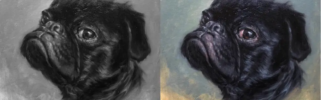
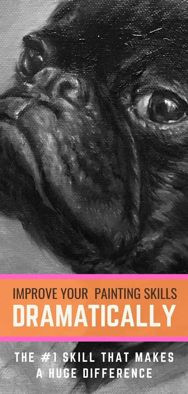
Want to know how to paint black fur? Click on the photo above and watch me paint this pug.
My Top 5 Tips For Seeing Values in Painting
Mastering value is much easier when you have the right tips and tools to help you. Below are some of the things I do and use to help me stay on the right track with value:
- Do a lot of drawing: I was fortunate to have a passion for drawing when I was growing up and had a couple of great drawing instructors at school. While representational art was not taught in any painting classes, it was center stage in drawing classes. I would encourage you to take drawing classes with an instructor in person if you can. This isn’t completely necessary with all of the incredible resources and tutorials you can find online, but it is nice to get feedback from an instructor in real-time so they can point out simple mistakes you may be making. Plus, it’s fun to be around other artists. I don’t do nearly as much drawing as I used to because I love to start getting paint on a canvas, but I did put in a lot of time in this area. I’ll also spend time drawing on my iPad to get a quick fix here and there.
- Take a photo of your subject in black and white: Color can trick the eye into thinking you have a strong subject to work from. By desaturating the photo and looking at it in black and white, it will help you to see the overall structure of your subject and determine if you need to make compositional adjustments. For instance, if you convert your photo to black and white and everything seems rather flat, you’ll know you need to adjust your lighting to increase contrast. It can also help you to see where the lightest part of your image is and decide if that is the focal point of the painting that you want. Increasing the contrast can also increase the drama, adding to the emotion of the work.
- Squint or take a tiny photo: If you’ve ever been in a drawing or painting class, at one point someone probably told you to squint your eyes. Why? Because squinting eliminates visual information and helps you to see the basic forms, including light and dark areas. When an artist looks at a subject, there is an endless amount of information they’re taking in which can be overwhelming. This can potentially keep the artist from seeing the overall structure. Squinting is the easiest way to block out that information and keep things simple. If you’re worried all that squinting will give you crows feet, fear not. You can also use your mobile phone to take a photo of your subject so you can see it on a small scale. I do this a lot while I’m in the middle of painting to check for values. A quick progress shot of the painting on my iPhone can help me to see where my values are too light or too dark from the reference.
- Use a Grey Scale and Value Finder: This is an inexpensive tool you can easily find on Amazon that makes a huge difference. While this won’t help you to see the right color, it will help you to see if the shade of color you are using is lighter or darker. Simply hold up the value finder next to your reference and determine if a color is lighter in value than the finder or darker. You can do the same thing on your painting. You will have to squint to see if the tone matches as the color will not.
- Do value studies: Value studies are very simple and quick drawings you do of your subject to determine which composition looks best. You can also do value studies directly on the canvas with burnt umber when painting live models. Value studies are important for establishing structure, comprehension, and emotion early on in the process. This can save a lot of time and help avoid reworking your painting later on. I need to follow my own advice on this point because I know when I do, I have a lot more success.
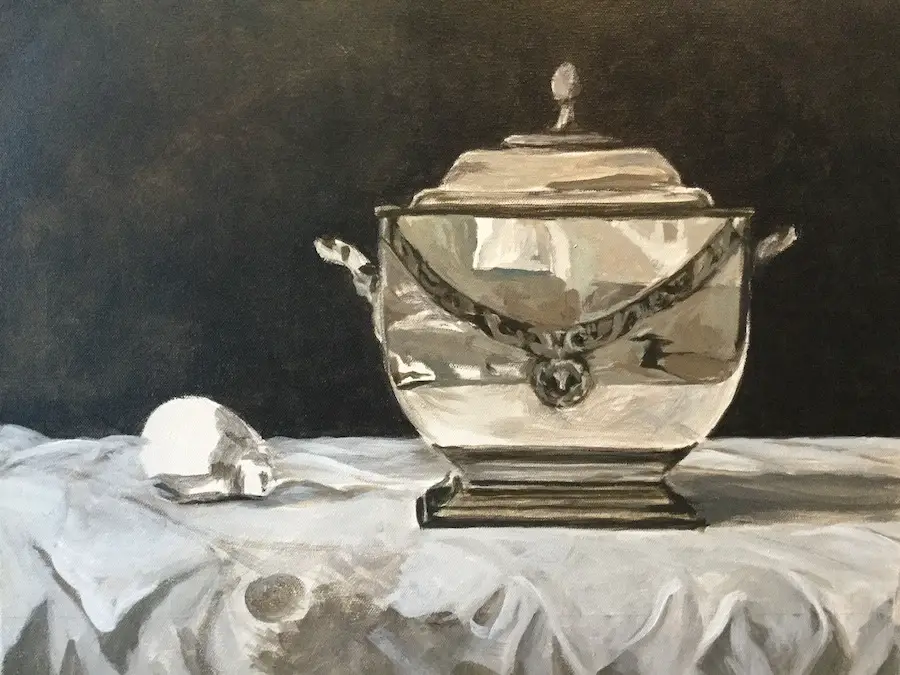
This is a value study for a still life painting I’m working on.
I’m just scratching the surface when it comes to the importance of value in creating art. I encourage you to look at how artists you admire use value when creating their art. Learning how to use value correctly in your art will change the way you see the world and improve your art as you learn and grow.
Thank you for stopping by!
I hope you enjoyed this article. If you are interested in more posts like this, below are my other popular painting tutorials. Simply click on a title below to view the article:
How to Paint Black Fur – Portrait of a Pug
7 Portrait Painting Tips For Traditional And Digital Painters
How To Paint A Dog Portrait Step-By-Step In Oil
Pet Portrait Painting: Watch Me Paint A Pug
Simple Step-By-Step Tomato Painting
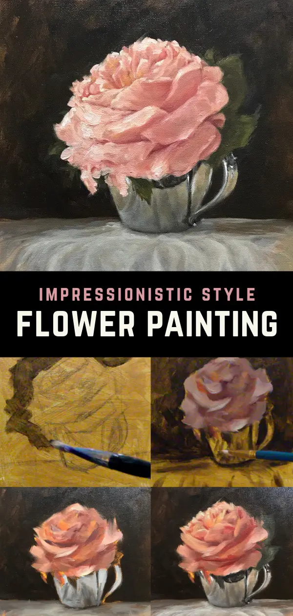
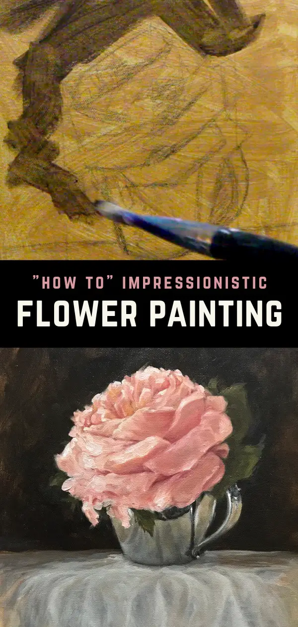
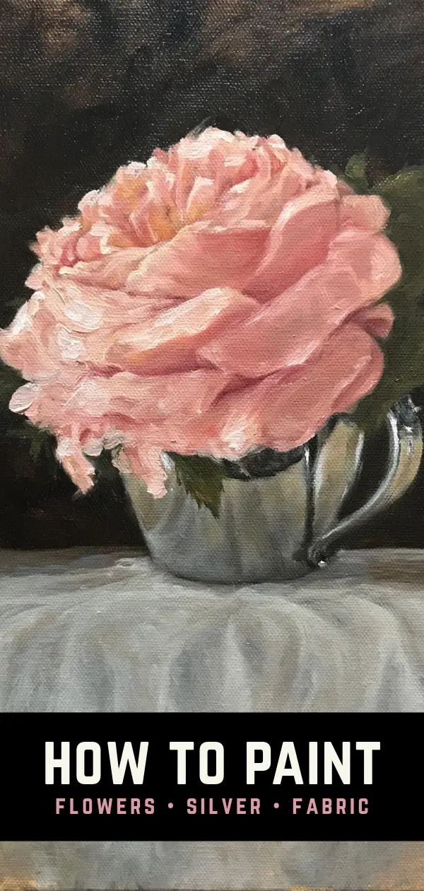
Tips For Painting Silver Objects
How To Paint A Cat On The iPad Pro – Digital Painting Tutorial Featuring Tippy
How I Paint On The iPad – A Step-by-Step Portrait In ArtRage
8 Tips for Painting Black Fur
How To Paint A Cat In Oil Step-By-Step With Jorge & Nacho
10 Tips For Painting A Dog Portrait Featuring A Japanese Chin
30 Faces 30 Days Portrait Painting Challenge
Painting A Cat In ArtRage Featuring Rémy The Gargoyle
Painting A Cat In Oil Featuring Prescott, A Gorgeous Maine Coon Cat
How To Paint A Sphynx Cat In Oil Step-by-Step
How To Paint A Corgi In ArtRage