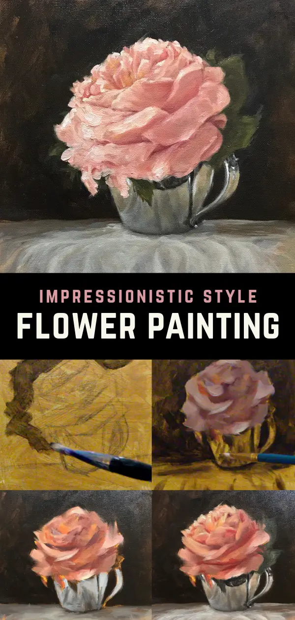
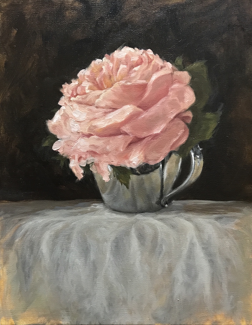
When I set out to do this impressionist flower painting, I wanted to learn more about how to capture the energy and essence of nature’s beauty. Artists have been painting flowers for centuries and I had painted a flower or two in my youth, but I didn’t remember how hard they were to do.
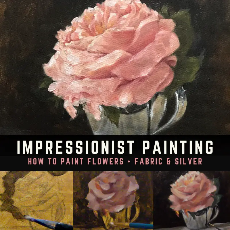
I decided to do what I thought was a simple still life of a flower. I found a pretty rose, busted out my favorite silver sugar bowl and a piece of canvas for a tablecloth. In my mind, I thought the painting would take me four hours to paint. I have no idea where that delusion came from. My simple still life had some very complicated elements: a complex, multi-petal flower, reflective silver, and wrinkled fabric. But because of that, I was able to practice painting three different subjects which I’ll share with you today.
Thinking About Composition
All three compositional elements could easily compete with each other for the viewer’s attention, so as I painted, it became clear that I would need to downplay some elements so the eye wouldn’t be confused by what to look at.
I’d love to say I consciously thought about the compositional complexity ahead of time, but I was more focused on positioning the flower in the bowl and getting the lighting set up in a pleasing way. I did comp a couple of photos together which gave me some trouble with the reflection in the silver, but I was able to correct for that without too much trouble as the painting progressed.
Some of the images I included in this article are screenshots from a video I did while painting this flower. If you’d like to watch the video, you should see it floating around on the page. All of the screenshots of the video will take you to my YouTube channel if you want to see it there.
Note: Some of the links in this article are affiliate links. I may receive a small commission if you use them to purchase items. By doing so, you are supporting a fellow artist. I’m so grateful for your support.
Impressionist Flower Painting – Getting Started
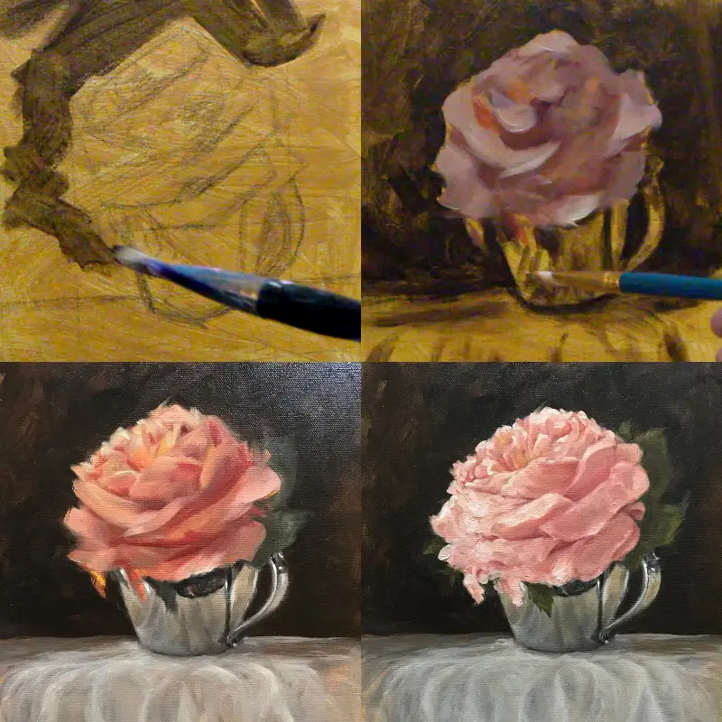
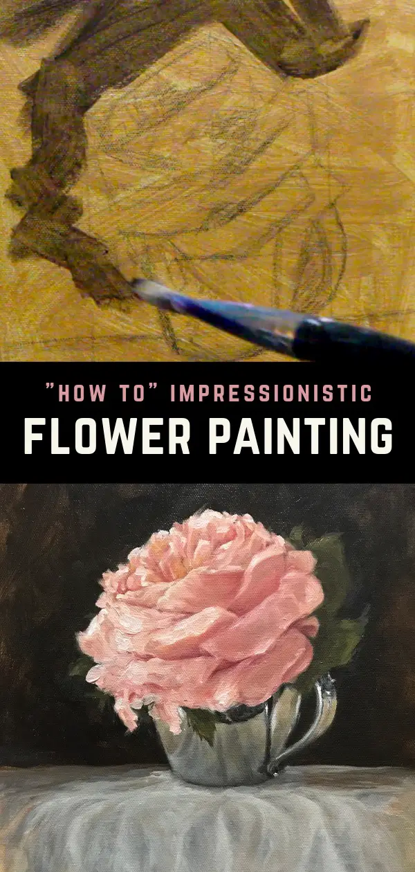
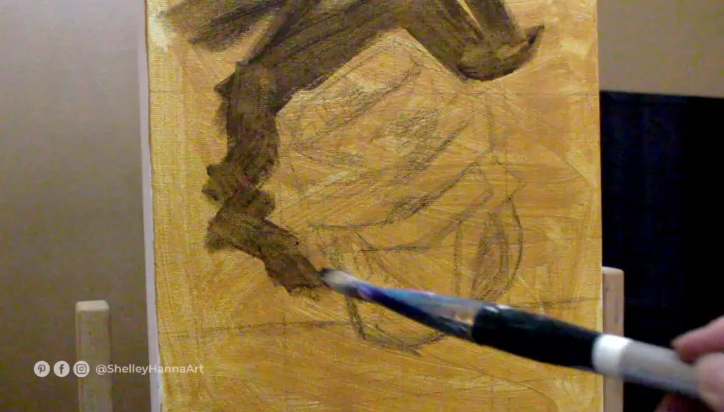
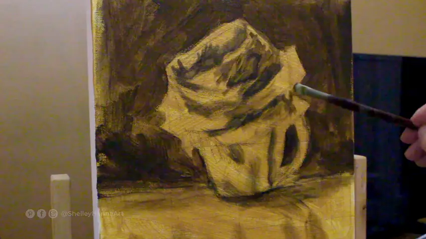
The first thing I did to start this flower painting was to put a yellow ochre wash in acrylic on an 11×14 canvas. I then sketched the flower and silver cup using vine charcoal. You can use the sight-size method by getting a copy of your subject to the exact size you want to paint it on canvas. If you don’t have a copy to the exact size, you can draw a grid on your reference image and create a corresponding proportional grid on your canvas. I used a grid for this painting to make sure I had a “visual center” since my flower was offset to the left a little.
A freehand drawing will work as well, especially if you have the help of a handy proportional divider to check measurements if you have a complicated subject. You can always sketch directly with paint if that is what you are comfortable with. I usually like to sketch something ahead of time to get my key points located on the canvas. There is a nice set on Amazon for a proportional divider, viewfinder, color wheel, and grey scale value finder. All of these tools are very helpful for creating a composition and accurately seeing values.
Supplies For Painting An Impressionist Flower
Below are the paints used in this impressionist flower painting. I have an introductory set of paints from Gamblin that I’ve gotten good results with (it’s more cost-effective to buy the set rather than individual tubes).
Ivory black and ultramarine blue on the left are considered to be cool blues. I don’t have a problem using black like some artists do, but will mix in burnt umber and ultramarine blue if I think the black is too strong.
See my comprehensive supply list here.
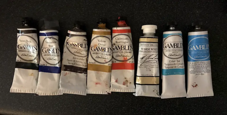
Burnt umber, yellow ochre, and cad red light are all warm tones. I use burnt umber as a very dark red. The warm white I used is from M. Graham. The warm white keeps my highlights from getting too bright too soon. I did use titanium white by Windsor Newton (not shown) for the brightest reflections on the silver and petals. Quinacridone rose and alizarin crimson was used to get some of my red and pink tones and was warmed up with yellow ochre, Indian yellow (optional) and cad yellow light as needed.
Veridian and permanent green light were used mixed with yellow ochre, ultramarine blue or burnt umber for the greenery. You can keep to a more limited color palette and skip or mix some of these colors, but I had them on hand and decided to use them. I used Gamblin’s solvent-free gel to add body to the paint and Gamsol mineral spirits to thin it. I also use a slow-dry medium toward the middle and end of a painting (a recipe can be found here.)
Palette & Mixing
Below is a photo of my palette before I started mixing. I use a toned glass palette. Toning the canvas the same color as the palette allows for a more accurate sense of color when it is placed on the canvas. I honestly don’t know why I don’t do that. I covered the canvas pretty quickly with color, so it wasn’t as necessary in this instance.
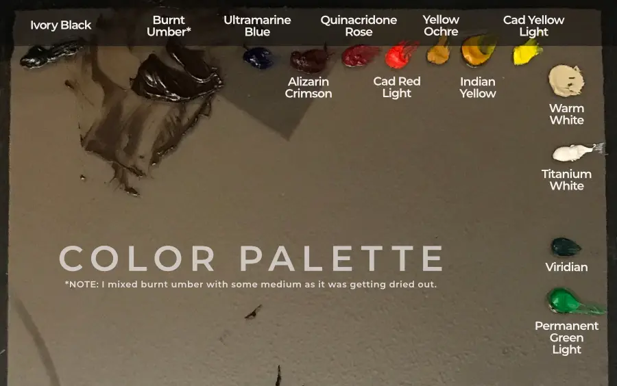
Since I painted in acrylics for many years, I was used to mixing my paint as I went. When you pre-mix acrylic paint you end up wasting a lot. It’s a different story with oil paint. It doesn’t dry fast so you can take time to pre-mix your palette. I think I read on Sarah Sedwick’s website that “time spent mixing paint is time spent painting”. This made sense to me so I made sure to pre-mix my palette below.
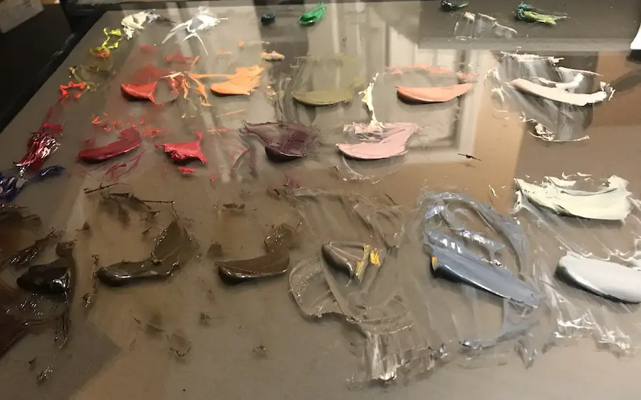
If you are new to color mixing, remember that complementary colors cancel each other out. Complementary colors are opposite on the color wheel. So if you have a color that is too saturated, you can tone it down with its complement.
I use complementary colors a lot to tone down reds, yellows, blues, and greens. I think this is why some artists keep black off of their palette. Mixing black into a color is not always the best way to make a color darker. Try a complementary color first and then darken it with burnt umber and ultramarine blue.
Block In The Dark Areas
As always, I start this impressionist flower painting by blocking in my dark areas. I did this using an acrylic burnt umber, but in hindsight, I think I would have been better off blocking in with oil paint thinned down with gamsol. I go over this challenge more in-depth in the video.
By starting with acrylic paint followed by oil paint, I am following the “fat over lean” principle. Many oil painters wouldn’t bother with acrylic paint and some may be very against it. But most canvases are primed with acrylic paint, so it’s perfectly fine. If you start painting on an oil-primed canvas, you have to skip acrylic and go straight to oil.
This painting was done alla prima (wet-in-wet), so I wasn’t worried about painting in layers. But if you allow the paint to dry in between sittings, you need to follow the fat over lean principle.
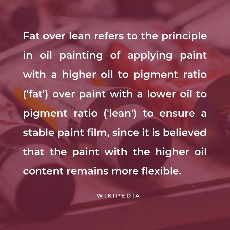
If you paint with a more “lean” paint on top of a more “fat” paint, you run the risk of the lean paint cracking on top as it dries faster than the slow-drying oil. I talk about this in the video, but the metaphor I use to remember how this works is with food. Fattening food tends to have more oil and butter in it whereas “lean” food contains less oil/butter.
If you put a layer of fat-free cream cheese on top of a layer of butter, the layer of cream cheese would eventually dry and crack on top of the butter. The butter would remain oily and flexible whereas the cream cheese would be less flexible and prone to cracking.
Adding Medium Tones To the Impressionist Flower Painting
Below I’m starting to add in the red tones to the flower. I was very excited to get the flower started and had a vision for where I wanted to go with it. That changed as the painting went on, but that’s all a part of the creative process.
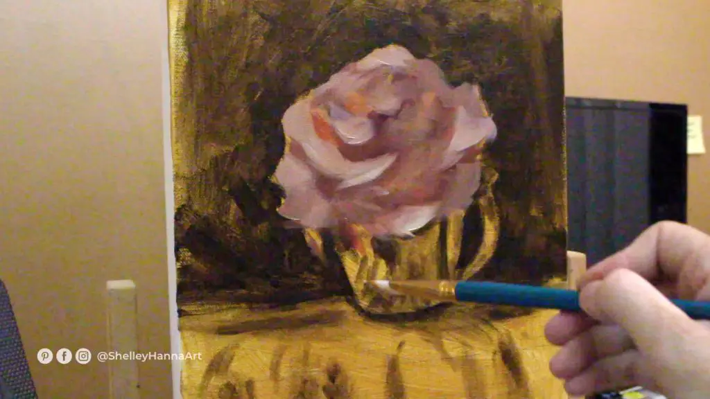
I made sure to start with my darker reds to define the shape and then move in with medium pink tones. This was my naive first pass at painting this “effortless” flower. Looking back, I started with a big brush which was great for blending the undertones. However, I think I should have switched to a smaller brush after that. I have been challenging myself to stick with a large brush to avoid getting too detailed too soon.
Blocking In The Silver And Fabric
In the photo below, I’ve quickly blocked in the values on the silver cup and fabric. At this point in the painting, I’m not too worried about things looking messy. My goal was to get the canvas covered as fast as possible. I do this with my digital paintings as well and refer to it as the “messy middle”.
Dealing With The Ugly Stage
The messy middle is always inevitable for me when I paint. I get impatient and lay paint down fast to keep my brain from thinking too much about what I’m doing. I’m trying to avoid the perfectionist inside from criticizing the work at the beginning.
This isn’t always easy to do and eventually, I can hear myself say “wow, that’s terrible”. And many times it really is terrible. But then I have to remind myself that it is just a stage and to keep going.
If I get too discouraged, I’ll get up and go do something else. Usually, when I come back to the painting after a break, things aren’t as bad as I thought they were.
Correcting Mistakes
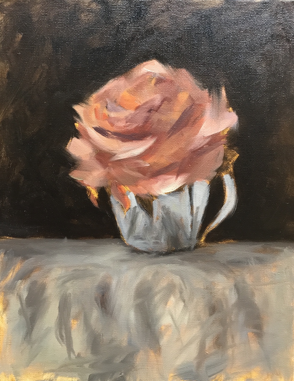
As I mentioned earlier, I comped a couple of photos together to use as a reference for this impressionist flower painting. In my original comped reference, I made a mistake and didn’t allow for the edge of the table to be reflected in the cup. This was causing me problems not only because there was a compositional mistake, but because the silver cup didn’t have enough darks to reflect back and look “silver”. Below you can see that I’ve added a darker reflection to the top of the silver cup.
Now the cup is more accurately reflecting the edge of the table and no longer feels “off”. It also reveals a convex shape which creates a mirror look. Shiny things reflect the environment around them. You don’t have to get super detailed with the reflection, but the shapes need to visually “read” as though they are mirroring the elements surrounding the object.
I did take time to roughly paint in the wrinkles on the fabric, making sure the perspective was correct. Later on, I’ll match up the wrinkles on the tablecloth to more closely match the ones in the reflection.
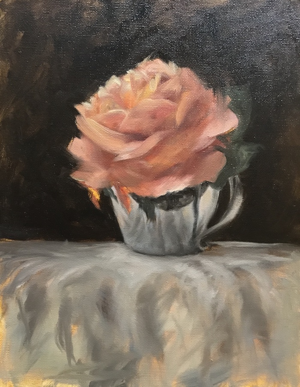
Making The Silver Look Like Silver
Just like painting eyes, shiny objects really start to look shiny when you add in the highlights. Below you can see I’ve gone in with titanium white to add my brightest highlights. You don’t need to add too much to make the object look shiny. In the video, you can see where I had added in highlights and then took one out because it was just too much.

Building Form In a Flower Painting
Continuing with the image above, you can see that I started to go in and reestablish the dark parts of the flower with a deeper red tone. Since the silver and tablecloth read very neutral in color, the flower had the opportunity to really steal the show.
Amping up the chroma on the flower is one way to do that. I used those dark areas to build my medium and light values on top to create the form of the flower.
Working Through Creative Blocks
Since I had decided to channel my inner Mary Cassatt while painting this impressionist flower, I found myself struggling with how loose to keep the strokes. On one hand, I wanted the painting to have a sense of realism to it, but on the other hand, I wanted it to have a sense of energy by using loose brush strokes. This struggle had me completely shut down on several occasions.
If I hadn’t been creating a video on this painting, I know I would have given up. For some reason, I think that painting should be easy and trouble-free. But the creative process is all about problem-solving and sometimes those problems are difficult to figure out. I’m glad I was filming this because it forced me to stick with the painting and find a solution instead of giving up and feeling pretty bad about the whole thing.
Setbacks Happen
Of course, after I had finished filming I had yet another problem – the footage was too dark. I thought I’d have to scrap the whole thing. Then I figured out how to lighten the footage through editing. After I figured that out I ran out of space on my hard drive. That meant I had to get an external hard drive and learn how to format it for Mac. THEN, iMovie wasn’t working. Fortunately, a quick restart fixed my iMovie problem without me ending up in a heap on the couch drowning my sorrows with chocolate and Netflix.
All of this threw me way off my schedule and it was very frustrating. But now I know SO MUCH MORE than I knew before, so I’m grateful for the setbacks. It just makes me more knowledgeable before I start other projects. The moral of this story is that being an artist and a maker has ups and downs. You have to remain flexible enough to deal with inevitable frustrations. Artists are natural problem solvers and know “where there’s a will, there’s a way”.
Creating A Focal Point In An Impressionist Flower Painting
Whether I’m painting people portraits or pet portraits, the natural focal point is always the eyes for me. When painting a still life, figuring out the focus is a little more of a challenge. However, because this painting is pretty monochromatic outside of the flower, it was much easier to know I wanted the focus somewhere within the flower. The human eye is naturally attracted to the lightest and brightest things, so the crown of the flower became my ultimate focal point.
I knew the rest of the flower and the silver would be attention-getters, but the dark line reflection of the handle in the cup draws the eye up. The curve of the dark reflection then keeps the eye moving up to the petals. Those petals curve upward and move the eye around to the top of the painting. So even if people look at the silver first, the eye is on the move fairly quickly.
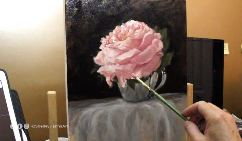
Will I Ever Get These Flower Petals Right?
Above you can see that I went a little overboard lightening my values. I did add in some warmer tones to the petals and then in the photo below, you can see where I add in cool tones for visual interest.
I made sure to keep the greenery toned down as I didn’t want the pinks and reds competing too much with vibrant green colors.
By the way, if you don’t have a mahl stick to steady your hand while you paint I highly recommend one. The stick I have isn’t fancy, but it does the trick. This is one like it on Amazon if you are looking.
Notes On Impressionism
Many realist painters are not a fan of Impressionism. I can see why as it kind of killed realism for a while and led to modern art being in favor. When I was in school, I never had an instructor outside of my drawing professor teach me anything that would help me as a realist artist. I was so disillusioned that I opted for a degree in design instead.
I still like impressionism and think it did influence some of the great realist artists in positive ways. The art world, in general, is more to blame for suppressing realism than Impressionism. And it was the art world’s inflexibility to include other forms of art that created the whole impressionist movement to begin with.
Impressionism also coincided with the development of modern physics. It always fascinates me how art not only reflects life but connects to it at a subconscious level. If you are interested in both art and science, the book “Art & Physics: Parallel Visions in Space, Time, and Light” may be worth checking out.
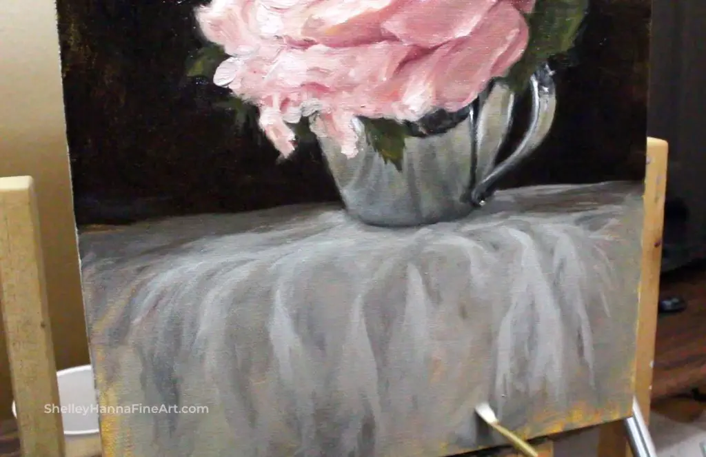
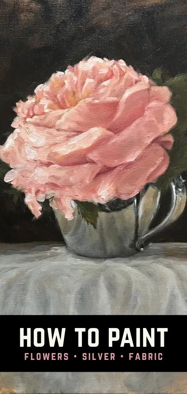
Creating Fabric Folds In An Impressionist Style
I have painted very detailed fabric folds before and have spent A LOT of time doing it. This tablecloth could have taken me days to paint if I had chosen to paint in a more realistic style. But painting in a realistic style does not have to be perfect in order to achieve a realistic look. The human brain will always fill in details for us, so simply suggesting the folds of fabric with loosely placed brush strokes is all that is required.
I merely “scribbled” in dark tones and blended them a bit with some mid-tones. Then I added in highlights by scumbling my brush across the canvas and gently blending everything out. It would be really easy to over-think this table cloth and I could feel my brain wanting to go there. Continually asking myself “what would Mary Cassatt do” sort of snapped me out of my desire to “get real” and stick with the impressionistic style.
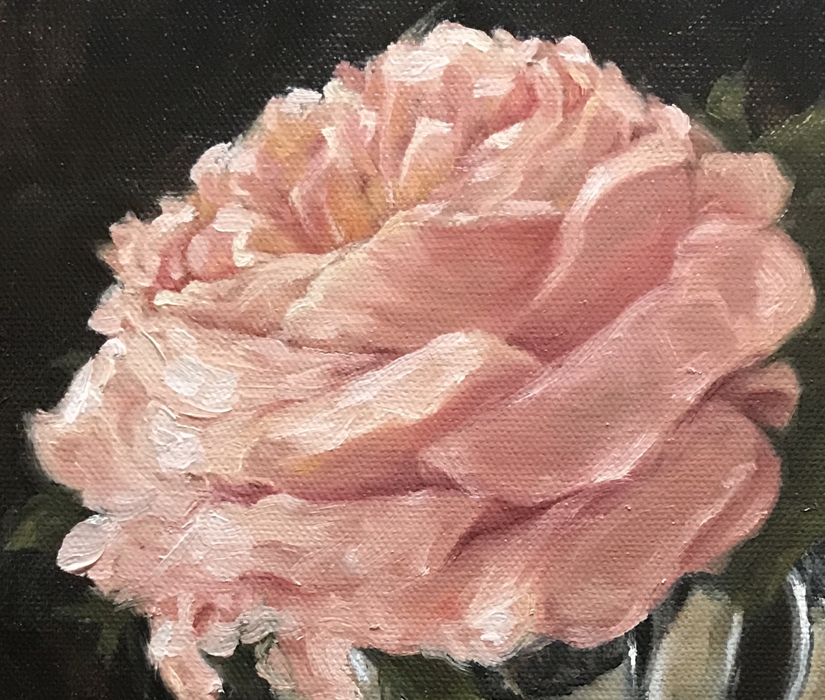
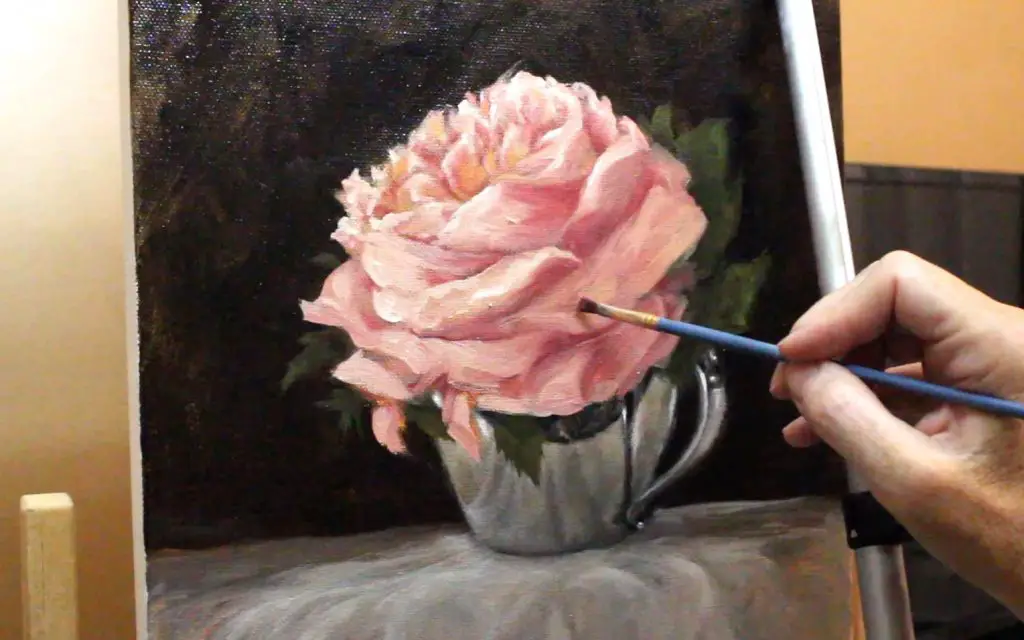
How Far To Go With Realism In An Impressionist Flower Painting
The battle between creating an illusion of what is real through loosely painted brushstrokes, and creating a highly realistic painting was full-on throughout this painting. After I decided to go with an impressionistic style, my goal was to create energy and emotion with paint. How far to go with that is based more on feeling than fact.
Above you can see where I’ve kept the petals very abstract in some parts. This visually creates energy and motion. Energy + motion = emotion in my book.
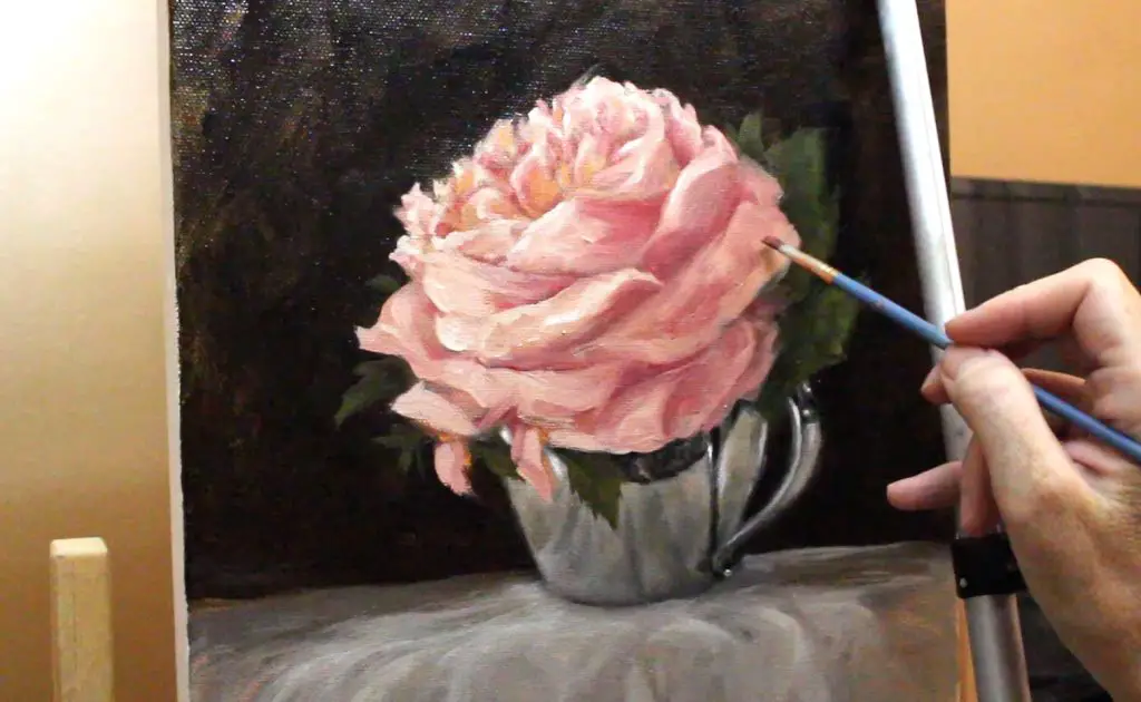
My goal is always to have my painting look “real” from a distance, but somewhat messy up close. With this impressionist flower painting, staying more on the messy side was important.
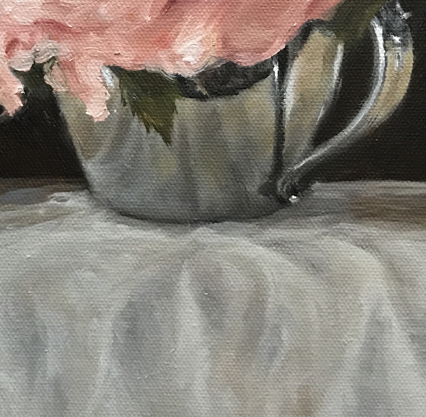
When you look at the close-up shot on the silver cup above, it really isn’t as detailed as you might think from a distance. It’s very simple and not perfectly blended.
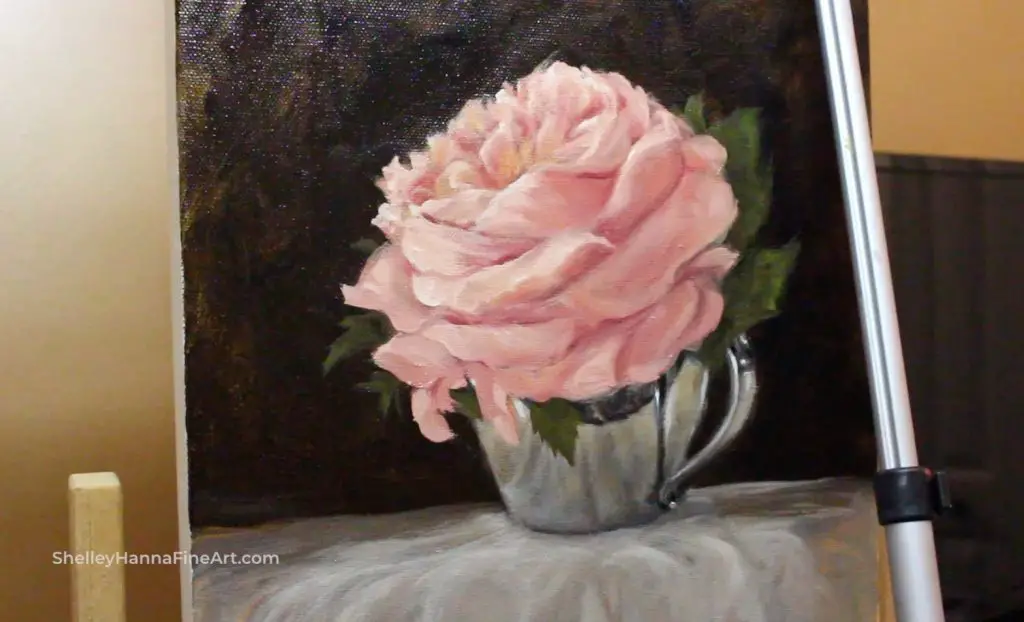
Final Thoughts On This Impressionist Flower Painting
My first thought is that I’m glad it’s over. This painting was a real struggle for me. I had a lot of decisions to make during the painting process that I hadn’t planned on. I should know better by now, but I still go into many paintings thinking I know exactly how things will turn out only to find myself in a bind. Then I have to laugh because I know how I operate well enough to know that on some level I have created this “MacGyver” experience so I’ll have a problem to solve.
This can all be avoided by doing smaller studies, but this painting was small enough and simple enough to basically be a study in itself.
I can always go back in and tweak things here and there, but for now, I’m going to call this painting finished and move on to another project.
Thank you for stopping by!
I hope you enjoyed this article. If you are interested in more posts like this, below are my other popular painting tutorials and articles:
7 Portrait Painting Tips For Traditional And Digital Painters
How To Paint A Dog Portrait Step-By-Step In Oil
Pet Portrait Painting: Watch Me Paint A Pug
Tips For Painting Silver Objects
How To Paint A Cat On The iPad Pro – Digital Painting Tutorial Featuring Tippy
How I Paint On The iPad – A Step-by-Step Portrait In ArtRage
8 Tips for Painting Black Fur
How To Paint A Cat In Oil Step-By-Step With Jorge & Nacho
30 Faces 30 Days Portrait Painting Challenge
Painting A Cat In ArtRage Featuring Rémy The Gargoyle
Painting A Cat In Oil Featuring Prescott, A Gorgeous Maine Coon Cat