
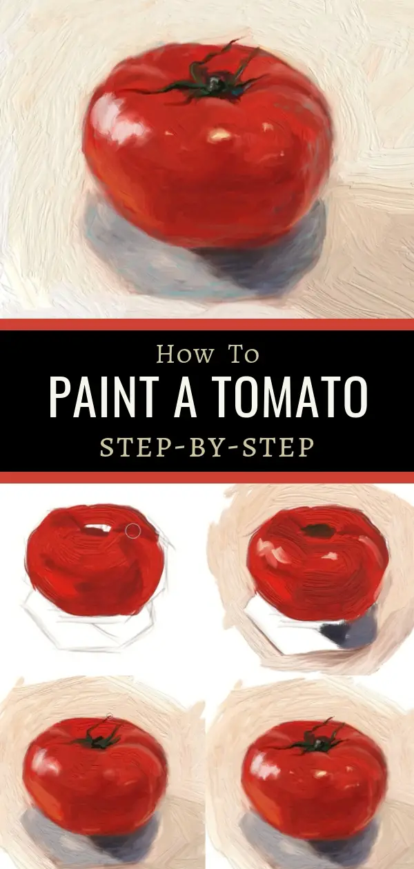
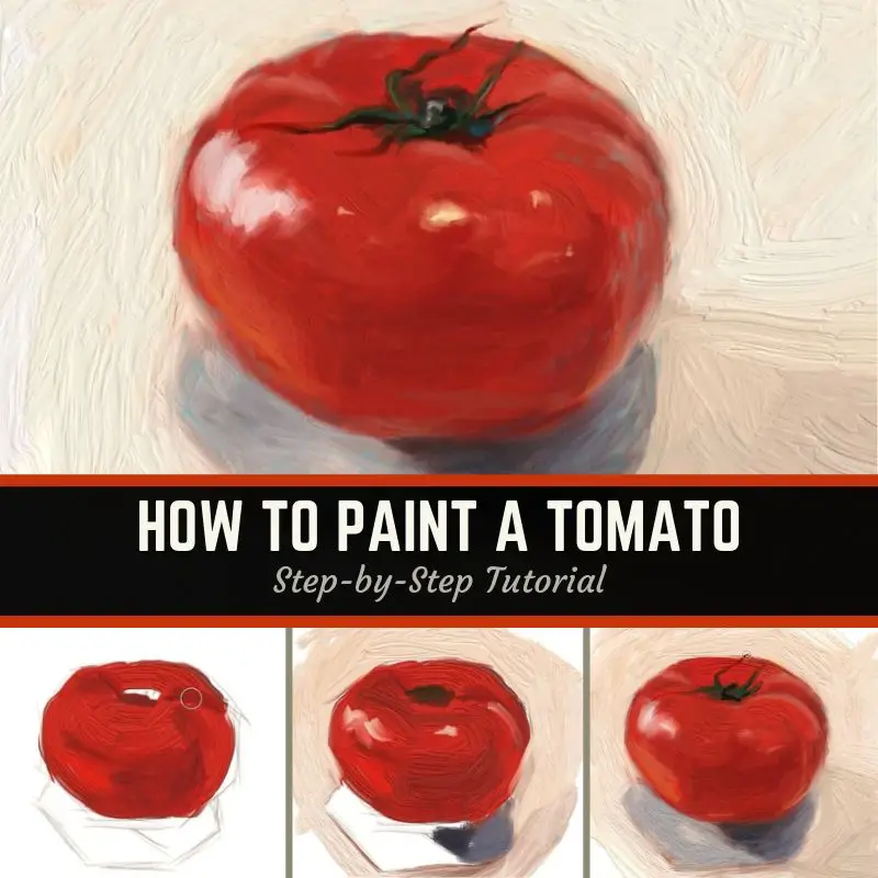
Have you ever wondered how to paint a tomato? Maybe not, but there is a lot you can learn by painting this simple, delicious subject. In this tutorial, you’ll learn 6 tips for painting this tomato’s portrait.
If you are new to painting, it’s always good to start out with a simple subject. But as I show you how to paint a tomato, you may realize there is a lot of complexity to this very simple veggie (which is also considered a fruit).
Note: some of the links below are affiliate links for products I use and may receive a small commission. As an Amazon Associate, I earn from qualifying purchases.
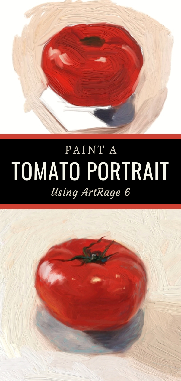
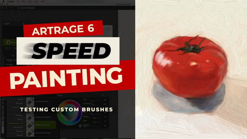
I painted this tomato to try out a desktop version of ArtRage 6, a digital painting program. If you’ve seen any of my other tutorials, you know I paint in traditional oil paints and also use the ArtRage app on the iPad Pro with an Apple Pencil. I use the same basic approach for both, so whether you are painting traditionally or digitally, you can follow along.
You can watch my speed painting video if you’d like to see my first experience with ArtRage 6 unfold. Click the image below to watch it on YouTube:
A Preview Of The 6 Tips On How To Paint A Tomato
Here are the basics of what I’ll be covering:
- Blocking in the base tomato color
- Adding deeper tones
- Indicating light source reflections
- Blocking in cast shadows
- Adding bounced reflections & fine-tuning highlights
- Enhancing with complementary colors
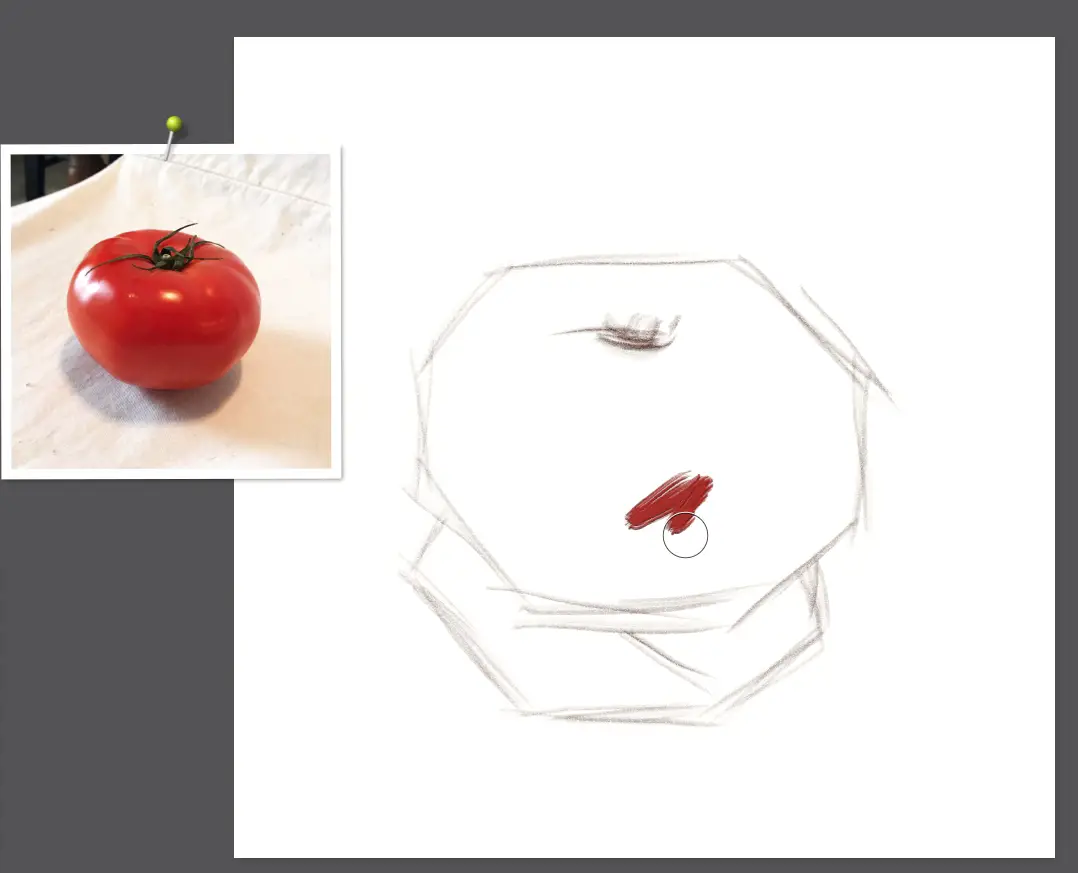
1. Blocking In The Base Color When You Paint A Tomato
In previous tutorials (links below) I have always said to start with your dark colors and work up to your lighter colors. I’ve broken with this rule a bit while painting this tomato.
After studying the tomato a bit, I decided to block in the color that is most prominent throughout which was a medium red color. I did this because the tomato is such a simple shape and I wanted to paint it quickly. Also, I find it’s easier to deepen red colors as long as no white has been introduced.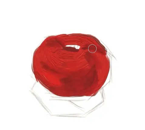
Moving quickly, I used a large brush that I created with the custom brush tool in ArtRage 6. Using a large brush to block in simple shapes is a fast way to establish your painting and something I do with my traditional paintings all the time. When painting on the iPad, I was limited to smaller brush sizes, so the desktop version of ArtRage has an advantage in this regard.
2. Adding In Deeper Tones Of The Tomato
As mentioned above, I have broken with my “dark to light” process. It’s OK though because there are a lot of ways to paint. While I am painting this digitally, I’m painting this all in one layer “alla prima” style, so my colors will be mixing just like real paint. That’s one of the things I love about ArtRage – it handles paint almost like the real thing.
If I were painting this on canvas – which I may do for another post or as an update to this post – I would most likely use alizarin crimson with burnt umber or ultramarine blue. Black can also be used as a dark blue to deepen red tones.
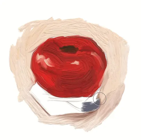
Tomatoes can be very reflective. Think of them like a dull Christmas tree ornament where you can see nearly the entire room in the reflection. The dark area of the tomato in the middle is reflecting where my kitchen flows into my living room – thus a darker reflection. You can sort of make out the ceiling and walls at this point as well.
NOTE: The images of this painting were taken as screenshots from the speed painting and blown up so they are a little blurrier than I would like, but still illustrate key points.
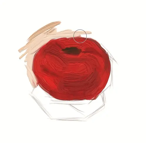
3. Indicating Light Source Reflection While Painting A Tomato
Because this tomato is quite shiny, I decided to indicate a few of the light source reflections while adding the background paint. Since I am using red paint here, I’m careful to not throw in bright white as that could get mixed in with the red and turn things pink.
The tomato had light coming from a door, a couple of overhead lights and a window. You can see where I quickly indicated those light sources around the upper part of the tomato.
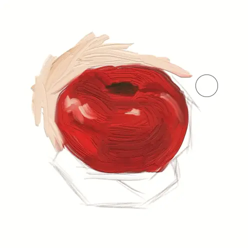
4. Blocking In Cast Shadows When Painting A Tomato
After establishing the light source reflections, I rapidly blocked in the rest of the background to help inform the shapes of the cast shadow.
Once again, I have broken from my “dark to light” rule while painting this tomato. Normally I would have gotten that dark shadow established right away. However, I was doing this very quickly and didn’t even think the painting was going to turn out so I wasn’t following too many rules.
I was more focused on learning how to use the custom brush tool in ArtRage 6 than my painting process. As you can see here, the texture of the brush is a bit strong, but I tone that down later. (That is some seriously thick paint!)
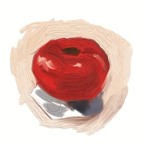
For the cast shadow, I selected a very neutral, bluish grey for the darkest part. As I said earlier, black can be used as a dark blue in painting so the dark grey here will “read” as blue and is a nice cool color in contrast to some of the warmer reds.
The grey on the left side of the shadow has a warmer grey tone. There was light coming from a north-facing window at about the 2 o’clock position which creates a cool shadow. A stronger sunlight source was coming from the west at the 10 o’clock position through a door which created a warmer shadow. It isn’t unusual to have different temperatures of color in shadows. The cool shadow color really helps the red to pop when painting a warm red tomato.
5. Adding Bounced Reflections & Fine Tuning Highlights
Above I did a little more blending and laid in some orange/red color to indicate bounced light. This can mostly be seen on the left side where the light is bouncing up off the cream surface of the fabric. There are also hints of this in a couple of other places near the bottom of the tomato.
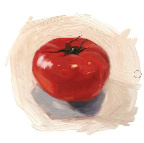
After I got the bounced light and highlights in the right position, I did a little blending with a light touch. I wanted this painting to feel loose and painterly rather than highly finished. Whether you paint a tomato with a loose finish or high realism, it doesn’t matter. That is up to you to decide. I like to do both.
6. Enhancing With Complementary Colors
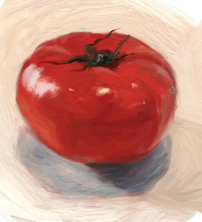
In the image above, you can see where I’m adding in some turquoise as a complementary color to the orange tones throughout the tomato.
Complementary colors vibrate optically which gives a sense of energy or “aliveness” to a painting. I always like to add complementary colors but only in small amounts. Too much optical vibration can be irritating. Of course, if you want your art to evoke certain feelings, then adding more may be what is required. Art is emotion, so you get to decide what you want the observer to feel.
If you want to see how I used subtle complementary colors to paint a handsome shelter cat, check out my video tutorial here. You can go through the step-by-step tutorial here on my website.
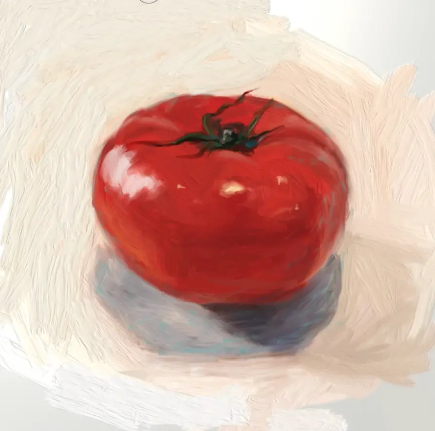
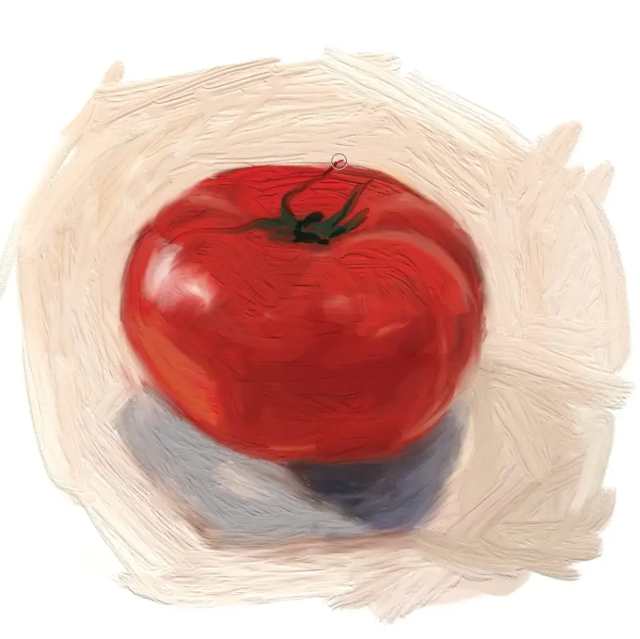
The Final Result Of This Tomato Painting
After establishing the light source reflections, I rapidly blocked in the rest of the background to help inform the shapes of the cast shadow. I also changed the background color from a peachy tone to one that was more neutral and visually reads as having a slightly greenish tone. Again, making use of complementary colors.
I did leave some of the peachy tones to bleed through which adds visual interest.
One thing you will notice in the finished painting below is that my custom brush strokes added a lot of nice texture. As I was painting the brushes were smooth and I felt that they made some really nice marks.
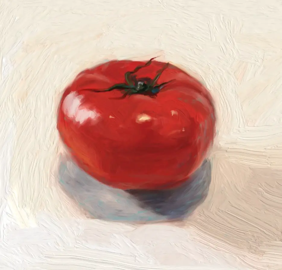
This painting took me approximately 1 hour to paint. And that was with struggling through the program like a newbie. I’m considering this experiment a success.
Stay tuned for more small veggie paintings as this tomato was just one ingredient of the salsa I made that day.
Thank you for visiting!
For your convenience, I’ve included links to my other popular tutorials below:
7 Portrait Painting Tips For Traditional And Digital Painters
https://shelleyhannafineart.com/portrait-painting-tips/
How To Paint A Dog Portrait Step-By-Step In Oil
https://shelleyhannafineart.com/how-to-paint-a-dog-portrait/
Tips For Painting Silver Objects
https://shelleyhannafineart.com/painting-silver-objects/
How To Paint A Cat On The iPad Pro – Digital Painting Tutorial Featuring Tippy
https://shelleyhannafineart.com/paint-a-cat/
How I Paint On The iPad – A Step-by-Step Portrait In ArtRage
https://shelleyhannafineart.com/paint-on-the-ipad-step-by-step/
8 Tips for Painting Black Fur
https://shelleyhannafineart.com/8-tips-for-painting-black-fur-traditional-digital/
How To Paint A Cat In Oil Step-By-Step With Jorge & Nacho
https://shelleyhannafineart.com/how-to-paint-a-cat/
30 Faces 30 Days Portrait Painting Challenge
https://shelleyhannafineart.com/portrait-painting-challenge/
Painting A Cat In ArtRage Featuring Rémy The Gargoyle
https://shelleyhannafineart.com/painting-a-cat-in-artrage/
Painting A Cat In Oil Featuring Prescott, A Gorgeous Maine Coon Cat
https://shelleyhannafineart.com/painting-a-cat-in-oil/
How To Paint A Sphynx Cat In Oil Step-by-Step
https://shelleyhannafineart.com/how-to-paint-a-sphynx-cat/