
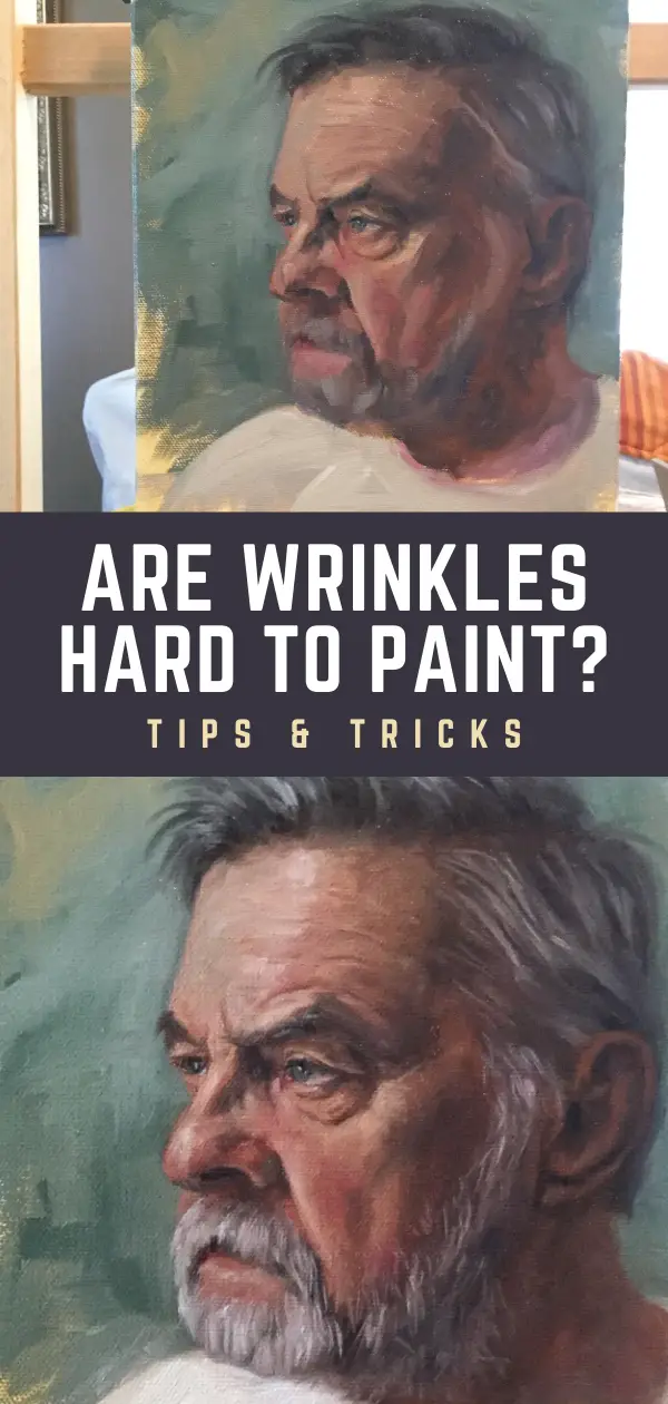

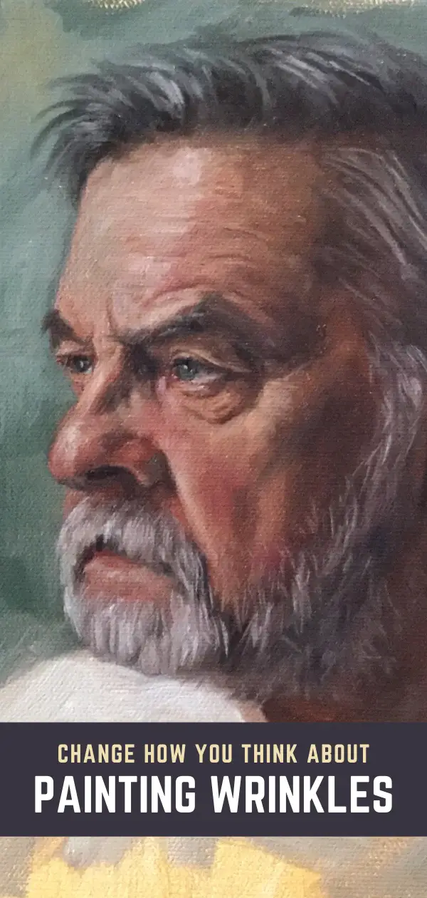
Painting wrinkles and grey hair have their own unique challenges. I’ve loved drawing and painting wrinkles ever since I was a kid. The more wrinkles, the better as far as I was concerned. Wrinkles add a lot of interest and character to a portrait.
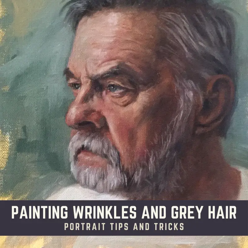
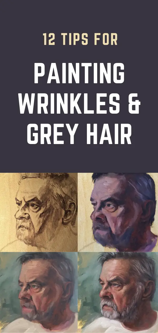
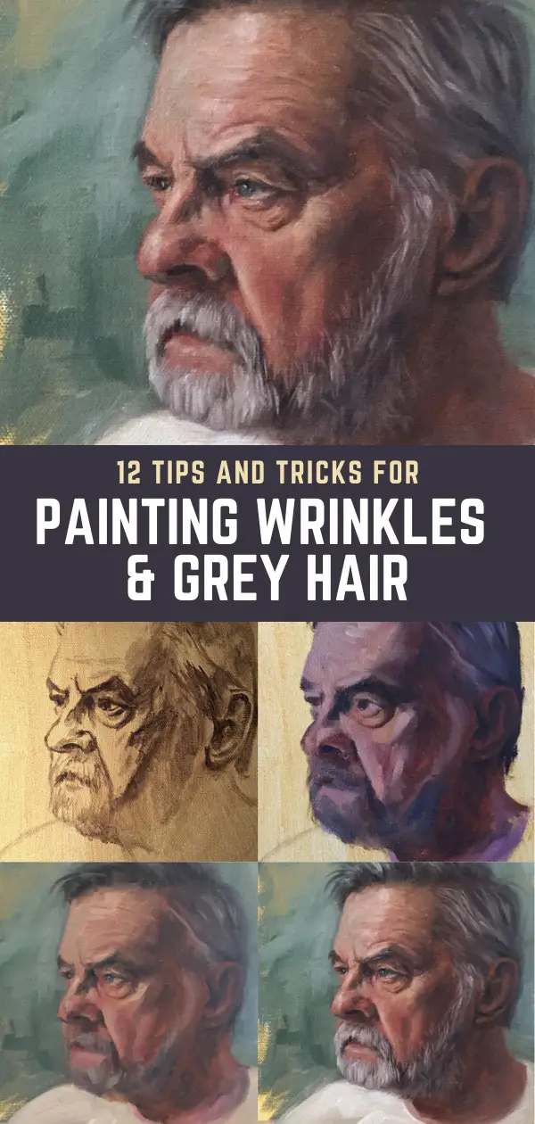
In my portrait painting tips article, I gave a basic 3 step process for painting wrinkles. In this article, I’ll go over 12 tips for painting wrinkles and grey hair including how to think about wrinkles in a different way. If you are intimidated about painting wrinkles, I hope this article will help you feel more confident about giving it a try. Like anything else when painting portraits, it takes practice. But it’s a skill you can learn and master.
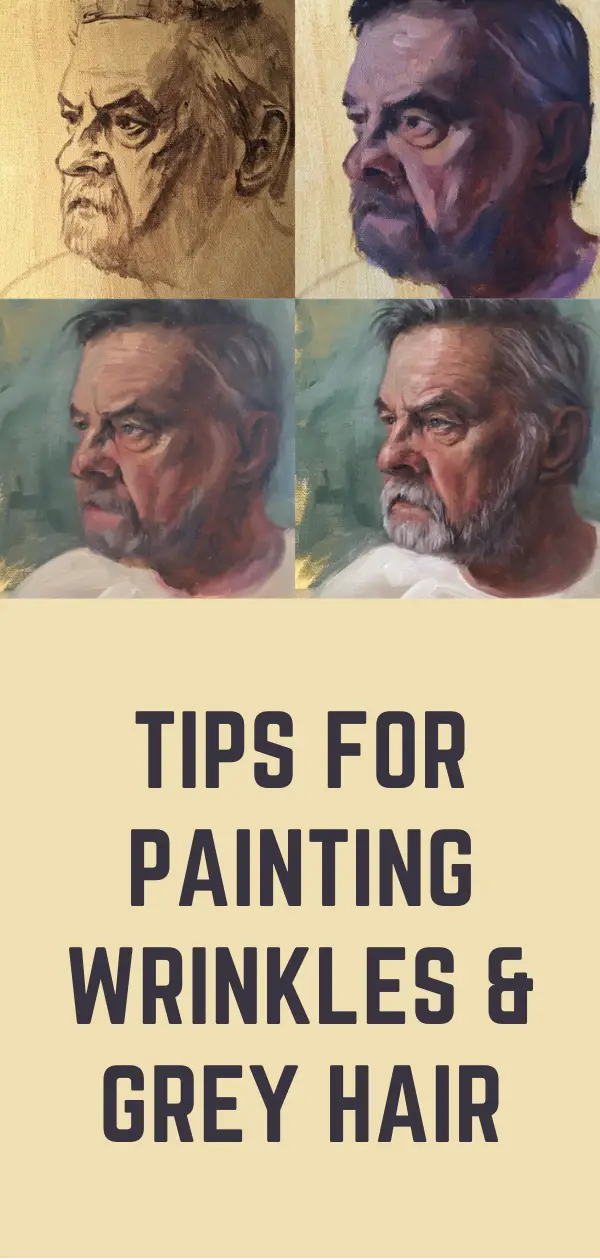
At the end of this article, I have provided a list of the supplies I used while creating this portrait.
Tip 1: Change How You Think About Painting Wrinkles
Below is a topographical map showing a river, tributaries, hills, and valleys. I like to think of these as the Earth’s wrinkles. The river at the top is a lighter color because it’s filled with water and reflecting the sky, but if it had no water it would be a dark color (and a very deep wrinkle).
The tributaries, hills, and valleys are the best visual metaphor for wrinkles on the skin that I can think of. The light source on the map is from the upper left, so the hills are highlighted on the left side and go into shadow on the right side. The valleys between the hills are also a darker color.
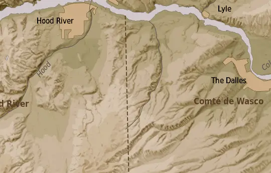
This is the same as wrinkles on an aging face. Think of a wrinkle as a small river or tributary which would be dark. Next to the wrinkle may be a hill that will catch light from one side and cast a shadow on the other side.
Practice drawing out the rivers and tributaries in the image above. It will give you a good sense of how wrinkles need to be painted in a portrait.
Tip 2: Get Your Sketch As Proportionally Accurate As Possible
A lot of times I get a little too impatient with sketching the face at the beginning. I would encourage you to make sure you get your proportions as accurate as possible so you aren’t having to move features around on the face later as you are painting. The next article I publish will go into more detail about how painful it was for me to paint a portrait because I didn’t take time to get my drawing right.

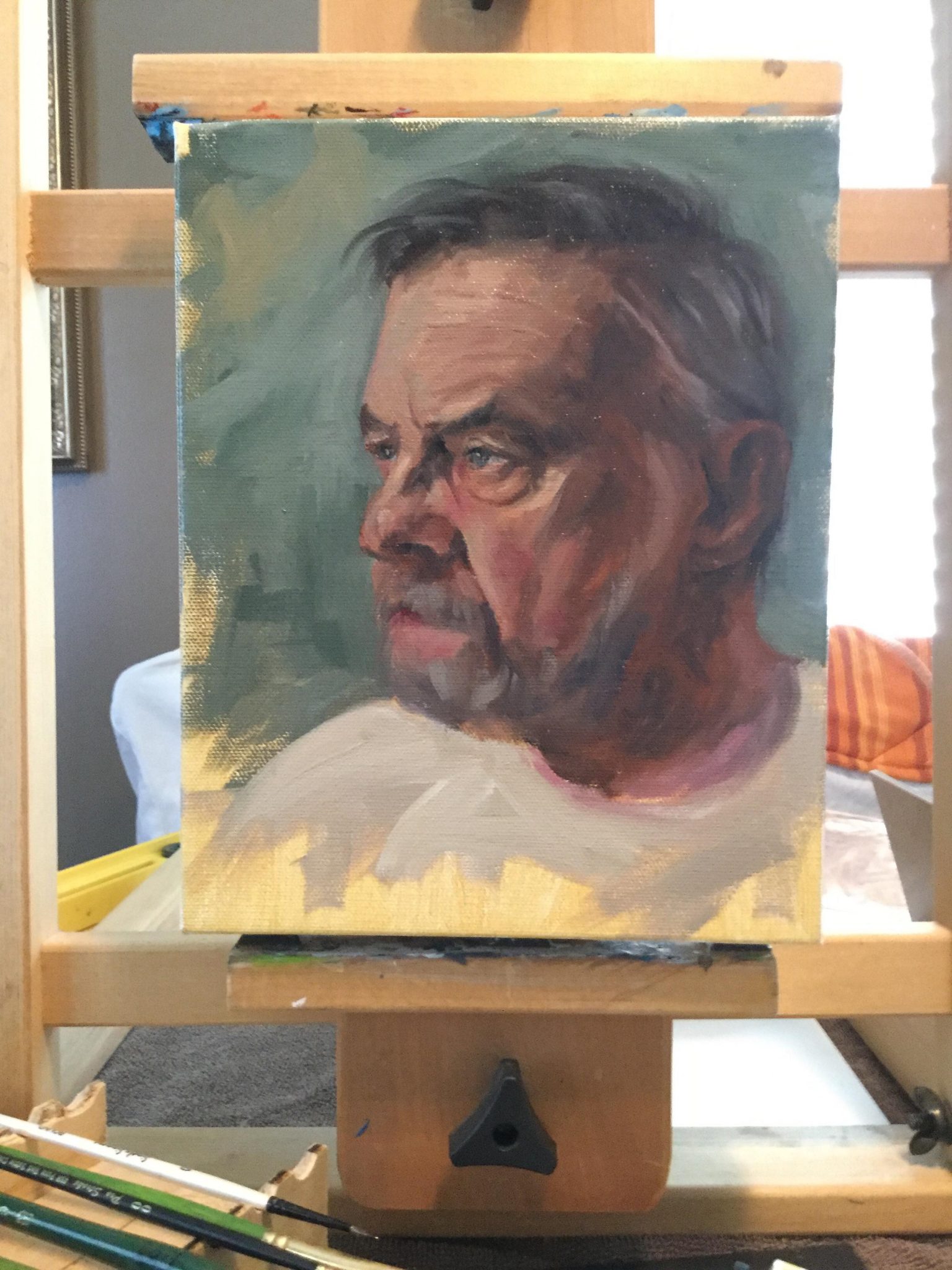
I painted this portrait on an 8×10 stretched canvas and had my reference photo printed out at the same size. This is known as sight-sizing, which I will go over in more detail with tip number 8.
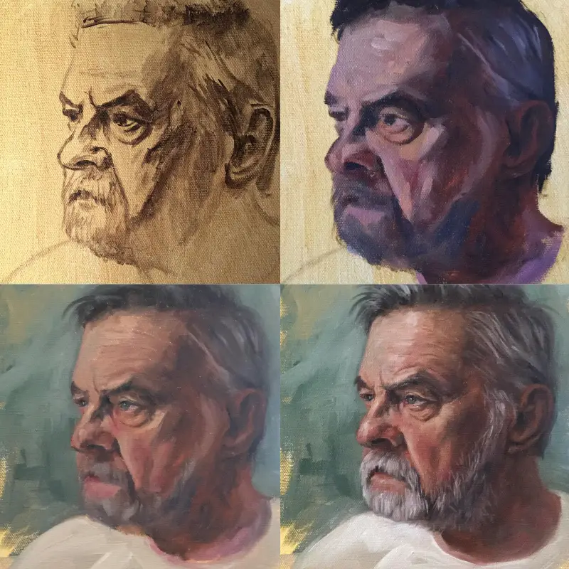
The photo above was taken at night in poor lighting, so it’s reading quite dark. I first toned the canvas with a yellow ochre wash in acrylic and then started my line drawing with a thinned down burnt umber, most likely in acrylic. You can also use burnt umber in oil thinned down with Gamsol at this stage. If you use acrylic before painting in oil, always make sure it’s a thinned down application so the oil paint has a chance to adhere correctly.
This drawing was sketched directly with paint, but feel free to use a grid or proportional divider and vine charcoal to help you get your key points and proportions correct. I used a grid when I painted Duke which sped up the process quite a bit.
Tip 3: Block In Underlying Skin Tones Loosely When Painting Wrinkles
I wish I had more pictures from the sketch to this rather terrifying looking picture below, but I’ll walk you through what I did. This picture is also coming off a little more purple in some places than it actually was. My lighting was terrible.
First, I painted in all of the darkest areas with a mixture of burnt umber and ultramarine blue. I did this for blocking in the hair, defining the features of the eyes, nose, mouth, and ear.

Next, I used burnt umber with a little cad red to place in my darker medium tones on the side of the nose, face, neck, and ear.
I then got some alizarin crimson into the mix and made sure to include that on the cheek, around the nose and a little bit in the corner of the eye. Adding lighter paint turned this into a purple color which I roughed in along the neck and mouth. I used a more muted version of this color on the cheek, nose, and forehead. These cooler colors are nice to play with when the warmer colors are added in. Warm colors and cool colors sort of “dance” with each other.
As you can see, I’m not being very careful as I block in these skin tones, resulting in a very ugly painting. It’s OK though because most of the darker value areas are the “valleys” on the face. Highlights will be added next to build the “hilltops”.
Grey Hair:
At this stage, I also took my burnt umber and ultramarine blue mix and added in a touch of white to create a bluish-grey color. You can also do this with ivory black and white. I quickly roughed in some of the darker medium tones in the hair and beard so I could start to build the form of the hair a little bit.
This whole ugly stage is about getting values added accurately. Squinting while painting helps you to see if you are blocking in the areas correctly. Colors can be adjusted and tweaked later.
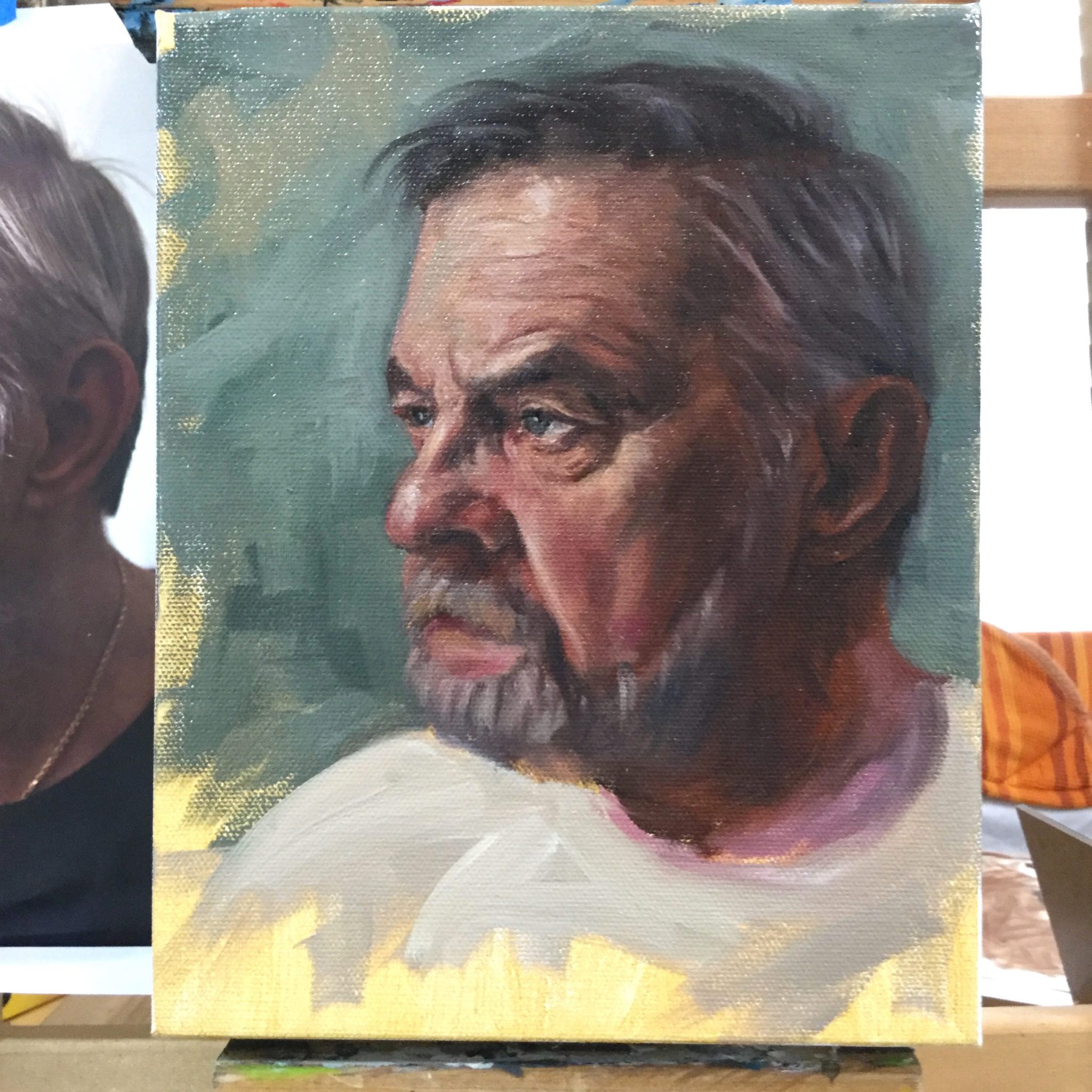
Tip 4: Highlight The “Hilltops” When Painting Wrinkles
In the ugly stage above, I defined some of the deepest wrinkles under the eyes and along the nose and mouth line. Since the last stage was much darker in value, I am able to build form by adding medium and lighter values on top of these colors.
Below you can see where I started to even out some of the skin tones and add in the forehead lines, brow line, and upper eyelid wrinkles. I did this with a small brush and darker paint. Those lines are like painting rivers and tributaries.
Next, I added highlights to the “hilltops”. Squinting helped me to see the light and dark areas much easier so I knew where to place the highlights.
When adding lighter colors, start off darker than you normally would and build to the lightest part gradually. You can’t get any brighter than white, so you want to make sure you have a broad enough value range to work with. Plus, once you add too much white into the paint, it’s very difficult to darken an area without it becoming milky.
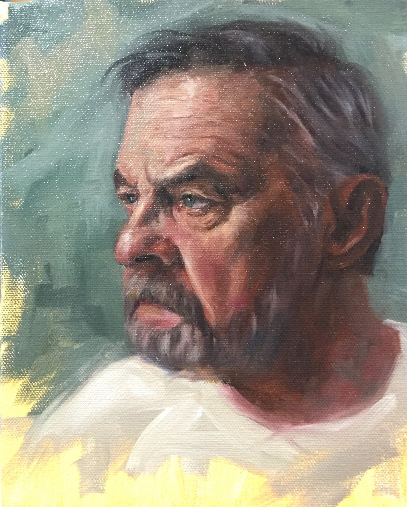
Tip 5: Reestablish The “Valleys, Riverbeds & Tributaries” When Painting Wrinkles
Once the skin tones are fairly well established, I like to go back and strengthen any of the wrinkled areas that may have lightened up too much. To do this, I go back in again with a small brush and a dark paint color and redraw in some of my “tributaries”.
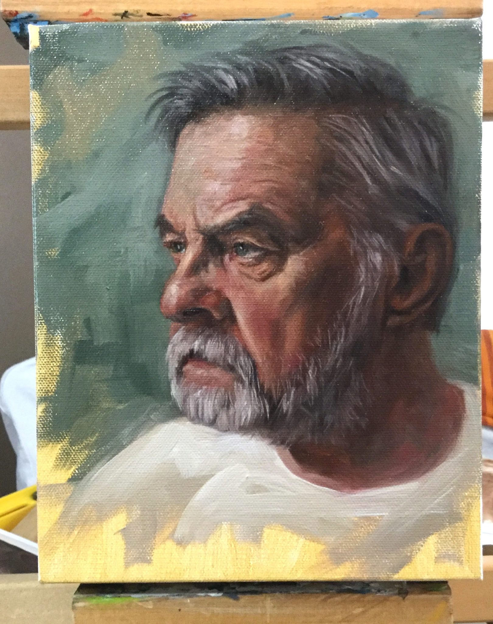
I keep squinting to make sure I’m matching values from the reference to my painting. If you notice on the cheek below, this area got darker in the “valleys” of the face. Matching values is the number one way to strengthen a realistic painting. It helps to establish structure. If the values are too light, the form may look less human and more gelatinous.
In the image above, you can see on the forehead and below the eye where I strengthened the lines. I made sure I wasn’t painting in solid dark lines though. This would not give the effect I want. I allowed the paint to blend in a bit with the paint under it so I would lose some of the edges on the wrinkles. If your paint has dried underneath, you can mix your paint with a small amount of linseed oil so it goes on a little more transparent.
I don’t try for a hyperrealistic look when painting. What I’m trying to do is create an illusion of reality with paint. My goal is for it to look like a painting up close, but appear more realistic from a distance.
Tip 6: Use Complementary Colors & Color Zones
I mentioned above that warm and cool colors “dance” with each other. That is because they are most likely complementary colors, appearing on opposite sides of the color wheel.
You can see this dance every sunrise and sunset with the warm colors coming from the sun hitting the clouds directly. The purple and blue cool colors are cast shadows from behind the clouds.
Warm colors typically receive light whereas cool colors are usually in the shadows. However, this doesn’t mean that you can’t use some of the cool colors in the warm areas and visa versa.
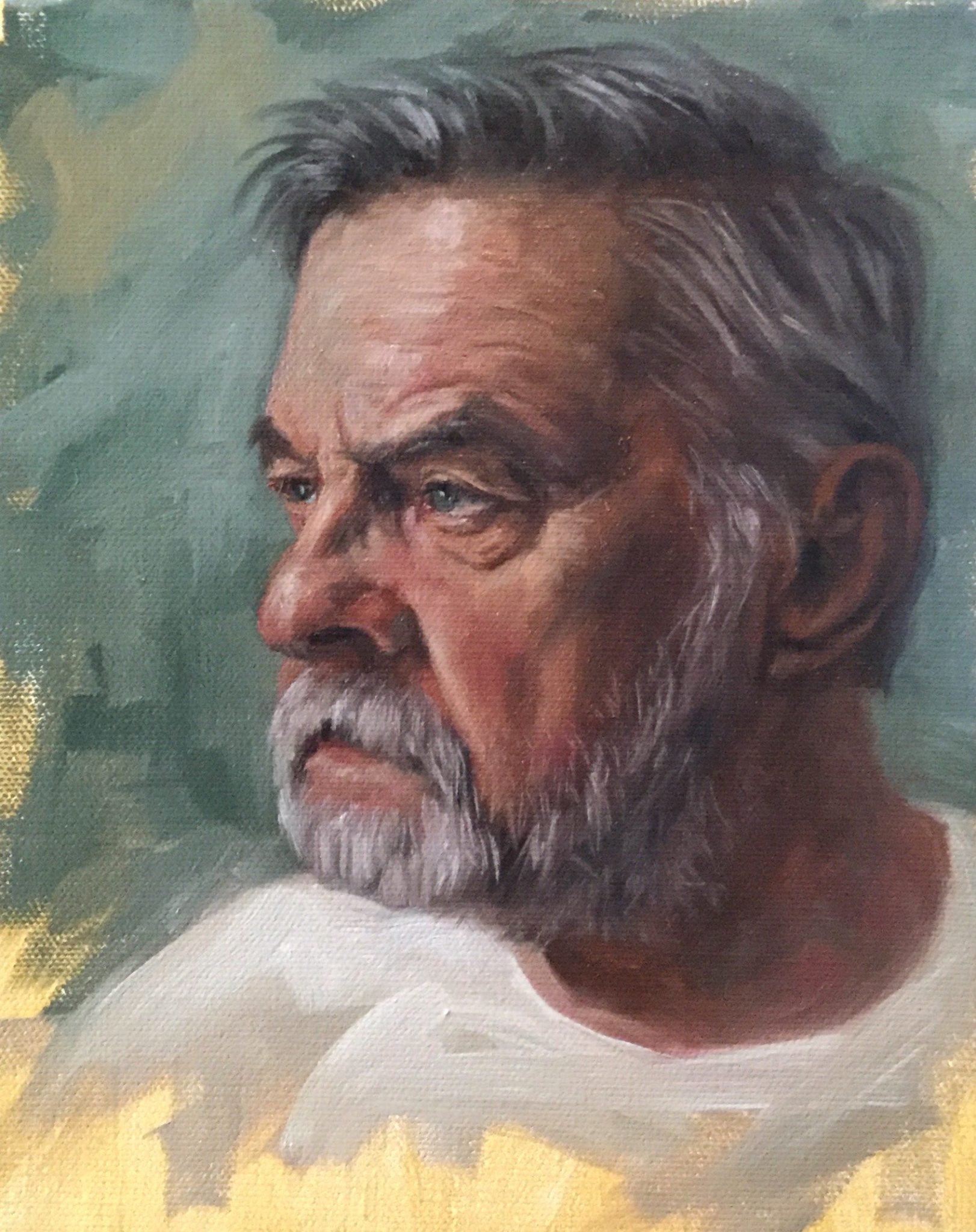
If you look at the forehead, on the left you can see where I’ve added in a hint of blue. This continues down to the brow. Blue and orange are on opposite sides of the color wheel, so using a hint of blue on the peachy skin adds interest for the viewer.
Color Zones:
When painting portraits, especially of Caucasians, keep in mind that the forehead will be a little more yellow. The middle of the face will be a little more red, and the chin will have blue and green tones. Foreheads are boney and receive more light which causes it to have a slightly yellow tone. The middle of the face is more vascular, creating red tones. And the bottom of the face falls into shadow, often creating cooler tones.
Since this subject has a beard, it’s not as easy to see all three zones, but the finished portrait in this tutorial shows how I added in these specific color zones at the end.
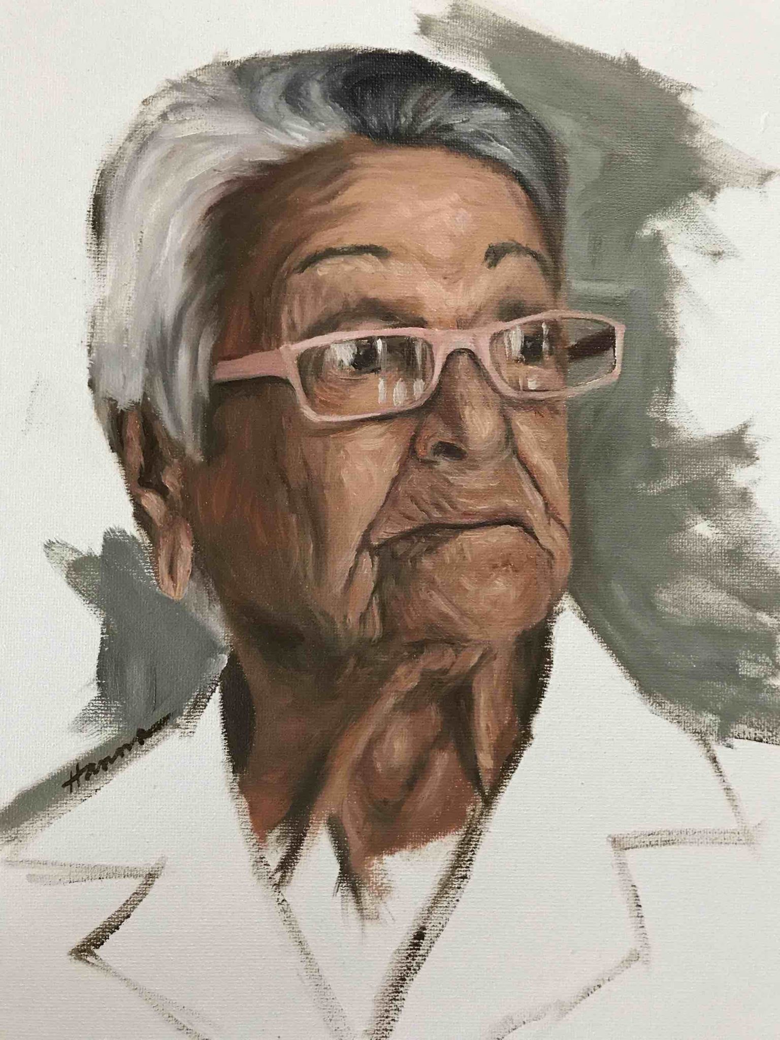
Tip 7: Don’t Over-blend When Painting Wrinkles
Unless you are planning to create a hyperrealistic portrait, I would recommend that you let your paint and brushstrokes do the blending for you. This creates a lively and painterly look and keeps you from painting too tight.
I have a tendency to paint much too tight and have to constantly remind myself to keep things loose. The human brain does a great job of mixing and blending colors for you, so you really don’t need to over-blend unless it’s something you really want to do.
I painted the portrait below in just a few hours. It’s just a study and doesn’t have the finish of a formal portrait, but her wrinkles still visually read as wrinkles. As you can see, I did very little blending at all. I could have enhanced the painting more with complementary colors and beefed up color zones. However, I’m still happy with how it turned out.
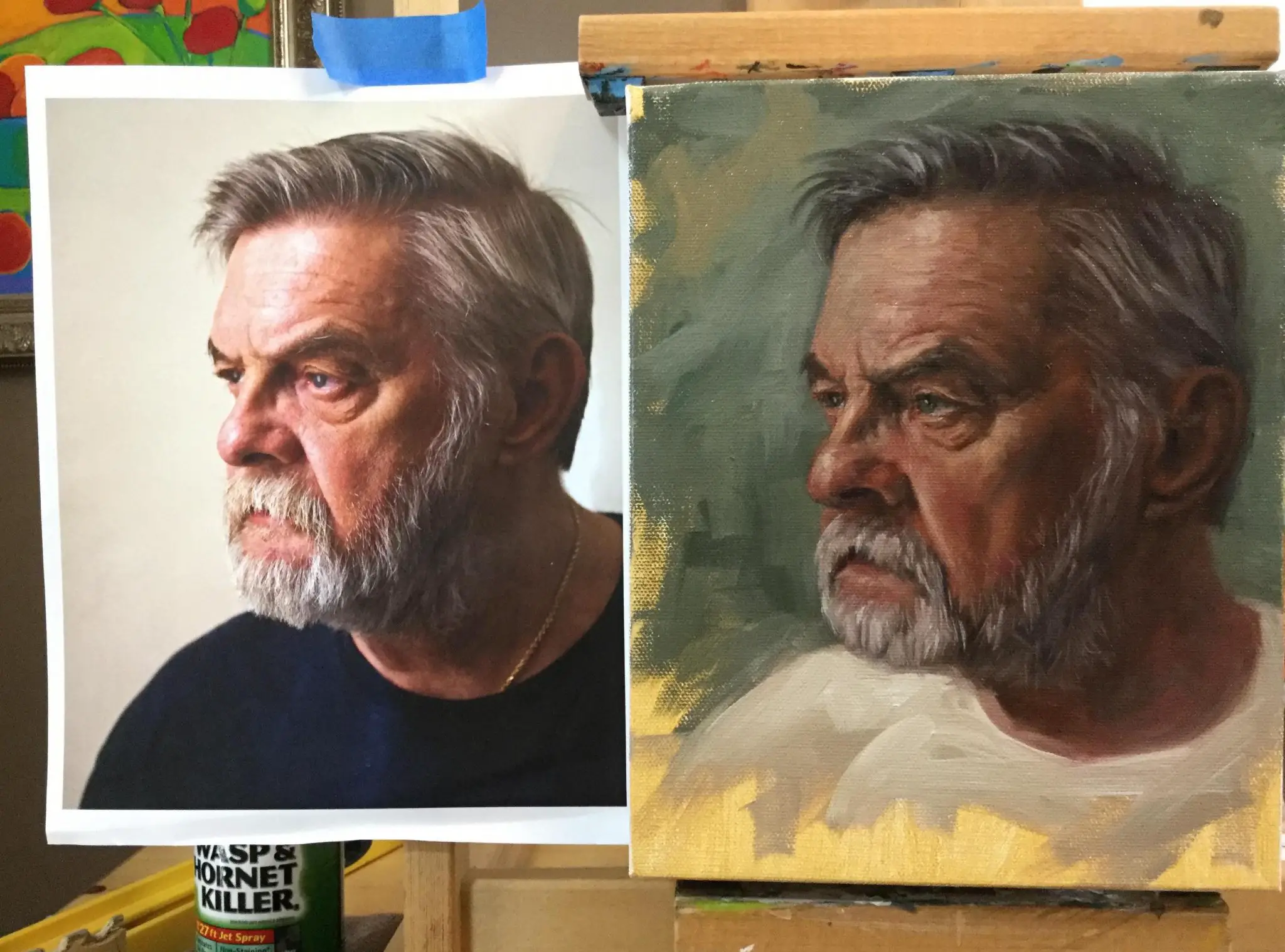
Tip 8: Use The Sight-Size Method
Below you can see my painting next to the reference photo. The reference was the same size as the portrait I painted, even though it appears slightly smaller due to it being behind the canvas a bit.
I wasn’t concerned about getting a likeness on this portrait. What I really wanted to do was practice painting wrinkles and grey hair. However, this portrait does look a lot like the reference and this was helped by using the sight-size method.
The sight-size method allows the artist to look back and forth between the reference and the painting quickly to look for differences. Dart your eyes back and forth between the photo on the left and the painting on the right. When you do this, you can see areas that I could change to match the reference more if I wanted to. It helps if you squint your eyes when you do this exercise.
Tip 9: Changing Background Color Will Change The Skintone
As you can see in the picture above, I changed some colors from the reference photo. I really liked the subject and wanted to practice certain skills, but I didn’t like the dark shirt and bright background. I thought his face blended in too much with the background on the left. Because of this, I decided to use a complementary color to provide visual interest.
Since I made the background darker, I thought the whole painting may be too dark if I kept the shirt the same color. So I changed it to a light grey.
I wouldn’t recommend swapping out colors like this without some sort of plan. What I ended up doing was use some of the blue colors from the background in his face and neck. The environment can be reflected in the skin somewhat, so this made sense. Plus, it helped to liven up the color a bit.
If you ever want to change a background color dramatically, create a plan ahead of time. Of course, if it doesn’t work, you can always paint over it.
Tip 10: Painting Grey Hair Is A Lot Like Painting Wrinkles
When painting wrinkles, it’s best to start dark and work your way up to the lighter colors. It’s the same with painting hair.
Most of the time, I like to keep hair very simple. In this portrait, I painted in the dark, underlying tones of the hair first quickly and loosely. I then blocked in some of the mid-tones, painting in the direction of the hair. Then it was just a matter of taking lighter shades of grey and suggesting strands of hair. This doesn’t need to be perfect by any means. But it should match the values from the reference photo.
The beard is the same way. I actually think I went a little too detailed with the beard. But the process was the same as the hair. Start dark, work in some mid-tones and then finish off with various shades of lighter grey, matching values as closely as possible.
Less is more when it comes to painting hair. Some of my better portraits have been when I just used a couple of simple brush strokes with the right value of paint in the right place. I always like the focus to be on the eyes in a portrait, so If I’m going to add detail, I would do that around the eyes. This is why I think I went overboard on the beard. The detail in the beard is competing with attention around the eyes in my opinion.
Tip 11: Keep It Simple When Painting Wrinkles Around Eyes
I love painting eyes in portraits and usually start on them right away, but held off with this painting.
Keep in mind that older eyes will have some color changes. The whites of the eyes are generally darker as older eyes tend to be more deeply set in the eye socket.
In this portrait, the light source was coming from above, so I drew in the outline of the eye with a small brush and also drew in the wrinkles. This helped me to get context for the eye. In step 3, you can see that I very roughly painted in the pupil and had a very dark purple grey for the white of the eye. I knew I would be able to build on both of these colors.

Tip 12: Make Sure To Sign Your Painting
If you’ve decided to take on the challenge to paint wrinkles and grey hair, make sure you document your achievement by signing your work. As you can see below, I still hadn’t signed my painting yet. However, after researching and writing this article about why it’s so important to sign your paintings, it got a signature.
I have drawings and paintings I did many years ago with older, wrinkled subjects which I signed. Since they were done so long ago, I barely remember doing them. The signature proves that I did the work, even if I can’t remember it very well. Give your art a chance to be recognized well into the future. Sign it. Even if you aren’t sure it’s finished.
Scroll down for a supply list is at the bottom of this article.
I Hope You Enjoyed These 12 Tips On Painting Wrinkles & Grey Hair
Thank you for stopping by and learning about how to paint wrinkles and grey hair. If you are interested in more artist tips and tutorials, here are a few you can check out:
How To Paint A Digital Portrait – Step-By-Step With Pictures
Impressionist Flower Painting PLUS How To Paint Silver & Fabric
Painting Supplies Overview
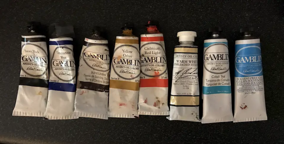
In the photo below, you can see the majority of the paints I used.
The introductory set of paints from Gamblin is great as it is more cost-effective to buy rather than as individual tubes.
Supplies:
All the paints below are oils from Gamblin unless otherwise indicated.
If you don’t have all of the supplies, use what you have. You’d be surprised at what you can create with what you have available.
Grey Matters paper palette a toned palette is much easier to work with blending colors than a white palette
Yellow ochre acrylic paint for toning the canvas – optional
Warm white from M. Graham optional
Titanium white by Windsor Newton
Gamsol mineral spirits were used to thin the paint
Gamblin’s solvent-free gel adds body to the paint
This tabletop easel on Amazon is very similar to the one I use and can accommodate larger canvas sizes
Mahl stick for steadying my hand while painting
8×10 stretched canvas or canvas panel
This is a great set of tool to help you with values and proportion: