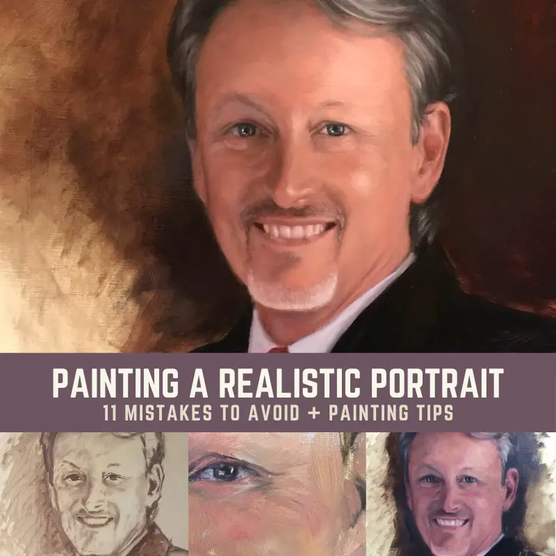
Realistic portrait painting has always been my favorite thing to do. However, getting a likeness can be a huge challenge due to simple mistakes. I’ll share with you a couple of the mistakes I made painting this portrait. I will also go over other common mistakes and helpful tips. This will help you to avoid some of the pain of painting portraits.
I’ve drawn and painted portraits of people and pets for as long as I can remember. Fortunately, I’ve been able to capture a likeness with most of my subjects.
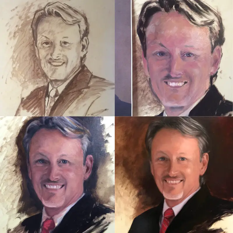
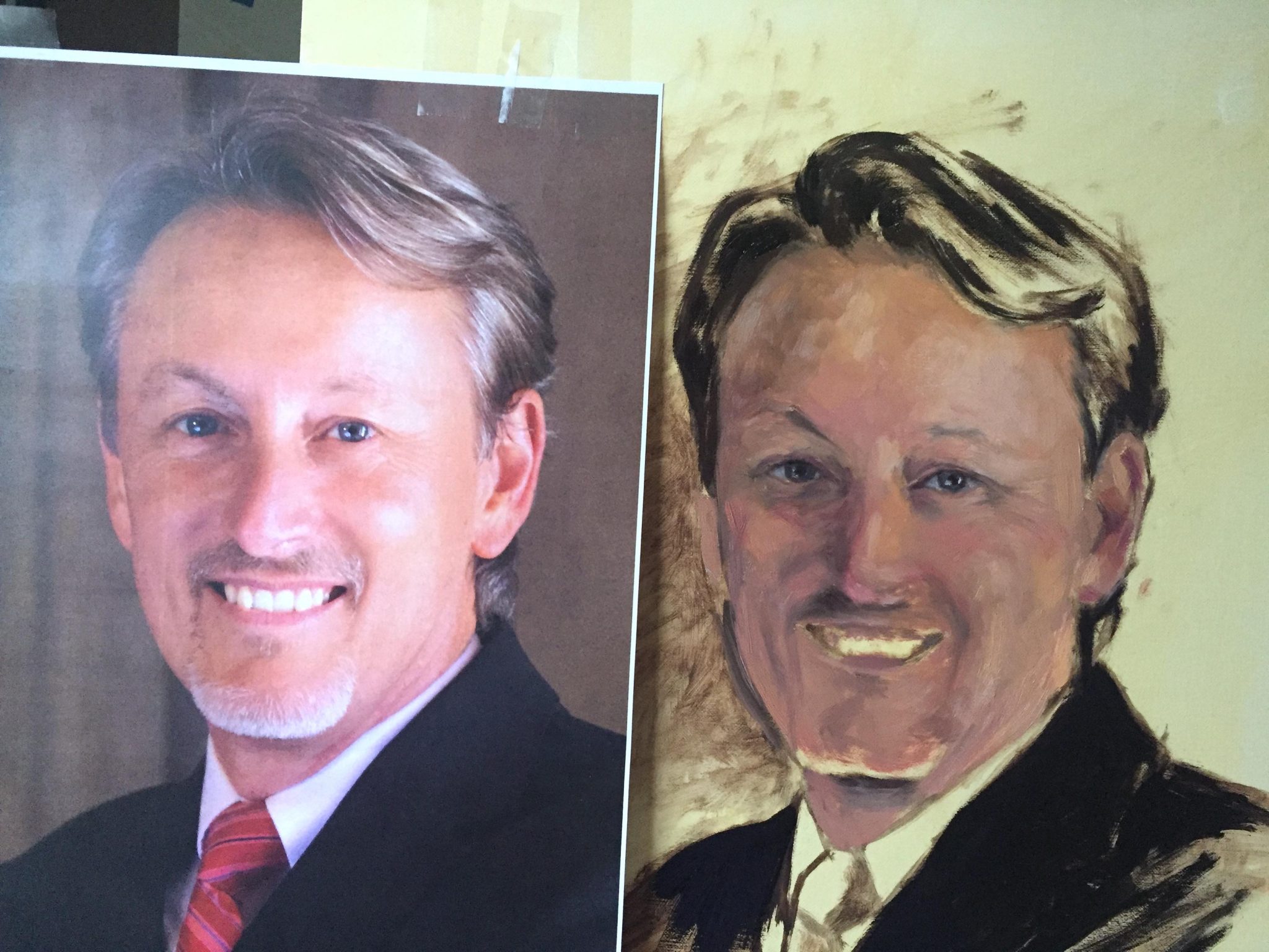
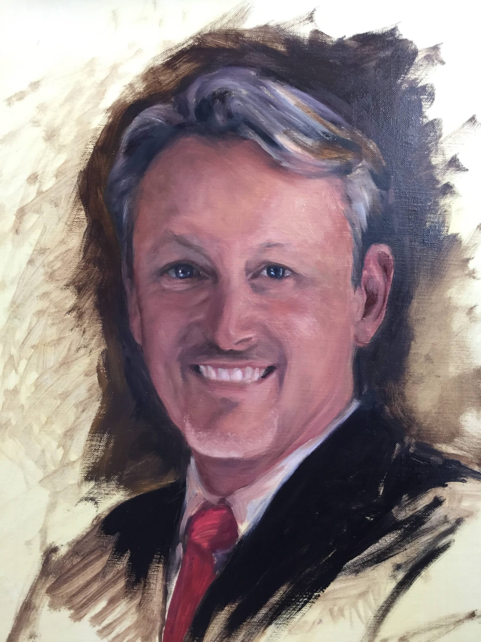
The only time I have trouble with a likeness is when I make some basic mistakes. With this realistic portrait of Dr. Claude Pressnell, I started out the painting with an inaccurate drawing. That was my first mistake. I also had
inadequate lighting at the time, which made painting very difficult.
Here is a quick review of the 11 mistakes to avoid when painting a realistic portrait:
- Drawing Inaccurately
- Value Study Not Thought Through
- Painting Surface Isn’t Properly Primed
- Poor Lighting
- Making The Whites Of Eyes Too White
- Painting Lines On Teeth
- Using Too Much Color
- Not Matching Values
- Over Blending
- Adding Too Much Detail Everywhere
Mistake #1 When Painting A Realistic Portrait – Inaccurate Drawing
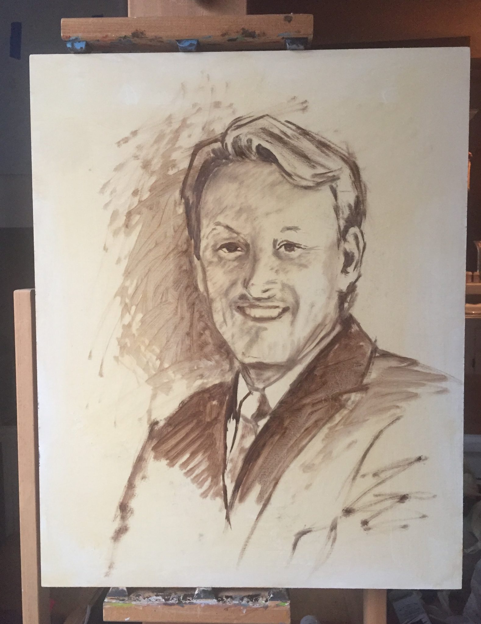
When I look back at how I started this portrait, it is so obvious to me that I didn’t draw the portrait accurately enough. I was so excited to get this painting started that I rushed through the drawing.
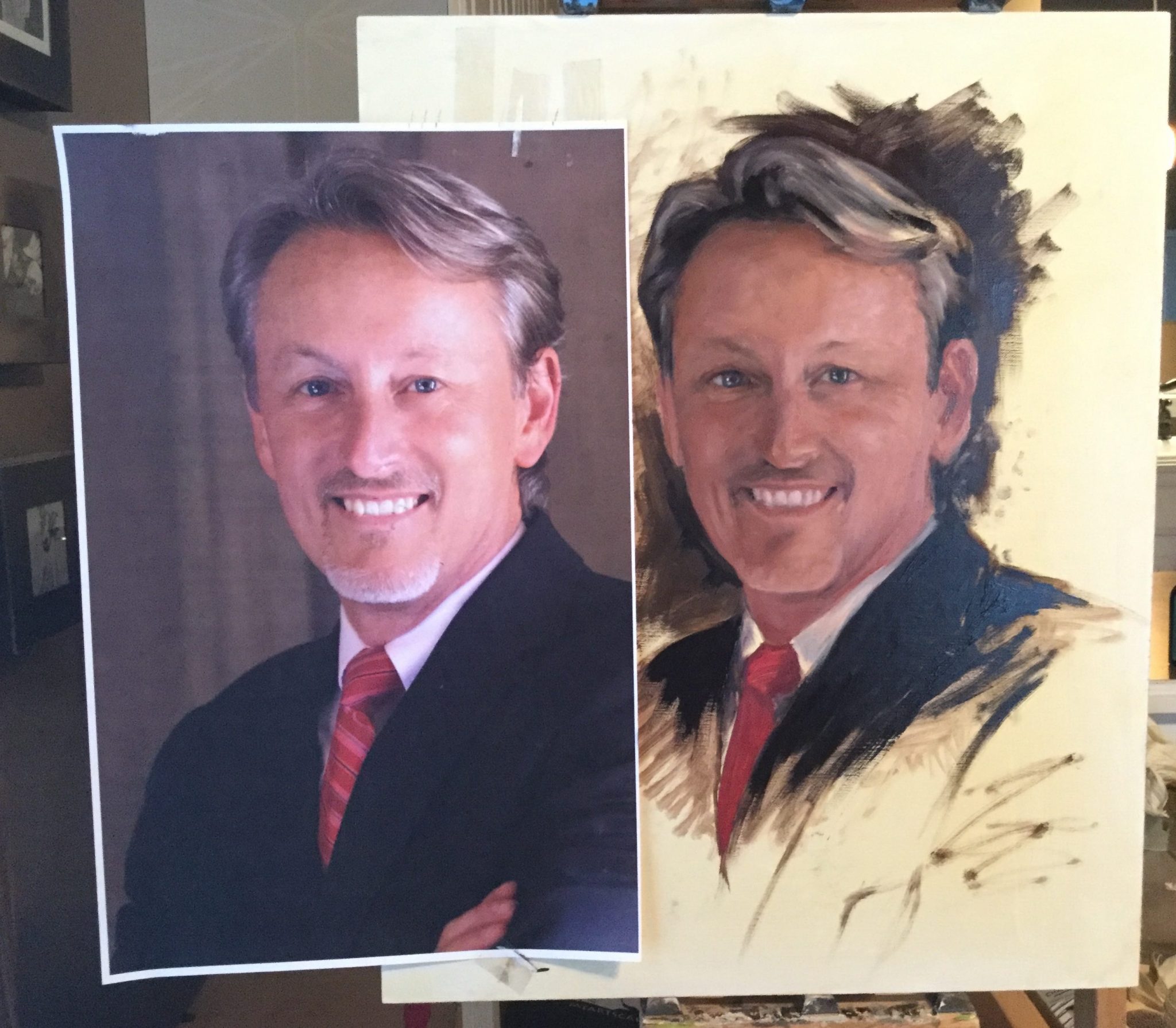
If you are painting a realistic portrait from a live model, sometimes you need to quickly get the sketch in and correct along the way as you paint. I’ve done this many times. However, I was painting from a photograph, so there was no need to rush.
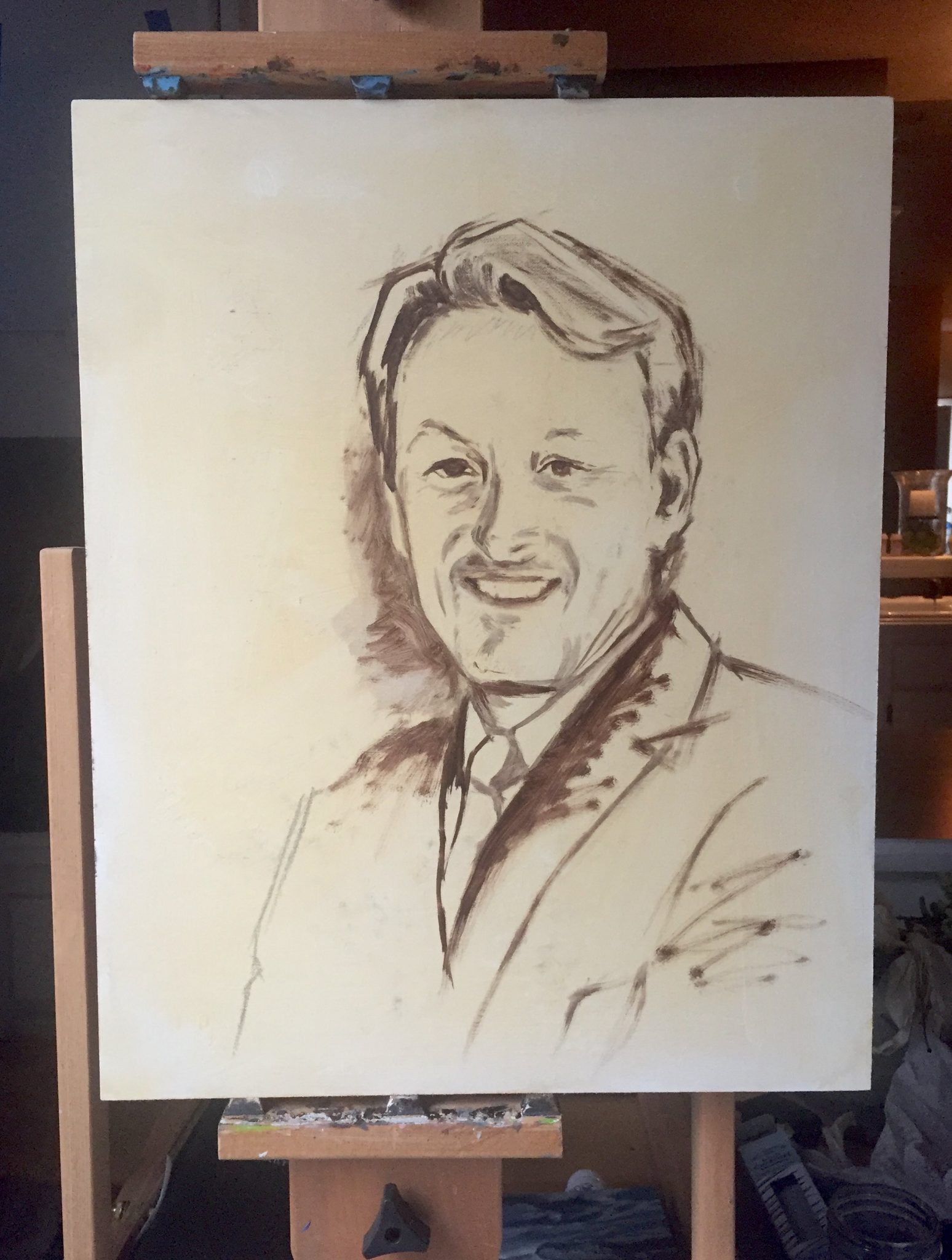
At the time I remembered thinking that the drawing was “close enough”. That was a huge mistake that haunted me through the entire painting. I am an impatient painter and want to get to the actual painting part as soon as possible. This time, my impatience cost me many hours because I had to correct my drawing mistakes.
Tips For Getting The Drawing Accurate On A Realistic Portrait
If you have a reference photo that you are working from, print out the photo at the exact same size that it will be on your painting. This way you can use a method called sight sizing. I talk more about it in this article when I painted a digital portrait. You can also see an example of this when I painted a portrait of Maiden in oil. I used a grid in conjunction with sight sizing.
Site sizing has many benefits. It allows you to measure accurately and you can put your print right next to your canvas so you can quickly dart your eyes back and forth from the image to the canvas, which makes it much easier to see differences. In some of the images below, you can see where I had the photo taped onto the canvas.
If you are working from an image that is smaller than your canvas, then I would suggest using a grid. Draw a grid on your print and then draw a grid proportionally on your canvas. This will give you key points to help you draw in your subject. Having a smaller grid with many boxes is not helpful as it can be too complex. If I use a grid, I keep it simple. You can see how I used a grid when I painted the portrait of Duke. A proportional divider is also a great tool to help you measure accurately.
Mistake # 2 – Not Taking Time For A Proper Value Study
Below, you can see that I started a value study, but I was impatient and went through this step very quickly. Again, this is fine for doing paintings of live models. Perhaps I was thinking I had to paint like I was in a live painting class while doing this. I spent many years in advertising where everything had to be done at breakneck speed. I keep forgetting that I don’t need to do that with painting.
Painting isn’t a race unless you have a deadline or are working against a timer in a live session. Even then, getting the drawing and value study as accurate as possible first will save you so much time fixing mistakes later on. The early stages of a painting are worth investing a little more time in.
For some reason, this is a lesson that is very hard for me to learn.
Mistake #3 – Painting On A Surface That Isn’t Properly Primed
Fortunately, this is a mistake I didn’t make. I used an oil-primed linen panel that was an absolute dream to work on. It was 16×20 inches in size. If you paint on a cotton canvas that is primed with acrylic gesso, chances are you may need to add another coat or two of gesso. If you don’t, the canvas might soak up the oil in the paint rather quickly.
This happened to me while I was painting this portrait of a pug. I thought it was because the room was too hot, but it really was because my canvas was thirsty. Gesso is formulated to allow oil paint to adhere to it even though it is acrylic-based paint. You can paint with acrylics first before you paint with oil, but only in very thin layers.
If you are fortunate enough to work on an oil-primed canvas, you won’t be able to paint with acrylics on top of it. It’s possible to paint oil over acrylic, but not the other way around. I didn’t use any acrylic paint in this portrait.
Mistake #4 When Painting A Realistic Portrait – Poor Lighting
When I started painting again, I was painting in my kitchen which had the best lighting in my house during the day. However, I was painting this portrait in the fall and only had the weekends to paint when it was light out. If the weekends were rainy or cloudy, I didn’t have enough light.
You simply can’t match color accurately without proper lighting. Poor lighting really slowed my progress down dramatically and every time I walked into my kitchen knowing I couldn’t work on the portrait was torture. I could see all the areas I needed to work on, but I knew it would be useless to try and put paint down because it would most likely be wrong and I’d have to fix it later.
I’ve since invested in some studio lights like these box lights on Amazon. I also purchased a ring light that is adjustable and puts out a nice amount of light. I’ll probably be adding more lighting in my studio so I always have enough light to work whether it’s day or night. Check around on YouTube for lighting setups. Some people have been able to make fantastic studio lights using inexpensive lighting from hardware stores.
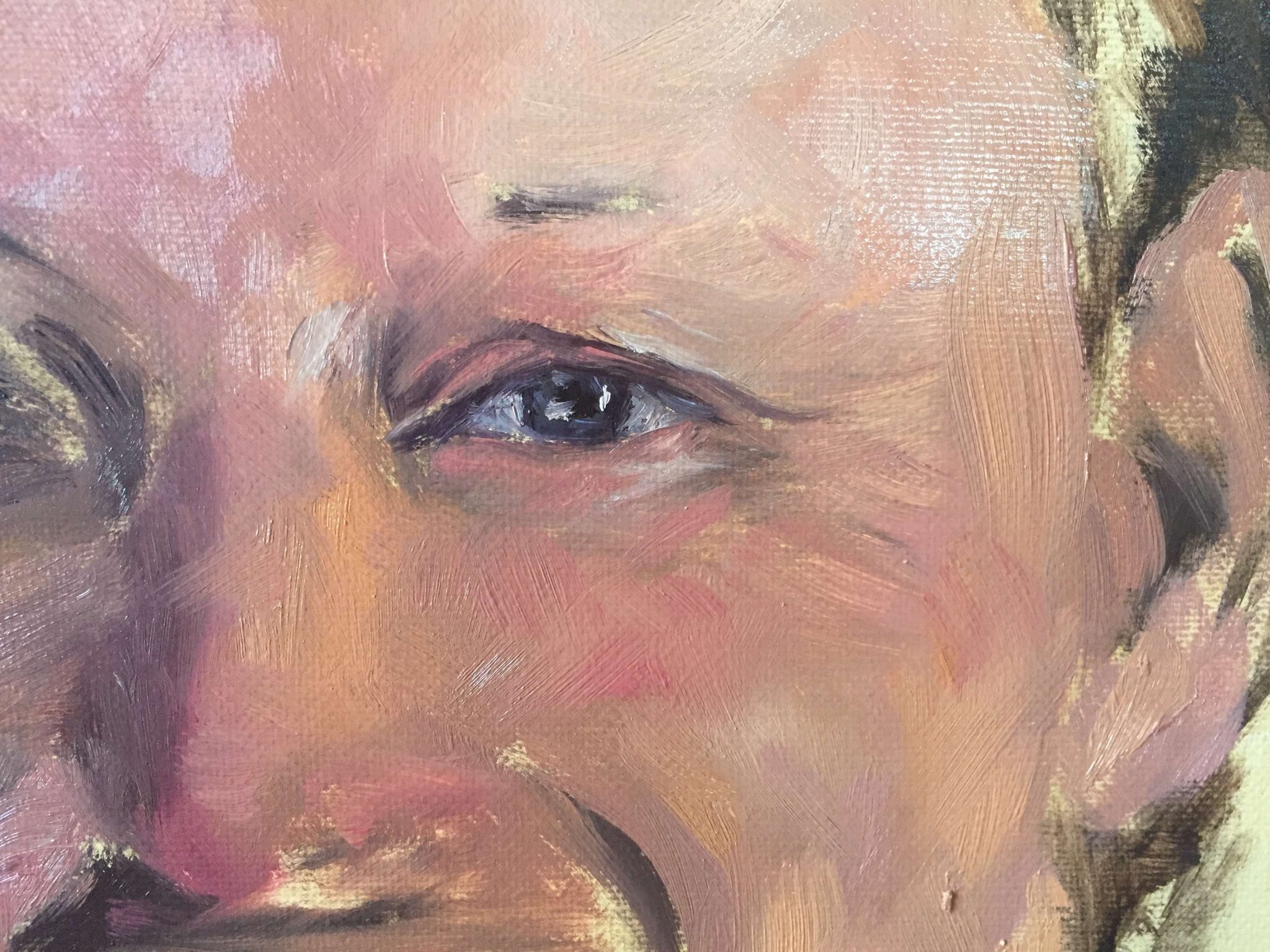
Mistake #5 – Painting The Whites Of The Eyes Too White
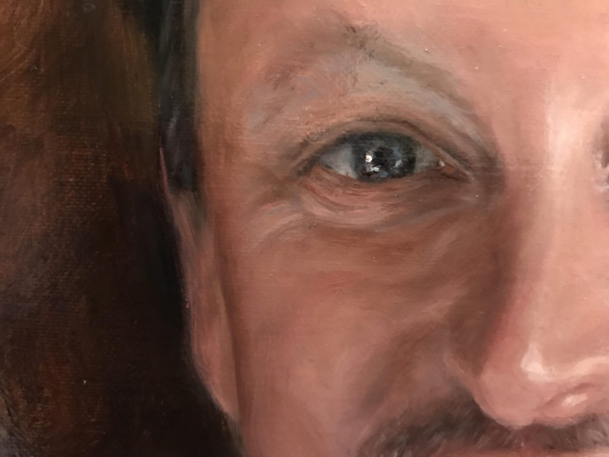
The whites of a person’s eyes are rarely white. The only time you see this is in overly retouched photos on magazine covers. Real people have a mix of colors, shadows, and reflections in the white area of the eye. I always start out with the eye in a darker grey color and then add the form to the eye with lighter colors. The only time I use anything close to white is for a reflected highlight in the eye. And even then, it usually isn’t pure white.
Tips For Painting Eyes
In the photo above, you can see that I have roughly painted in the white of the eye using mostly medium blue-grey tones. Early on in the painting, I don’t worry too much about details and blending. I’m more concerned about getting the right values. Squinting helps me see the values accurately. I also move my eyes back and forth from the reference to the painting while I’m squinting. This helps me to see the differences.
With eyes, there is usually a shadow under the lid, so I make sure that the top part of the eye is darker than the bottom part. I also paint the pupil dark and use the same dark color around the outer edge of the iris. You only need a couple of brushstrokes using a lighter hue to create the color of the iris. In this portrait, it was a blue-grey and I allowed that color to blend with the darker colors. A couple of highlights after the basic components of the eye are painted in can give you a pretty realistic portrait effect.
Mistake #6 When Painting A Realistic Portrait – Painting Lines On Teeth
You don’t see too many portraits painted with big smiles. This is because when portraits were painted in the past, people sat for them and it would be impossible to hold a genuine smile that long.
The “no smile” portrait became the style for a formal portrait. Of course, now that we have photography to work from, smiles are possible to paint but can be very difficult. Most portrait artists I know avoid painting teeth because they can start to look weird really fast. This is because beginner painters are painting what they THINK they’re seeing rather than what they are actually seeing.
Tips For Painting Teeth
When I paint teeth, instead of thinking of each individual tooth, I think of the shape of the upper gums and the shape created by the teeth along the bottom lip. You can take some tracing paper and practice drawing the shape along the gumline and bottom lip. This helps you to see the overall shapes rather than the individual teeth.
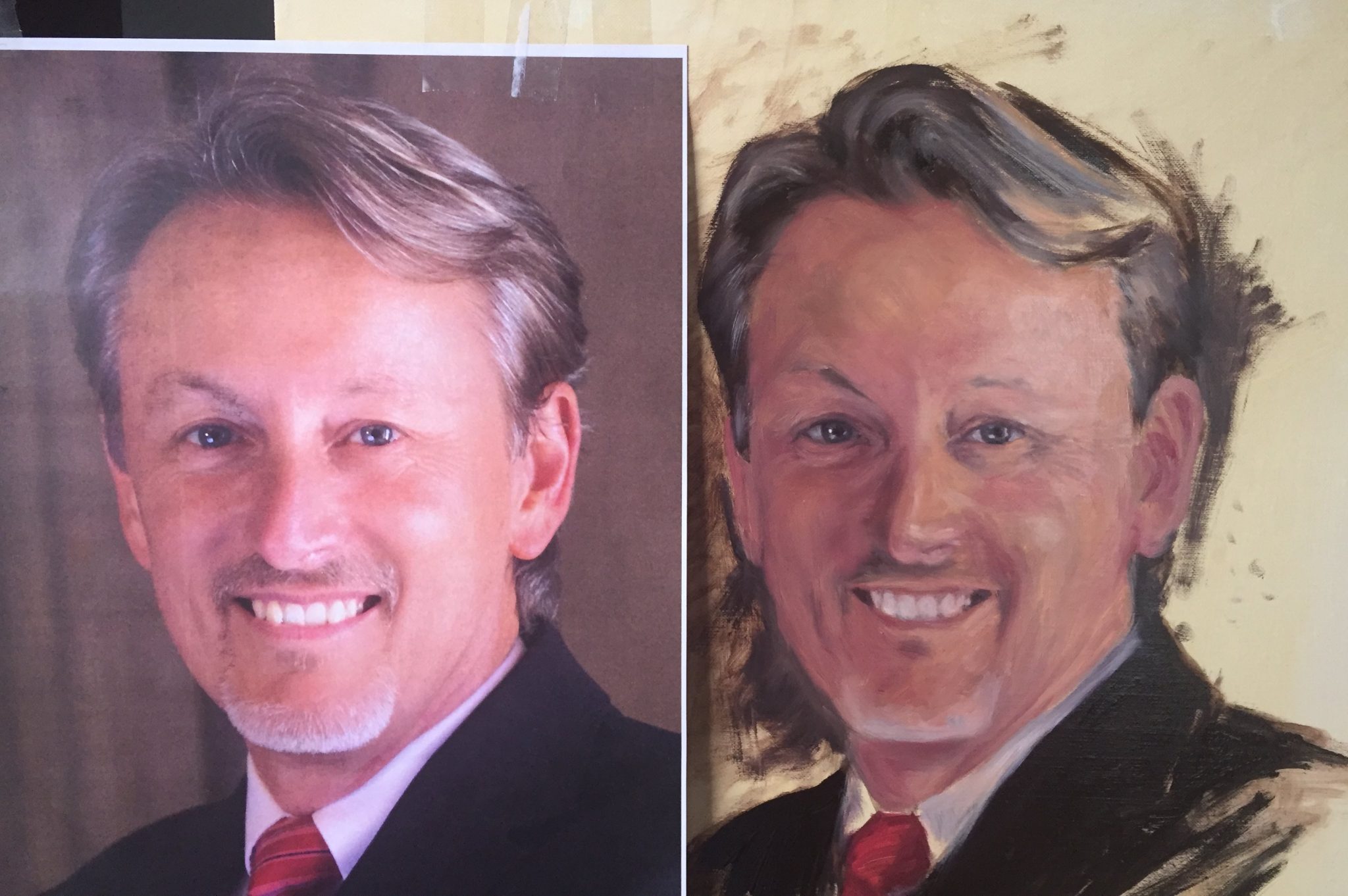
Most of the time when I paint or draw teeth, I won’t create a line from top to bottom. In this portrait, I did indicate the individual teeth with a very light grey color. In the image above, I had painted out the teeth and moved them because my drawing was off. They are too light, but the overall shape between the reference photo and painting when you squint your eyes is close. The shadows between the teeth look very dark and will be corrected.
There was a lot of modeling done on the teeth as I painted. Each tooth has its own plane and creates slightly different shadows. Below you can see that I’m adding the form to the teeth by shading on the sides and bottom. I still have a ways to go to make the teeth look realistic.

Lost Edges
Below, I’ve skipped ahead so you can see the mouth near completion. Notice how there are some lost edges on the right-hand side of the teeth. I highly recommend working with lost edges if you are painting teeth. Otherwise, you could end up with a portrait of someone who looks more like a monster. We don’t want that.
Teeth, just like eyes, are rarely pure white. They are very reflective. Many times I work flesh tones into the teeth and only concentrate on shadows along the top and the bottom. Keep squinting when you paint teeth, this will help you to see if they are looking realistic or not.
Mistake #7 When Painting A Realistic Portrait – Too Much Color
If you are wanting to create a realistic portrait, then you will have to get past the urge to use all the paint colors you own. Just because you have twelve tubes of paint doesn’t mean you have to use all of them.
Many successful portrait painters use a limited palette, but the most famous one that I’m aware of is Anders Zorn. His palette consisted of only four colors. Oil paints are expensive, so using only four colors is a cost-effective way to create a realistic portrait.
Zorn didn’t always use only four colors, but there are many examples of his work that do including the two paintings below.

Anders Zorn self-portrait using the Zorn palette
The Zorn palette consists of:
- Ivory Black: Used to decrease value and also used as a substitute for blue. You can always think of ivory black as a very dark blue. Adding white brings out the blue tones.
- White: Used to increase value. I generally use titanium white or a warm white. (However, you can create warm white with titanium white and yellow ochre.)
- Yellow Ochre: This substitutes for yellow on the palette. Most skin tones will not need a high chroma yellow. You can find yellow ochre here.
- Cadmium Red Light: Cad red is the highest chroma pigment in the palette and works extremely well in creating all shades of flesh tones.
When I picked up oil painting again, I ordered the Gamblin Artist Oil Colors Introductory Set on Amazon. It can be a more cost-effective way to go and even comes with a painting panel. If you are more budget-conscious, I’ve heard good things about the student grade set that you can also find here on Amazon. It also comes with a wooden painting panel. With both sets, you get eight tubes of oil color – which include the colors in the Zorn palette – plus a tube of solvent-free gel.
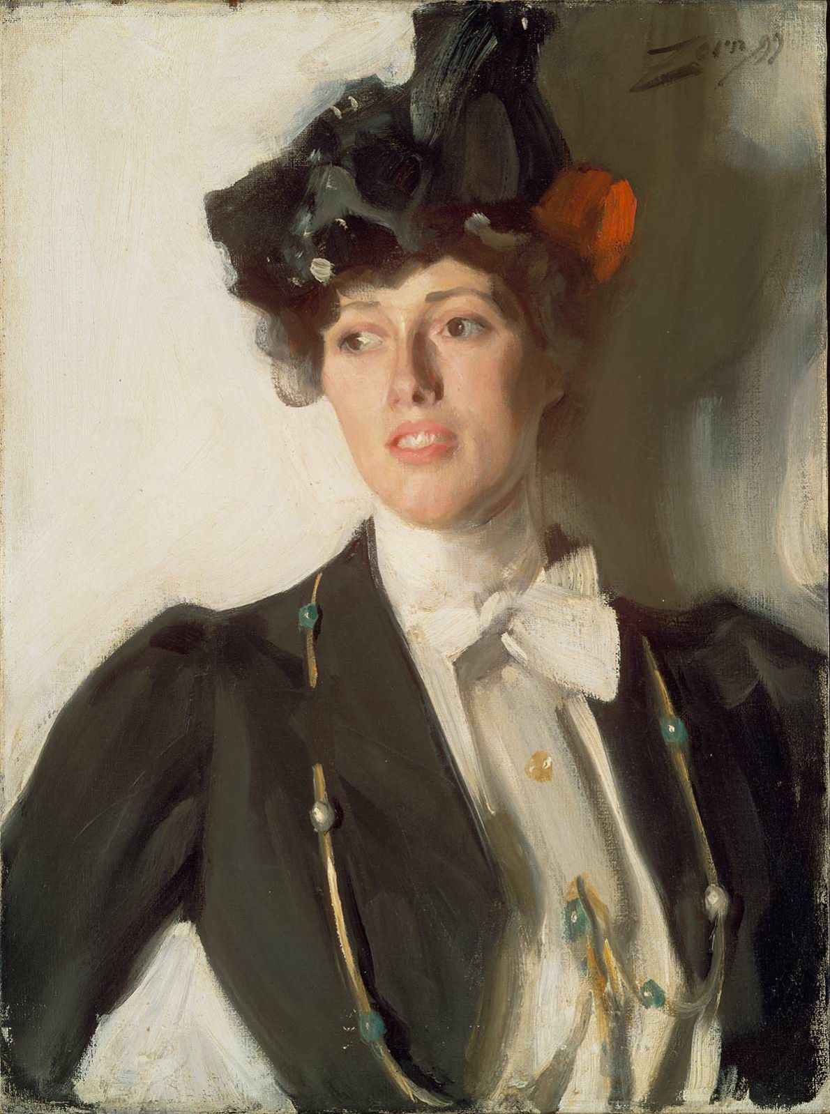
Portrait of Martha Dana by Anders Zorn
As you can see, Zorn has been able to create beautiful portraits with very simple colors. This is an excellent palette to start out with especially if you are a beginner. Color adds complexity to the process while painting. More colors mean more decisions. Using a limited color palette cuts down on the decision making and allows you to focus on value, shape, and composition.
In the image below, I’ve stuck mostly to the Zorn palette, but I did add quinacridone rose to get some of the pink flesh tones. When you start with the basic four colors, it’s much easier to add in one or two extra colors as you work to extend the palette.
Mistake #8 – Inaccurate Values
Value is basically how light or dark paint is on a scale from black to white. If you took an image on your phone and changed it to black and white, you would end up with the tonal values of your subject.
Not getting values accurate is the biggest mistake most artists make. Many artists start their paintings too light and then can never get enough of a value range to work with.
Tips For Painting Values
- Squint your eyes frequently to see the values more accurately. By squinting, this reduces the visual information so you see the larger shapes and tones.
- Print out a greyscale version of your image if you are working from a photo. If you are working from a live model, you can always take a picture of your subject and change it to black and white so you can get a good sense of what the values are.
- Use a Greyscale And Value Finder. This can help tremendously when you are starting out painting. It’s an inexpensive tool that provides a lot of value – literally.
You can find out more information about the importance of value in this article I wrote. Value is a big subject and something artists are continually learning about each time they paint.
Mistake #9 When Painting A Realistic Portrait – Over Blending
As you can see in the Anders Zorn painting examples above, you don’t need a lot of detail to create a realistic portrait. The human brain is very efficient at filling in the blanks for us. Because of this, we don’t need to put every little detail down on the canvas, unless we want to.
John Singer Sargent was well known for his society portrait paintings and is regarded as a “painter’s painter”. Nearly every portrait artist I know would love to have the Sargent sensibility when it comes to creating a realistic portrait. He challenged himself to get as much information in each brushstroke as possible. He knew if he matched values correctly, the viewer’s brain would take over and complete the painting.
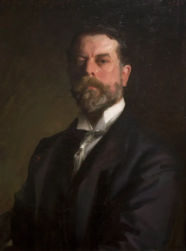
John Singer Sargent self-portrait
I like to paint with the end result looking “realistic” from a distance, but then look like a painting up close. It’s one of the hardest things to do for me because I love adding detail. Knowing when and where to add detail to direct attention becomes an art in itself.
In his self-portrait above, you can see the economy of stroke that Sargent uses to create this portrait. Up close it looks more like a mess of paint, but from a distance it is brilliant. Sargent was known to continually stand far back from his painting, mix his colors accurately, and then walk up to his painting and lay down a stroke in a bold and confident manner.
Mistake #10 – Adding Too Much Detail Everywhere On A Realistic Portrait
This is similar to mistake number nine, but I wanted to make a distinction. You can over blend areas and not have a lot of detail.
Sometimes artists can get too caught up in realism and not see the forest for the trees. When you focus too much on details too soon, you can end up with a great looking nose that you spent a lot of time on, but it is out of place.
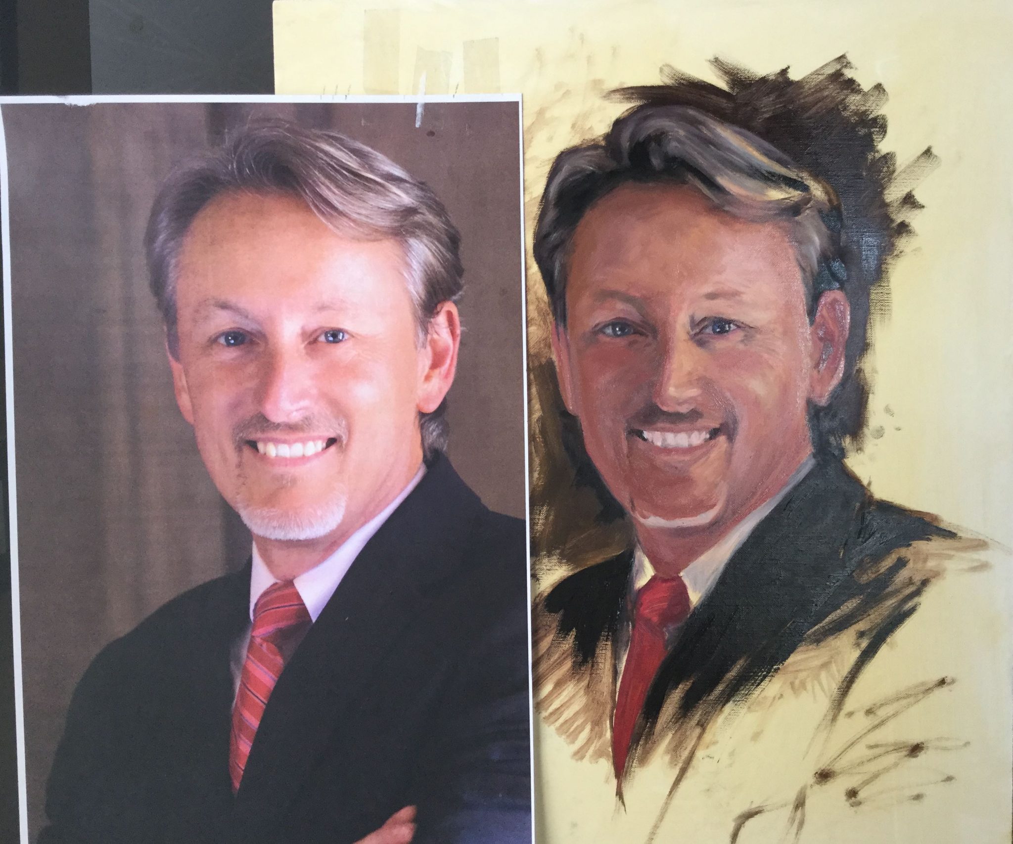
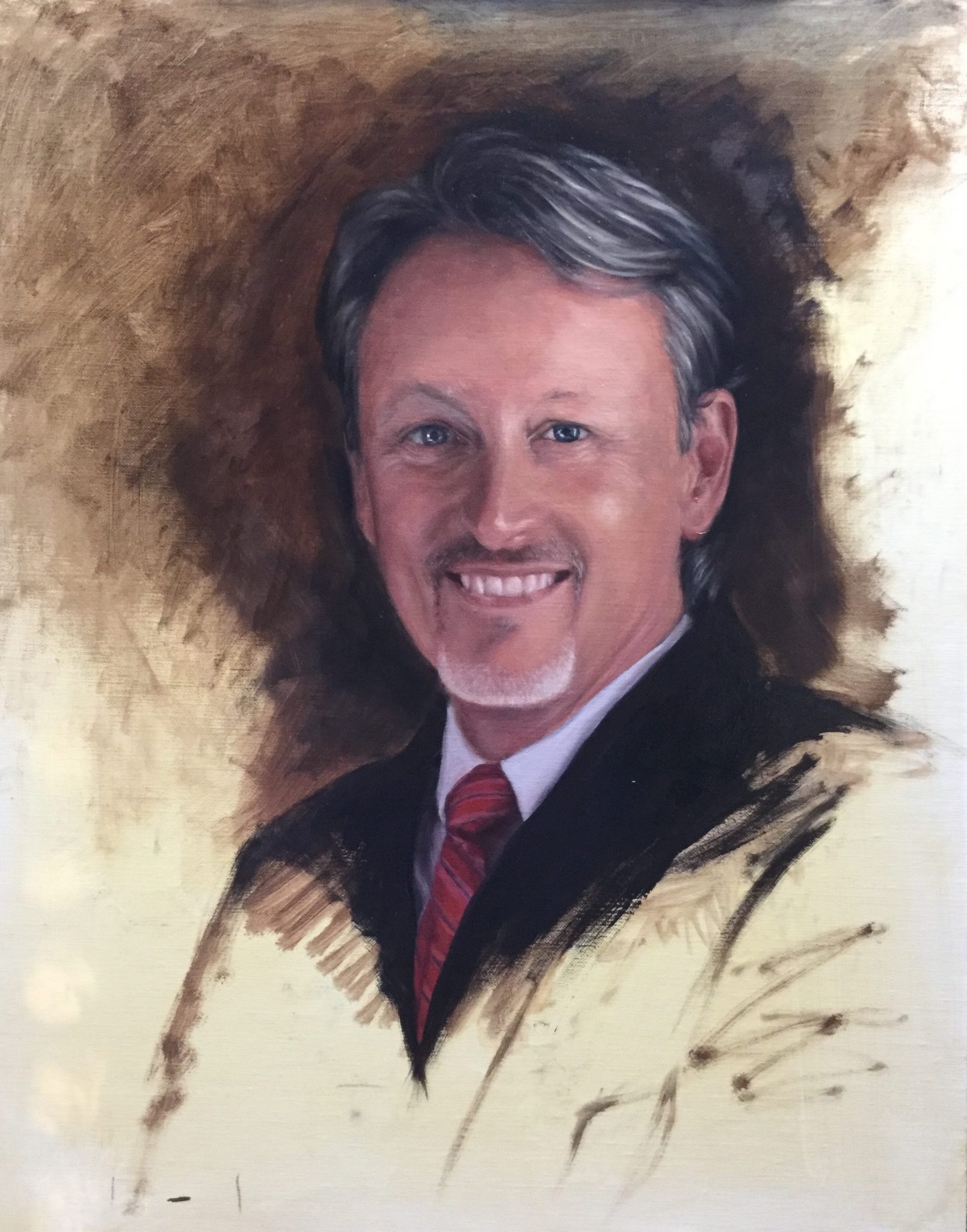
Nothing can be too precious on your painting that can’t be moved. In this portrait of Dr. Pressnell, I had made the mistake of not getting my drawing done accurately, which meant I was moving facial features around A LOT. If you compare the picture above with the picture below, you can see there are differences, but they are very subtle.
If I had painted in his features too detailed, I would have not wanted to move them later on because I spent so much time on them. Keep your paintings as loose as possible and only add detail at the very end when you know you have the likeness down.

Mistake #11– Adding Background Too Late
You can see during the progression of this painting that I started to add in the background around the head fairly early on. I had a feeling I wanted this portrait to have an “unfinished” look, so I only added a small amount of background.
If you don’t add in the background color, the values of the skin tones can be way off. You don’t have to have your final color placed, but you should have the value established so you can figure out your tonal range.
In my pet portrait of Duke, I made sure to establish a darker value background. However, I ended up changing the color at the end. You can see the progression of Duke’s painting here.
3 More Tips On Painting A Realistic Portrait
Now that I’ve covered some common mistakes, I’ll review some of the decisions I made in this portrait and go over a few tips. I’ve included some close-up images for your reference so you can see more detail.
1. Finishing The Painting
I struggled with how detailed I wanted this realistic portrait to get. This was painted from a photograph, so the photographer had made a lot of decisions on the lighting and overall color. Because of this, I wanted to create a contemporary and painterly effect while keeping a formal feel.
In the image below (which, unfortunately, is a little flat), I was playing with how much I wanted to complete the background. I made sure to use a lot of energy in my brushstrokes to contrast the formality of the pose. This adds a lot of visual interest and emotion to the work. Dr. Pressnell is a very engaging person, so I tried to capture his energy the “unfinished” background.
I did some small sketches on my iPad with varying degrees of finished background and decided this level of completion had the feel I was going for. When the background was completely painted in on my sketch, the energy and emotion of the painting decreased and it felt “off”.
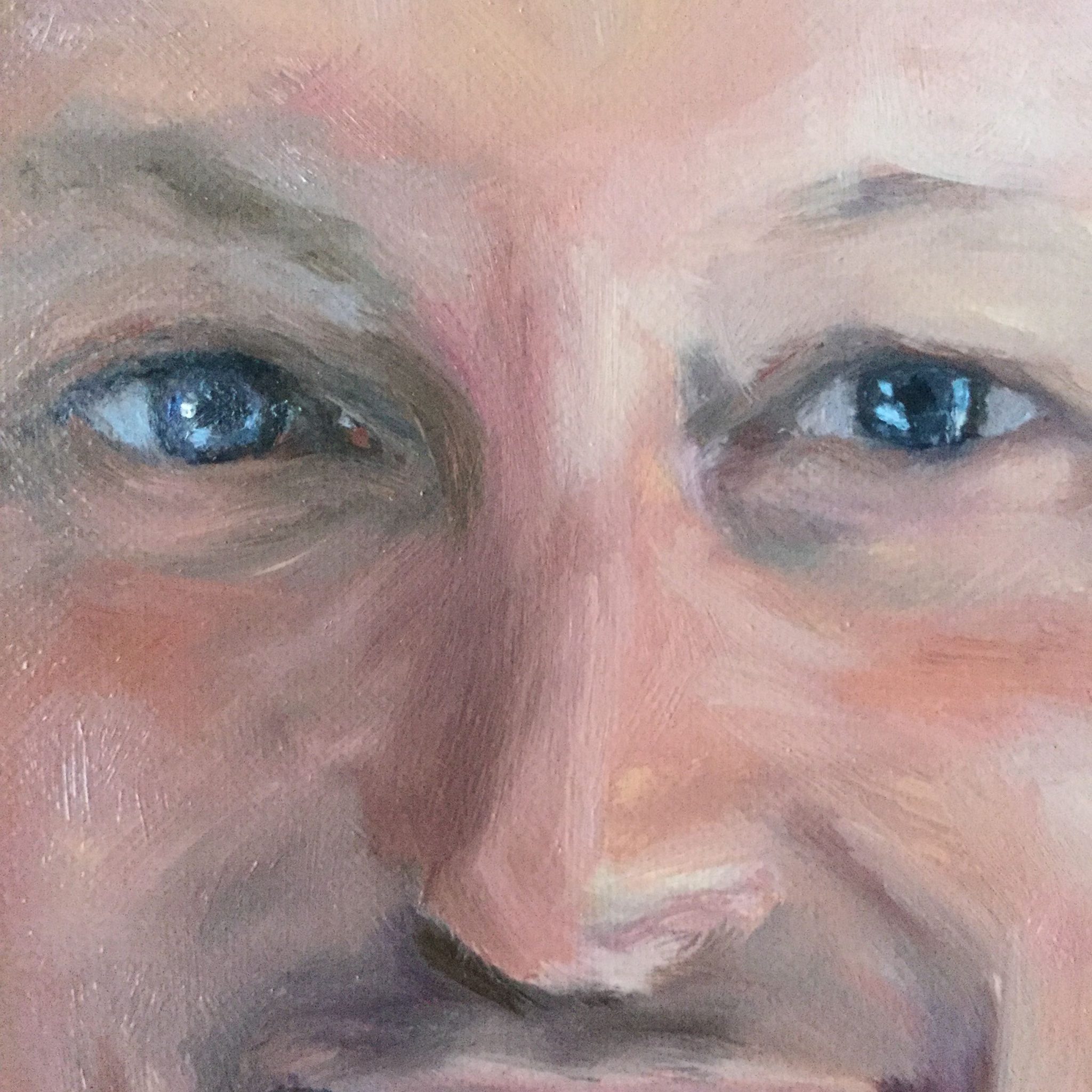
2. Adding Subtle Complementary Colors
In the detail photo below, you can see around the eye socket where I have some blue tones mixed in with the peachy tones. Complementary colors are opposites on the color wheel. When you add complements, it enhances color. Think of how beautiful a sunset is. The complementary colors of the cool blue sky contrasting with the warm orange tones from the sun creates a stunning visual effect.
Complementary colors “vibrate” visually and add a little life and drama to your work. I always try to work in subtle complementary colors in my portraits. It adds a level of interest and excitement for the viewer.
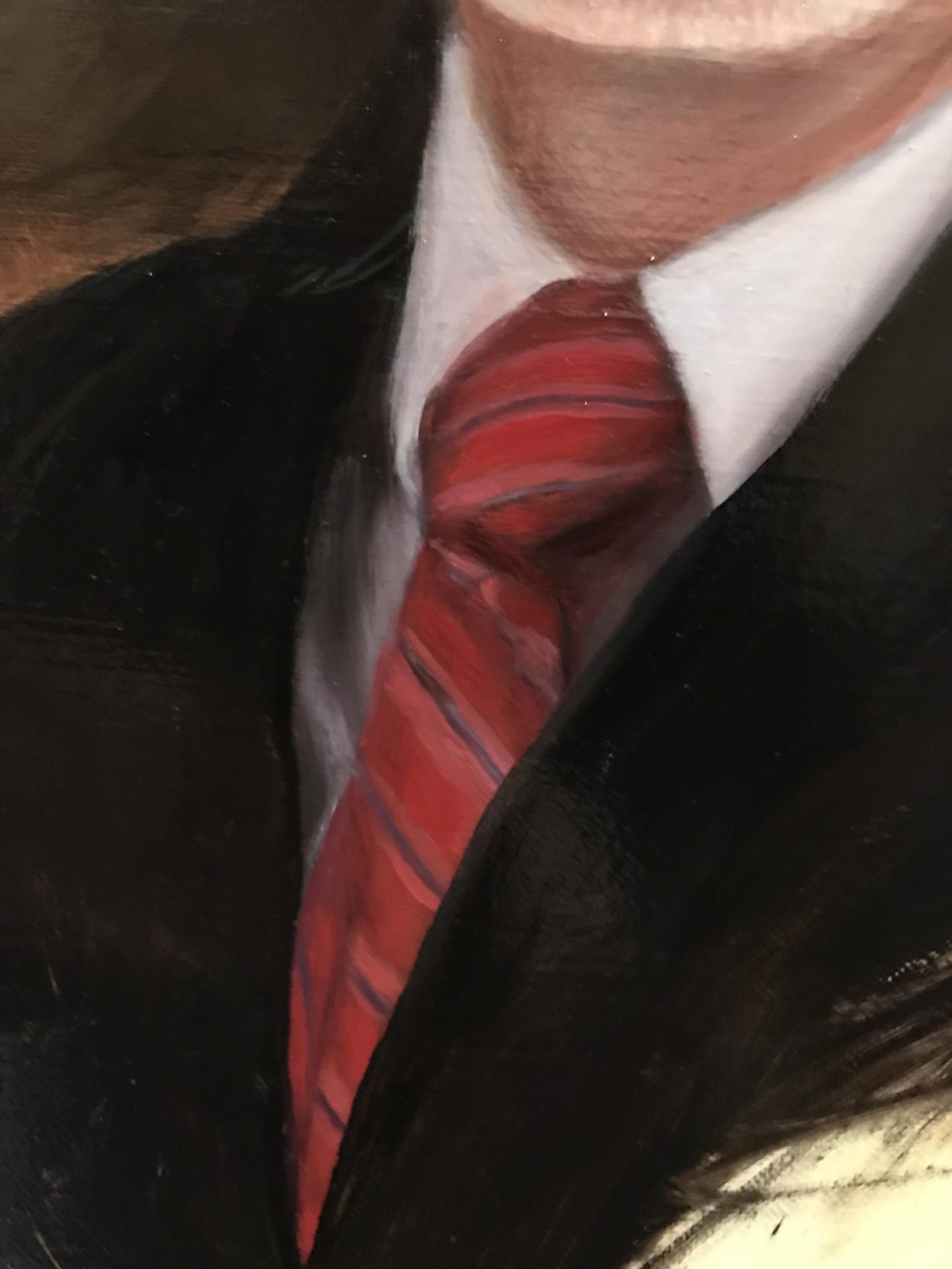
3. Clothing Details In A Realistic Portrait
It’s funny because I always worry about details like ties and jewelry. To overcome this, I spend time on Pinterest looking at how other painters have tackled these subjects.
I always find that the more simple the execution, the better the outcome.
The eyes of any portrait will more than likely be the focal point. So anything beyond the “eye zone” can be less finished. Remember, the brain loves to fill in the blanks for us. A few brush strokes are all it takes to create a realistic effect. It doesn’t have to be perfect, but the values do need to match.
Drying Times For Oil Painting
When I painted this portrait, I used a slow dry medium so I could keep the painting in an “alla prima” style. I definitely did not do this all in one sitting, but I did want the effect of painting wet-on-wet.
I wouldn’t necessarily classify using a slow dry medium as a “mistake”, but it sure did take a very long time to dry. The medium I used did create a very luminous effect, so I was happy I used it.
This portrait was also painted when it was colder outside, which meant it was colder inside. Oil paint tends to dry much slower when it’s cold. It can also take up to a year to dry, so if you have a painting you need to do on a deadline, be cautious with the mediums you use. They can really slow you down.

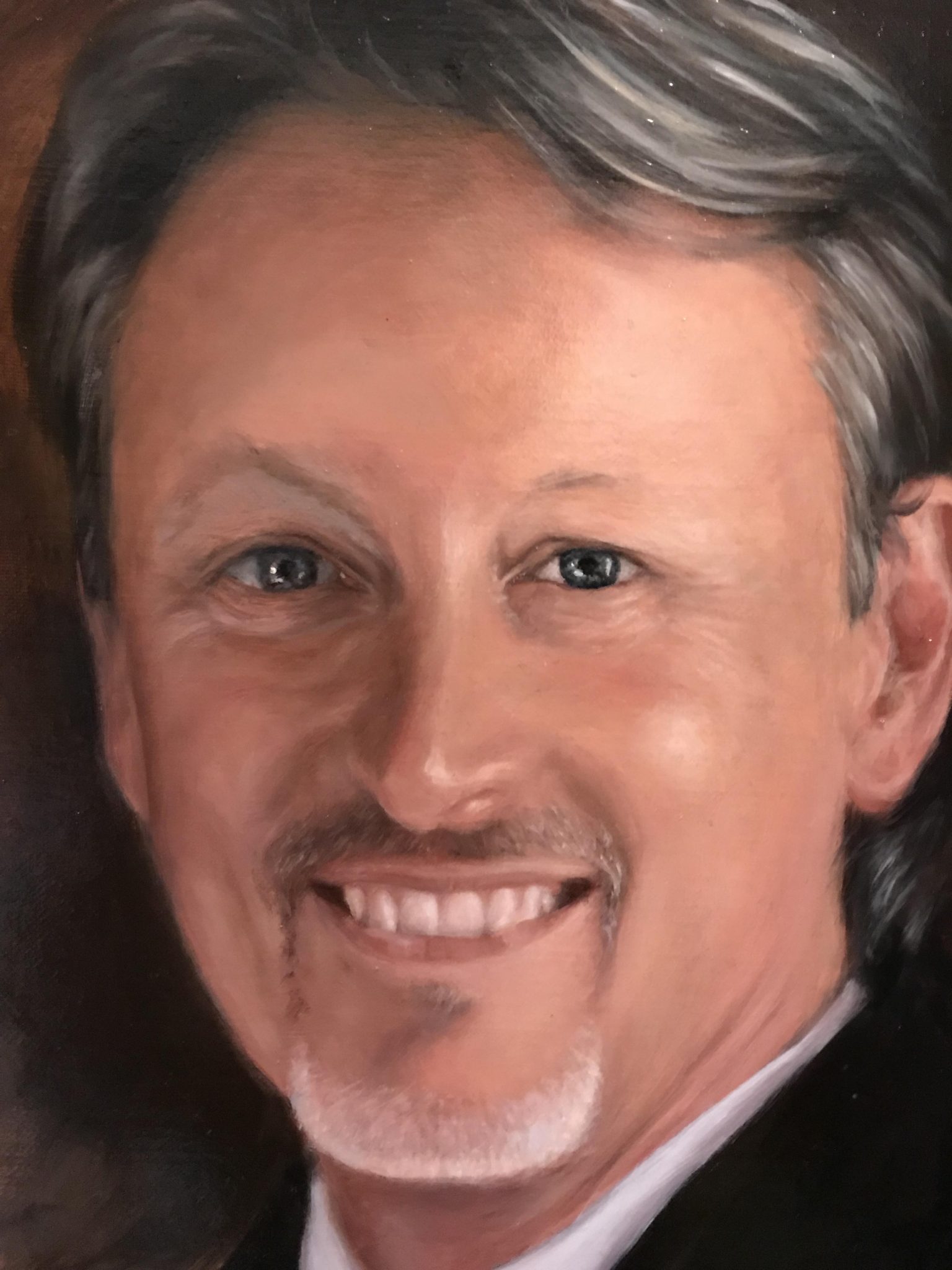
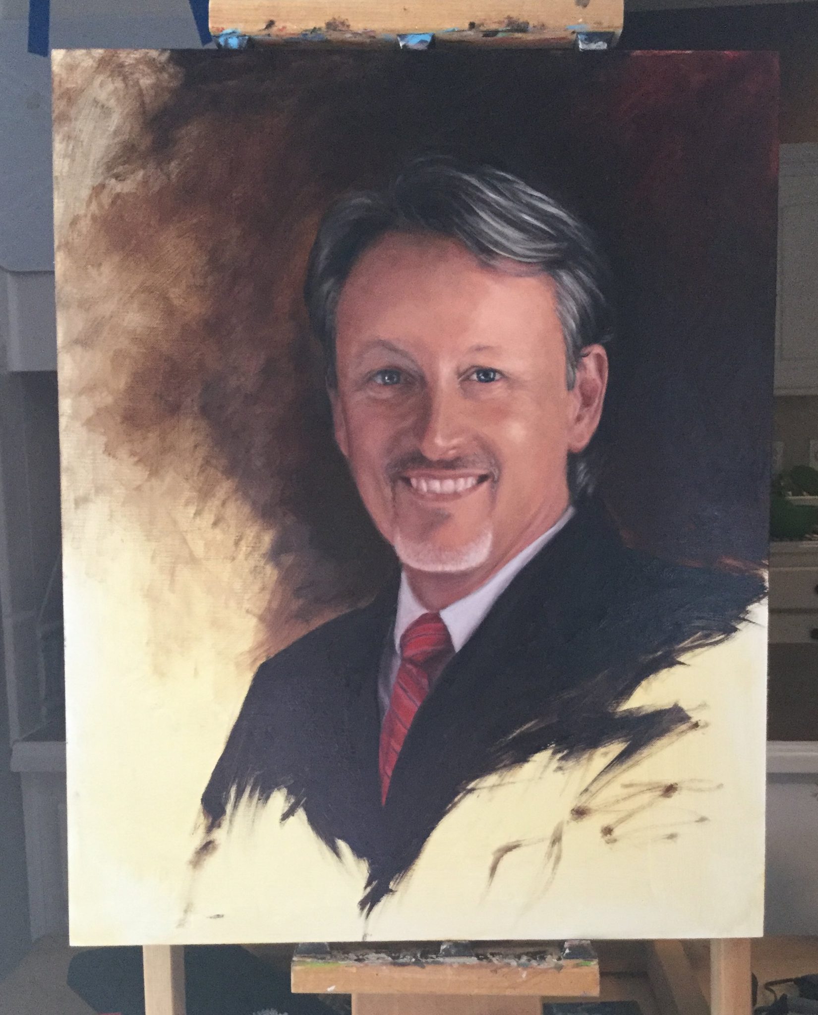
Dr. Claude Pressnell finished portrait
The Finished Portrait
As with all of my paintings, I get a little sad when they are done because I get attached to the work. There is a lot of problem-solving that goes into each painting. It seems that every artist has to overcome a few personal struggles while solving these problems. I think that is why I bond with these paintings so much. They are proof that I persevered and made it to the other side of the conflict.
I’d also like to thank Dr. Claude Pressnell for giving me the opportunity to paint his portrait. He was very patient with the progress and understood the challenges. As with all my paintings, I learned so much about the art of painting and about myself along the way. The painting was an absolute joy for me to paint despite my drawing errors early on.
Thank you for stopping by!
I hope you enjoyed this article. If you would like to learn more, below are some other popular painting tutorials that I’ve done both digitally and traditionally: